> ## Documentation Index
> Fetch the complete documentation index at: https://sentiment-docs.arhamwebworks.com/llms.txt
> Use this file to discover all available pages before exploring further.
# About us page
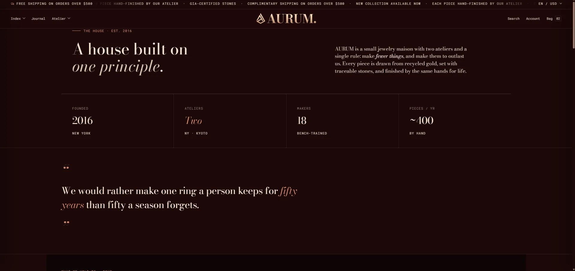
The **About Us** page in the Sentiment theme is a fully editorial brand story page built from seven stacked sections: an **Editorial header** with stat blocks, a **Pull quote & body** section, a **Values grid** with principle cards, an **Image with text** section with multiple rows, an **Ateliers** section with location cards, a **Milestone timeline**, and a **Centered CTA**. Each section can be configured or reordered independently from the Theme Editor.
 ### How to Configure the About Us Page
1. From your Shopify admin, go to **Online Store → Themes** and click **Customize**.
2. From the top page dropdown, select **Pages → About us** (or your equivalent page).
3. Click any section in the left sidebar under **Template** to open its settings.
4. Click **Save** when done.
The page template contains these sections:
* **Editorial header** — masthead with heading, lede copy, and stat blocks
* **Pull quote & body** — large editorial quote with optional body blocks
* **Values grid** — principles grid with Value card blocks
* **Image with text** — alternating image/text rows
* **Ateliers** — atelier location cards
* **Milestone timeline** — brand history timeline
* **Centered CTA** — closing call-to-action with two buttons
***
### Editorial Header Section Settings
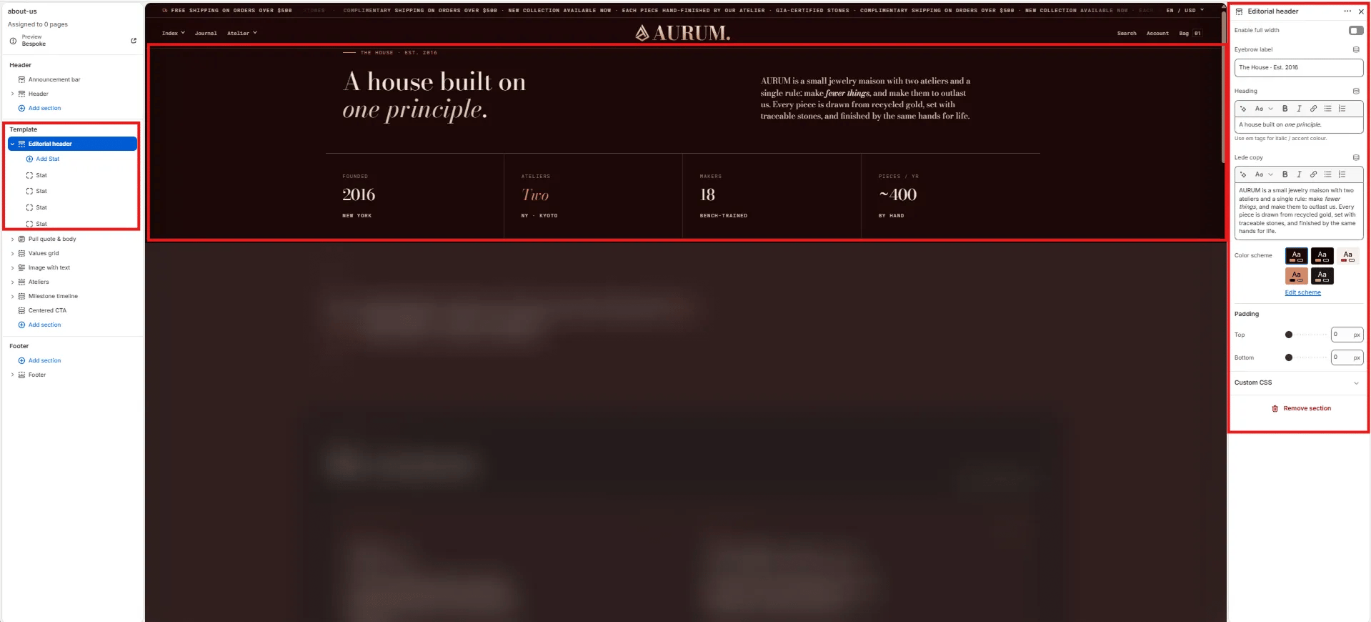
The Editorial Header is the masthead at the top of the about page — combining an eyebrow, heading, lede paragraph, and a row of Stat blocks that display key brand figures (year founded, number of ateliers, makers, annual pieces).
### How to Configure the About Us Page
1. From your Shopify admin, go to **Online Store → Themes** and click **Customize**.
2. From the top page dropdown, select **Pages → About us** (or your equivalent page).
3. Click any section in the left sidebar under **Template** to open its settings.
4. Click **Save** when done.
The page template contains these sections:
* **Editorial header** — masthead with heading, lede copy, and stat blocks
* **Pull quote & body** — large editorial quote with optional body blocks
* **Values grid** — principles grid with Value card blocks
* **Image with text** — alternating image/text rows
* **Ateliers** — atelier location cards
* **Milestone timeline** — brand history timeline
* **Centered CTA** — closing call-to-action with two buttons
***
### Editorial Header Section Settings
The Editorial Header is the masthead at the top of the about page — combining an eyebrow, heading, lede paragraph, and a row of Stat blocks that display key brand figures (year founded, number of ateliers, makers, annual pieces).
 #### Content
* **Enable full width:** Toggle to extend the section edge-to-edge across the viewport.
* **Eyebrow label:** Small label above the heading (e.g., "The House · Est. 2016").
* **Heading:** Main page heading. Supports rich text and italic emphasis (e.g., "A house built on *one principle.*").
* **Lede copy:** Opening paragraph displayed to the right of the heading (e.g., "AURUM is a small jewelry maison with two ateliers and a single rule: make *fewer things*, and make them to outlast us.").
#### Style
* **Color scheme:** Choose a color scheme for the section.
#### Spacing
* **Padding top / Padding bottom:** Control vertical spacing around the section.
***
### Stat Block Settings
Each Stat block is one figure displayed in the horizontal stats row below the heading. Add multiple Stat blocks to build out your brand facts bar.
#### Content
* **Enable full width:** Toggle to extend the section edge-to-edge across the viewport.
* **Eyebrow label:** Small label above the heading (e.g., "The House · Est. 2016").
* **Heading:** Main page heading. Supports rich text and italic emphasis (e.g., "A house built on *one principle.*").
* **Lede copy:** Opening paragraph displayed to the right of the heading (e.g., "AURUM is a small jewelry maison with two ateliers and a single rule: make *fewer things*, and make them to outlast us.").
#### Style
* **Color scheme:** Choose a color scheme for the section.
#### Spacing
* **Padding top / Padding bottom:** Control vertical spacing around the section.
***
### Stat Block Settings
Each Stat block is one figure displayed in the horizontal stats row below the heading. Add multiple Stat blocks to build out your brand facts bar.
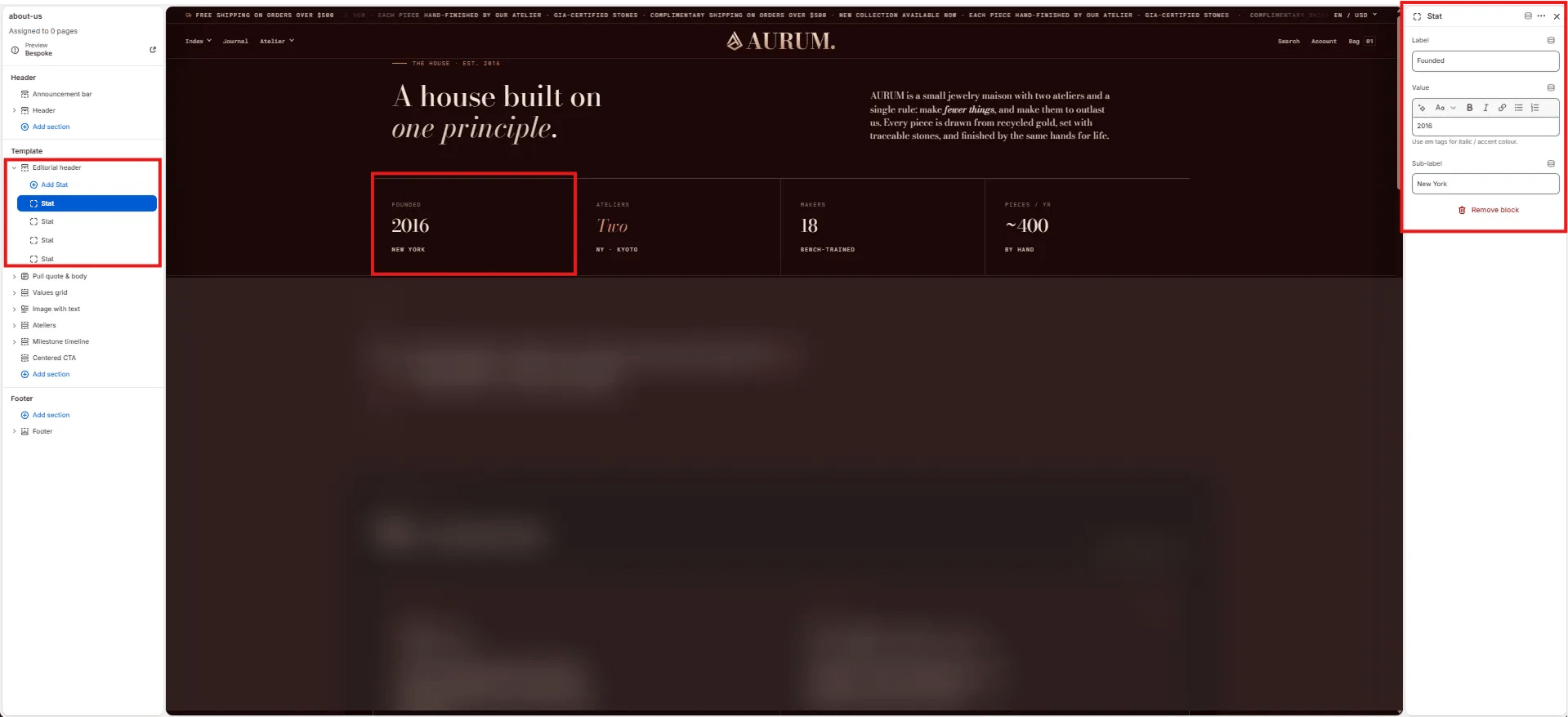 * **Label:** The stat category label shown above the value (e.g., "Founded", "Ateliers", "Makers", "Pieces / yr").
* **Value:** The main stat value, supports rich text and italic/accent color styling (e.g., "2016", "*Two*", "18", "\~400").
* **Sub-label:** Secondary small text shown below the value (e.g., "New York", "By · Kyoto", "Bench-trained", "By hand").
***
### Pull Quote & Body Section Settings
The Pull Quote & Body section renders a full-width large editorial quote — ideal for communicating a brand manifesto or founding philosophy in a single striking statement.
* **Label:** The stat category label shown above the value (e.g., "Founded", "Ateliers", "Makers", "Pieces / yr").
* **Value:** The main stat value, supports rich text and italic/accent color styling (e.g., "2016", "*Two*", "18", "\~400").
* **Sub-label:** Secondary small text shown below the value (e.g., "New York", "By · Kyoto", "Bench-trained", "By hand").
***
### Pull Quote & Body Section Settings
The Pull Quote & Body section renders a full-width large editorial quote — ideal for communicating a brand manifesto or founding philosophy in a single striking statement.
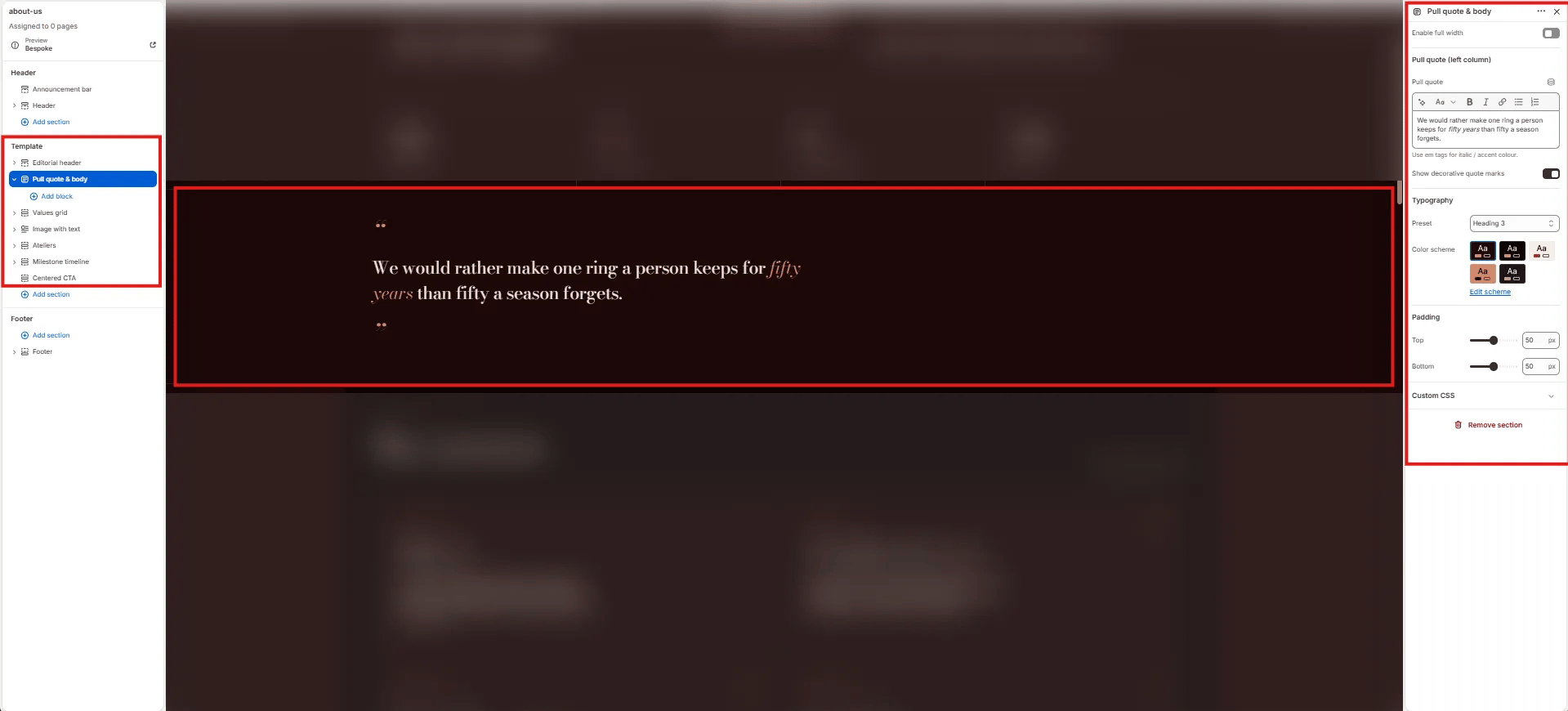 * **Enable full width:** Toggle to extend the section edge-to-edge.
* **Pull quote:** The large quote text displayed in the left column. Supports rich text and italic/accent colour styling (e.g., "We would rather make one ring a person keeps for *fifty years* than fifty a season forgets.").
* **Show decorative quote marks:** Toggle to display large decorative opening and closing quotation marks above and below the quote text.
* **Typography:** Choose the typographic preset for the quote text (e.g., Heading 3).
* **Color scheme:** Choose a color scheme for the section.
* **Padding top / Padding bottom:** Control vertical spacing.
***
### Values Grid Section Settings
The Values Grid section renders an editorial principle cards grid — each card features a principle number, icon, title, and body text. Use it to articulate your brand's core values or standards.
* **Enable full width:** Toggle to extend the section edge-to-edge.
* **Pull quote:** The large quote text displayed in the left column. Supports rich text and italic/accent colour styling (e.g., "We would rather make one ring a person keeps for *fifty years* than fifty a season forgets.").
* **Show decorative quote marks:** Toggle to display large decorative opening and closing quotation marks above and below the quote text.
* **Typography:** Choose the typographic preset for the quote text (e.g., Heading 3).
* **Color scheme:** Choose a color scheme for the section.
* **Padding top / Padding bottom:** Control vertical spacing.
***
### Values Grid Section Settings
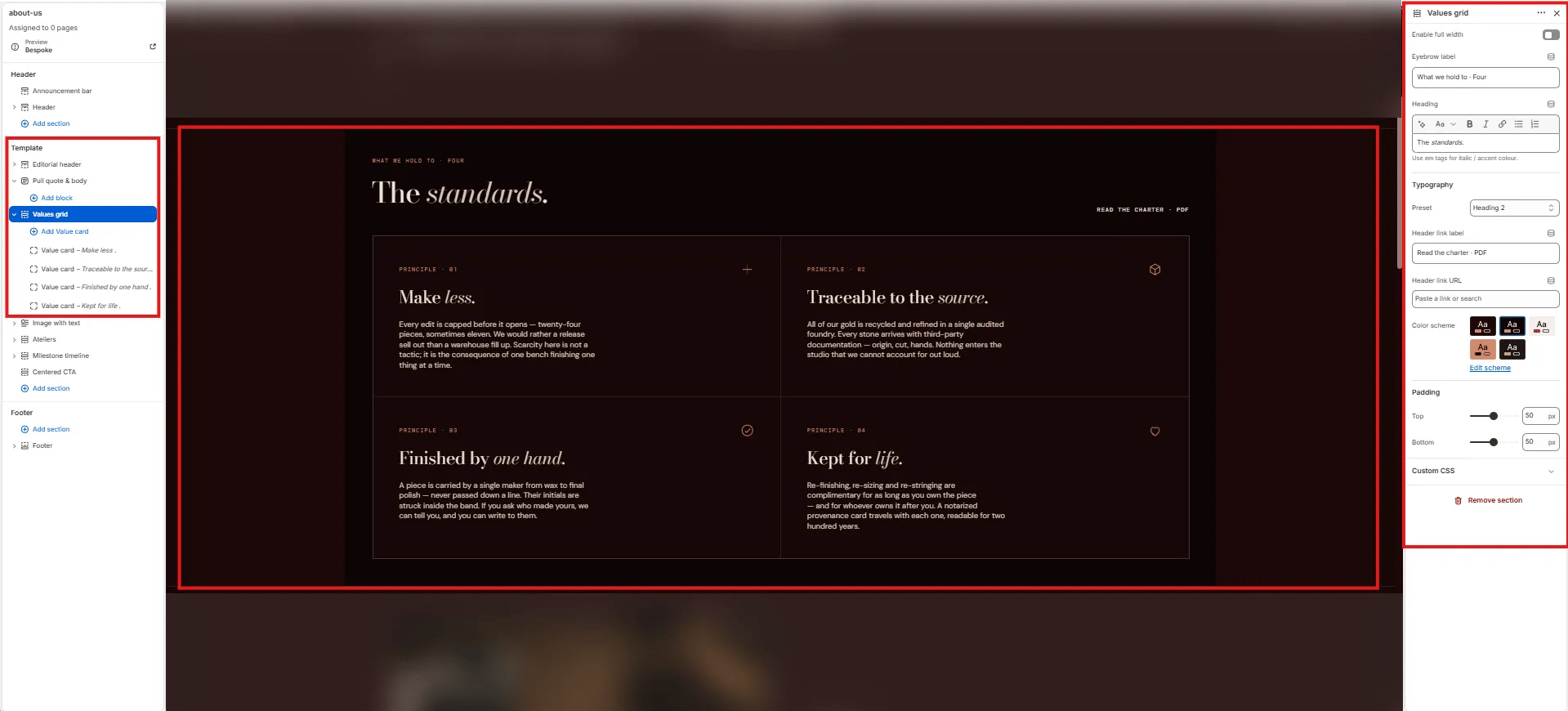
The Values Grid section renders an editorial principle cards grid — each card features a principle number, icon, title, and body text. Use it to articulate your brand's core values or standards.
 #### Content
* **Enable full width:** Toggle to extend the section edge-to-edge.
* **Eyebrow label:** Small label above the heading (e.g., "What we hold to · Four").
* **Heading:** Section heading displayed above the grid (e.g., "The standards."). Supports italic/accent colour.
* **Typography:** Choose the typographic preset for the heading (e.g., Heading 2).
* **Header link label:** Label for the optional link displayed top-right of the heading row (e.g., "Read the charter · PDF").
* **Header link URL:** URL destination for the header link.
#### Style
* **Color scheme:** Choose a color scheme for the section.
#### Spacing
* **Padding top / Padding bottom:** Control vertical spacing.
***
### Value Card Block Settings
Each Value Card block is one principle card in the grid. Cards display in a 2-column grid.
#### Content
* **Enable full width:** Toggle to extend the section edge-to-edge.
* **Eyebrow label:** Small label above the heading (e.g., "What we hold to · Four").
* **Heading:** Section heading displayed above the grid (e.g., "The standards."). Supports italic/accent colour.
* **Typography:** Choose the typographic preset for the heading (e.g., Heading 2).
* **Header link label:** Label for the optional link displayed top-right of the heading row (e.g., "Read the charter · PDF").
* **Header link URL:** URL destination for the header link.
#### Style
* **Color scheme:** Choose a color scheme for the section.
#### Spacing
* **Padding top / Padding bottom:** Control vertical spacing.
***
### Value Card Block Settings
Each Value Card block is one principle card in the grid. Cards display in a 2-column grid.
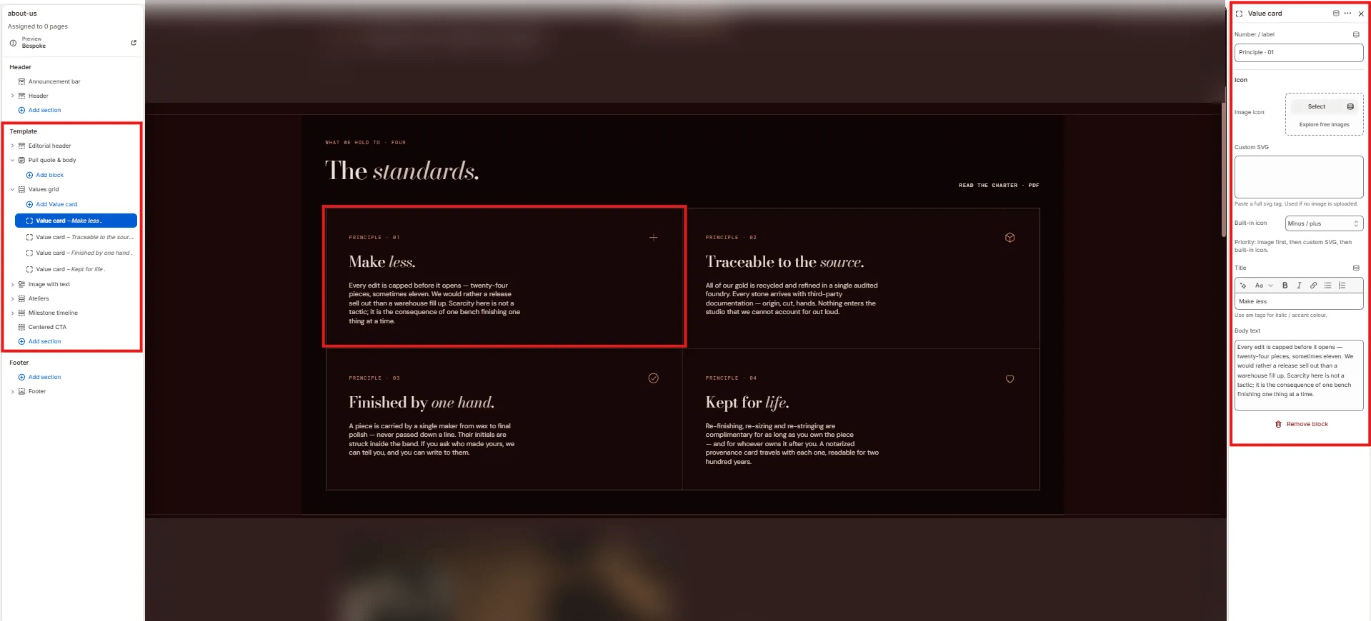 * **Number / label:** The card identifier displayed at the top (e.g., "Principle · 01").
* **Image icon:** Upload a custom icon image for this card. Takes priority over the SVG and built-in icon.
* **Custom SVG:** Paste a full SVG tag to use as the card icon (used only if no image is uploaded).
* **Built-in icon:** Select a built-in icon from the theme icon set (e.g., "Minus / plus", Heart, Diamond).
* **Title:** The card heading (e.g., "Make *less.*"). Supports italic/accent colour.
* **Body text:** The principle description displayed below the title.
***
### Image With Text Section Settings
The Image With Text section renders alternating full-width image/text rows — each row has a large image on one side and editorial copy on the other, ideal for telling the craft and provenance story of the brand.
* **Number / label:** The card identifier displayed at the top (e.g., "Principle · 01").
* **Image icon:** Upload a custom icon image for this card. Takes priority over the SVG and built-in icon.
* **Custom SVG:** Paste a full SVG tag to use as the card icon (used only if no image is uploaded).
* **Built-in icon:** Select a built-in icon from the theme icon set (e.g., "Minus / plus", Heart, Diamond).
* **Title:** The card heading (e.g., "Make *less.*"). Supports italic/accent colour.
* **Body text:** The principle description displayed below the title.
***
### Image With Text Section Settings
The Image With Text section renders alternating full-width image/text rows — each row has a large image on one side and editorial copy on the other, ideal for telling the craft and provenance story of the brand.
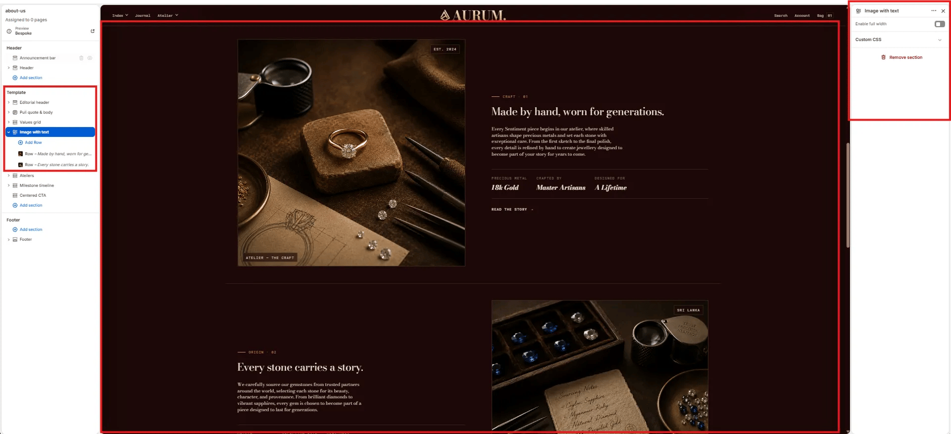 * **Enable full width:** Toggle to extend the section edge-to-edge.
***
### Row Block Settings
Each Row block is one image/text pair within the Image with Text section. Multiple Row blocks stack vertically, alternating image position.
* **Enable full width:** Toggle to extend the section edge-to-edge.
***
### Row Block Settings
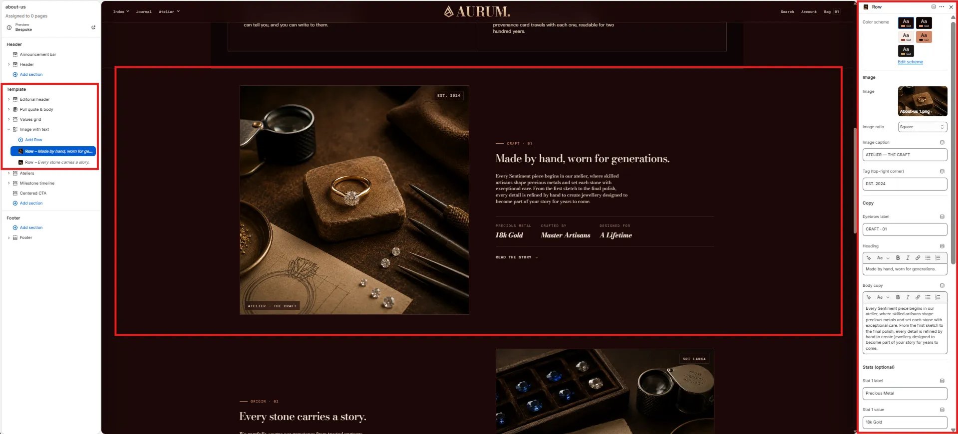
Each Row block is one image/text pair within the Image with Text section. Multiple Row blocks stack vertically, alternating image position.
 #### Style
* **Color scheme:** Choose a color scheme for this row.
#### Image
* **Image:** Upload the image for this row.
* **Image ratio:** Aspect ratio for the image — Square, Landscape, Portrait, or Adapt.
* **Image caption:** Small caption text displayed below the image (e.g., "ATELIER — THE CRAFT").
* **Tag (top-right corner):** Short text badge overlaid in the top-right corner of the image (e.g., "EST. 2024", "SRI LANKA").
#### Copy
* **Eyebrow label:** Small label above the row heading (e.g., "CRAFT · 01", "ORIGIN · 01").
* **Heading:** Row heading displayed in the text column (e.g., "Made by hand, worn for generations.").
* **Body copy:** Supporting paragraph text below the heading.
#### Stats (optional)
Up to three stat pairs displayed in a small row below the body copy:
* **Stat 1–3 label / value:** Label and value for each stat (e.g., "Precious Metal / 18k Gold", "Crafted by / Master Artisans", "Designed for / A Lifetime").
***
### Ateliers Section Settings
The Ateliers section renders a side-by-side atelier location card grid — each Location block contains address, operational details, and action buttons for directions and viewing bookings.
#### Style
* **Color scheme:** Choose a color scheme for this row.
#### Image
* **Image:** Upload the image for this row.
* **Image ratio:** Aspect ratio for the image — Square, Landscape, Portrait, or Adapt.
* **Image caption:** Small caption text displayed below the image (e.g., "ATELIER — THE CRAFT").
* **Tag (top-right corner):** Short text badge overlaid in the top-right corner of the image (e.g., "EST. 2024", "SRI LANKA").
#### Copy
* **Eyebrow label:** Small label above the row heading (e.g., "CRAFT · 01", "ORIGIN · 01").
* **Heading:** Row heading displayed in the text column (e.g., "Made by hand, worn for generations.").
* **Body copy:** Supporting paragraph text below the heading.
#### Stats (optional)
Up to three stat pairs displayed in a small row below the body copy:
* **Stat 1–3 label / value:** Label and value for each stat (e.g., "Precious Metal / 18k Gold", "Crafted by / Master Artisans", "Designed for / A Lifetime").
***
### Ateliers Section Settings
The Ateliers section renders a side-by-side atelier location card grid — each Location block contains address, operational details, and action buttons for directions and viewing bookings.
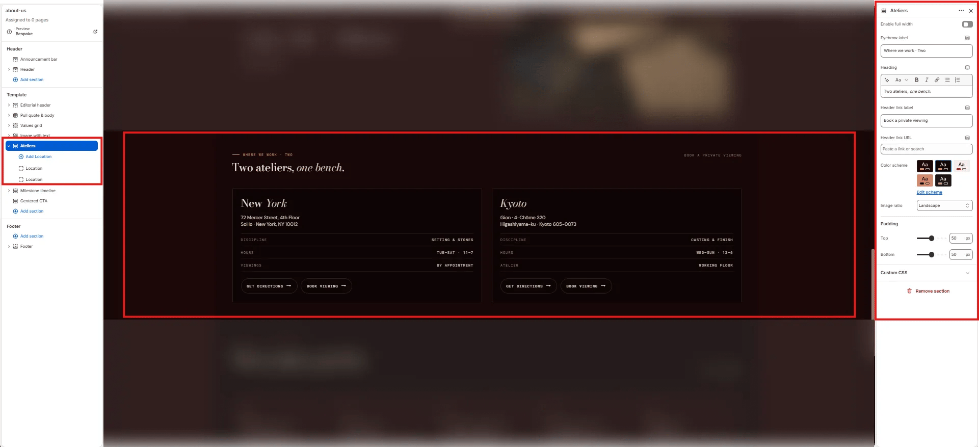 #### Content
* **Enable full width:** Toggle to extend the section edge-to-edge.
* **Eyebrow label:** Small label above the heading (e.g., "Where we work · Two").
* **Heading:** Section heading (e.g., "Two ateliers, *one bench.*"). Supports italic/accent colour.
* **Header link label:** Label for the link on the right side of the heading row (e.g., "Book a private viewing").
* **Header link URL:** URL destination for the header link.
#### Style
* **Color scheme:** Choose a color scheme for the section.
* **Image ratio:** Aspect ratio for atelier images — Landscape, Portrait, or Square.
#### Spacing
* **Padding top / Padding bottom:** Control vertical spacing.
***
### Location Block Settings
Each Location block is one atelier card in the grid.
#### Content
* **Enable full width:** Toggle to extend the section edge-to-edge.
* **Eyebrow label:** Small label above the heading (e.g., "Where we work · Two").
* **Heading:** Section heading (e.g., "Two ateliers, *one bench.*"). Supports italic/accent colour.
* **Header link label:** Label for the link on the right side of the heading row (e.g., "Book a private viewing").
* **Header link URL:** URL destination for the header link.
#### Style
* **Color scheme:** Choose a color scheme for the section.
* **Image ratio:** Aspect ratio for atelier images — Landscape, Portrait, or Square.
#### Spacing
* **Padding top / Padding bottom:** Control vertical spacing.
***
### Location Block Settings
Each Location block is one atelier card in the grid.
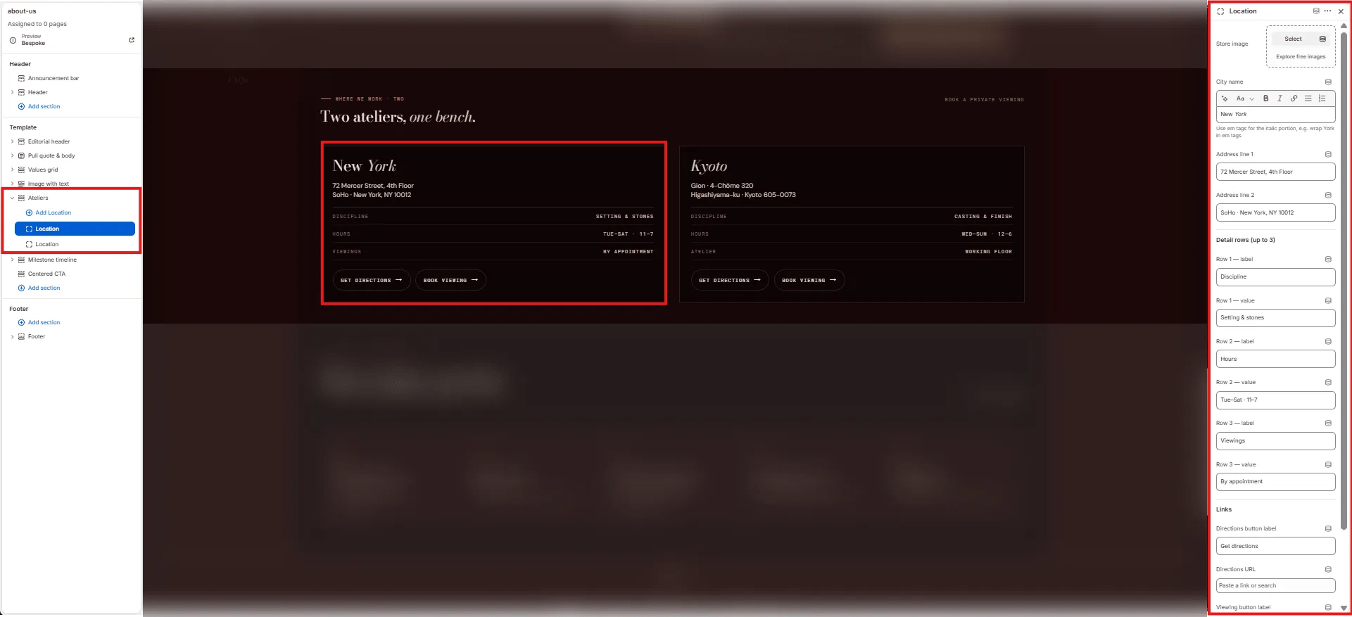 * **Store image:** Upload a photo of the atelier location.
* **City name:** The city name displayed as the card heading. Supports italic/accent colour (e.g., "*New York*", "*Kyoto*").
* **Address line 1:** First line of the atelier address (e.g., "72 Mercer Street, 4th Floor").
* **Address line 2:** Second line of the address (e.g., "SoHo · New York, NY 10012").
**Detail rows (up to 3):** Key/value pairs displayed in a data row within the card:
* **Row 1–3 label / value:** (e.g., "Discipline / Setting & stones", "Hours / Tue–Sat · 11–7", "Viewings / By appointment").
**Links:**
* **Directions button label:** Label for the directions CTA (e.g., "Get directions").
* **Directions URL:** Link to Google Maps or equivalent.
* **Viewing button label:** Label for the booking CTA (e.g., "Book viewing").
* **Viewing URL:** Link to the viewing booking page.
***
### Milestone Timeline Section Settings
The Milestone Timeline section renders a horizontal scrollable brand history timeline — each Milestone block is one card in the chronological sequence.
* **Store image:** Upload a photo of the atelier location.
* **City name:** The city name displayed as the card heading. Supports italic/accent colour (e.g., "*New York*", "*Kyoto*").
* **Address line 1:** First line of the atelier address (e.g., "72 Mercer Street, 4th Floor").
* **Address line 2:** Second line of the address (e.g., "SoHo · New York, NY 10012").
**Detail rows (up to 3):** Key/value pairs displayed in a data row within the card:
* **Row 1–3 label / value:** (e.g., "Discipline / Setting & stones", "Hours / Tue–Sat · 11–7", "Viewings / By appointment").
**Links:**
* **Directions button label:** Label for the directions CTA (e.g., "Get directions").
* **Directions URL:** Link to Google Maps or equivalent.
* **Viewing button label:** Label for the booking CTA (e.g., "Book viewing").
* **Viewing URL:** Link to the viewing booking page.
***
### Milestone Timeline Section Settings
The Milestone Timeline section renders a horizontal scrollable brand history timeline — each Milestone block is one card in the chronological sequence.
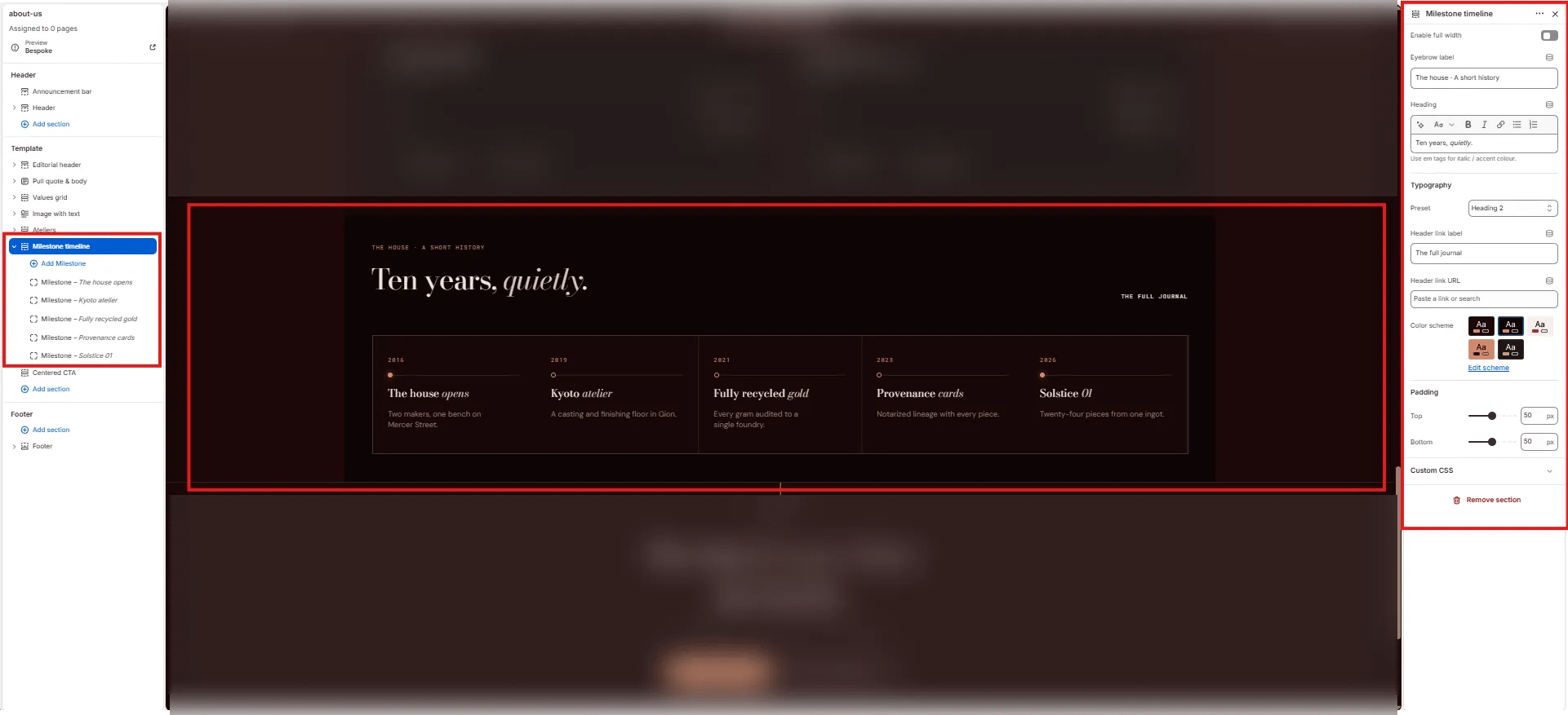 #### Content
* **Enable full width:** Toggle to extend the section edge-to-edge.
* **Eyebrow label:** Small label above the heading (e.g., "The house · A short history").
* **Heading:** Section heading (e.g., "Ten years, *quietly.*"). Supports italic/accent colour.
* **Typography:** Choose the typographic preset for the heading (e.g., Heading 2).
* **Header link label:** Label for the link on the right side of the heading (e.g., "The full journal").
* **Header link URL:** URL destination for the header link.
#### Style
* **Color scheme:** Choose a color scheme for the section.
#### Spacing
* **Padding top / Padding bottom:** Control vertical spacing.
***
### Milestone Block Settings
Each Milestone block is one event card in the timeline.
#### Content
* **Enable full width:** Toggle to extend the section edge-to-edge.
* **Eyebrow label:** Small label above the heading (e.g., "The house · A short history").
* **Heading:** Section heading (e.g., "Ten years, *quietly.*"). Supports italic/accent colour.
* **Typography:** Choose the typographic preset for the heading (e.g., Heading 2).
* **Header link label:** Label for the link on the right side of the heading (e.g., "The full journal").
* **Header link URL:** URL destination for the header link.
#### Style
* **Color scheme:** Choose a color scheme for the section.
#### Spacing
* **Padding top / Padding bottom:** Control vertical spacing.
***
### Milestone Block Settings
Each Milestone block is one event card in the timeline.
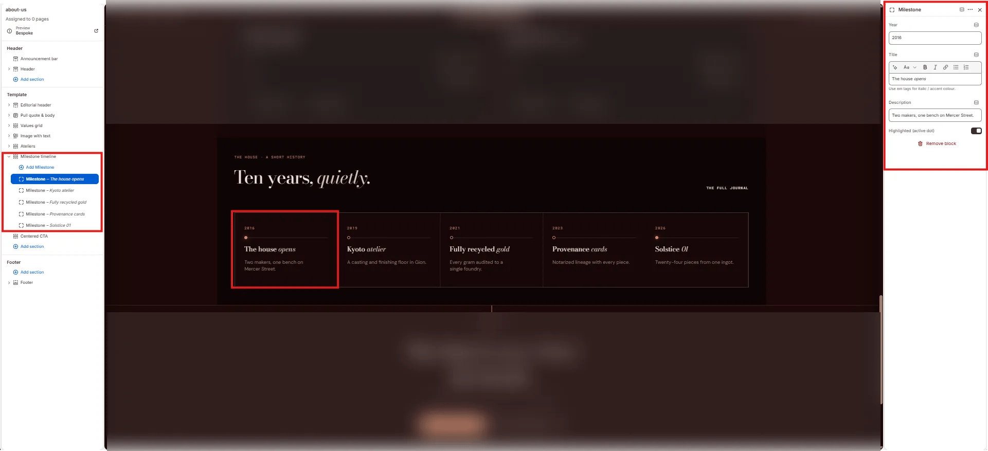 * **Year:** The year displayed at the top of the milestone card (e.g., "2016", "2019").
* **Title:** The milestone heading. Supports italic/accent colour (e.g., "*The house opens*", "Kyoto *atelier*").
* **Description:** Short description displayed below the title (e.g., "Two makers, one bench on Mercer Street.").
* **Highlighted (active dot):** Toggle to mark this milestone with a filled accent dot — use for the most recent or most significant milestone.
***
### Centered CTA Section Settings
The Centered CTA section renders a full-width closing section with a centered eyebrow, heading, sub-text, and two side-by-side CTA buttons — typically used to invite visitors to book a viewing or explore the journal.
* **Year:** The year displayed at the top of the milestone card (e.g., "2016", "2019").
* **Title:** The milestone heading. Supports italic/accent colour (e.g., "*The house opens*", "Kyoto *atelier*").
* **Description:** Short description displayed below the title (e.g., "Two makers, one bench on Mercer Street.").
* **Highlighted (active dot):** Toggle to mark this milestone with a filled accent dot — use for the most recent or most significant milestone.
***
### Centered CTA Section Settings
The Centered CTA section renders a full-width closing section with a centered eyebrow, heading, sub-text, and two side-by-side CTA buttons — typically used to invite visitors to book a viewing or explore the journal.
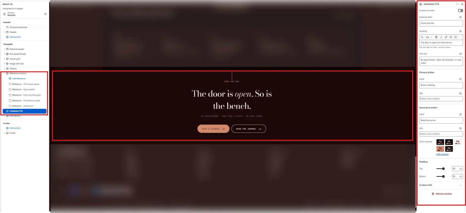 * **Enable full width:** Toggle to extend the section edge-to-edge.
* **Eyebrow label:** Small label above the heading (e.g., "Come and see").
* **Heading:** Main CTA heading. Supports italic/accent colour (e.g., "The door is *open.* So is the bench.").
* **Sub-text:** Supporting text below the heading (e.g., "By appointment · New York & Kyoto · or over video").
* **Primary button label:** Label for the filled/accent primary button (e.g., "Book a viewing").
* **Primary button URL:** Link for the primary button.
* **Secondary button label:** Label for the outlined secondary button (e.g., "Read the journal").
* **Secondary button URL:** Link for the secondary button.
* **Color scheme:** Choose a color scheme for the section.
* **Padding top / Padding bottom:** Control vertical spacing.
* **Enable full width:** Toggle to extend the section edge-to-edge.
* **Eyebrow label:** Small label above the heading (e.g., "Come and see").
* **Heading:** Main CTA heading. Supports italic/accent colour (e.g., "The door is *open.* So is the bench.").
* **Sub-text:** Supporting text below the heading (e.g., "By appointment · New York & Kyoto · or over video").
* **Primary button label:** Label for the filled/accent primary button (e.g., "Book a viewing").
* **Primary button URL:** Link for the primary button.
* **Secondary button label:** Label for the outlined secondary button (e.g., "Read the journal").
* **Secondary button URL:** Link for the secondary button.
* **Color scheme:** Choose a color scheme for the section.
* **Padding top / Padding bottom:** Control vertical spacing.