> ## Documentation Index
> Fetch the complete documentation index at: https://sentiment-docs.arhamwebworks.com/llms.txt
> Use this file to discover all available pages before exploring further.
# Blog page
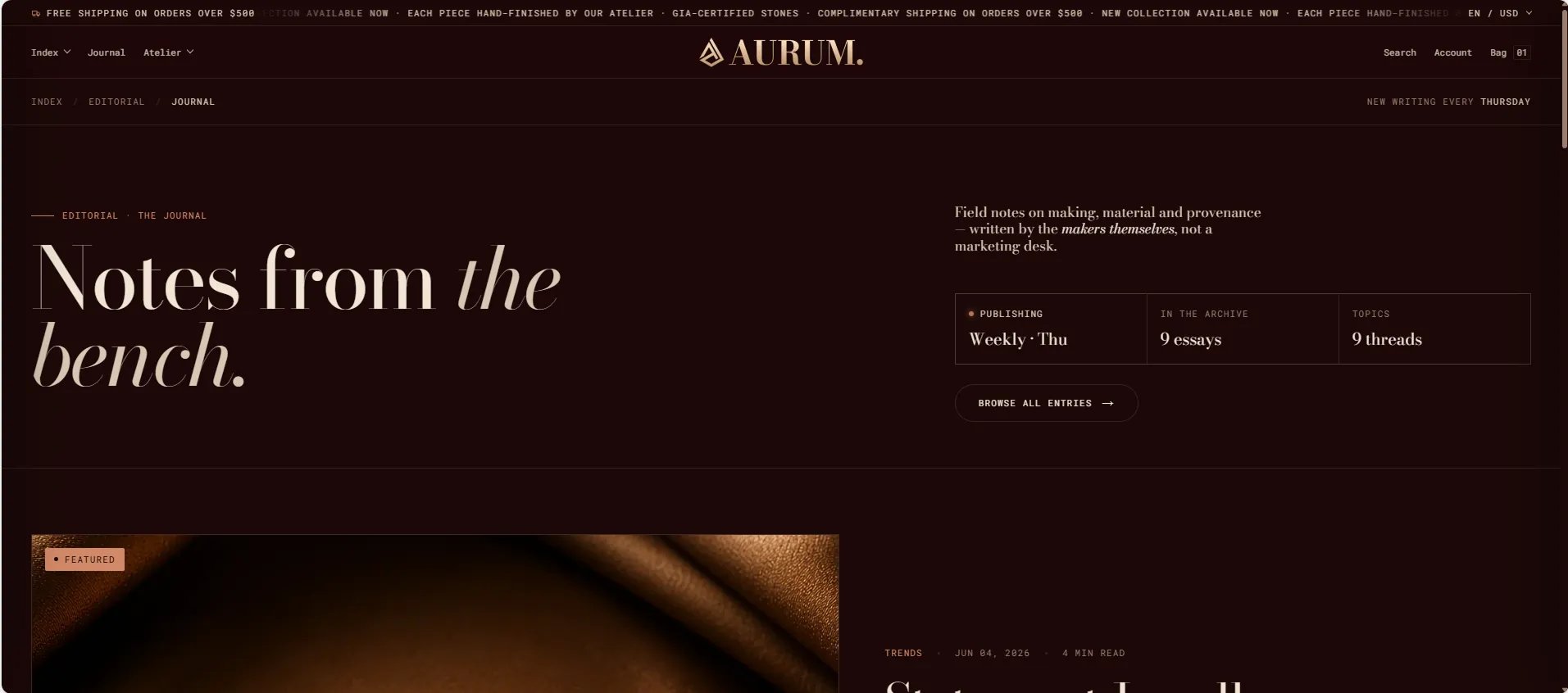
The **Default Blog** template in the Sentiment theme is built from four stacked sections — a Blog header masthead, a Featured article spotlight, a Blog posts grid, and a Newsletter signup. Each section can be configured independently from the Theme Editor to control the full look and feel of your journal listing page.
 ### How to Configure the Blog Page
1. From your Shopify admin, go to **Online Store → Themes** and click **Customize**.
2. From the top page dropdown, select **Blogs → Journal** (or your blog name).
3. Click any section in the left sidebar under **Template** to select and configure it.
4. Click **Save** when done.
The blog listing page template contains these sections:
* **Blog header** — editorial masthead with heading and breadcrumb
* **Featured article** — spotlight card for the most recent or pinned post
* **Blog posts grid** — paginated grid of all articles
* **Newsletter** — email signup at the bottom of the listing page
***
### Blog Header Section Settings
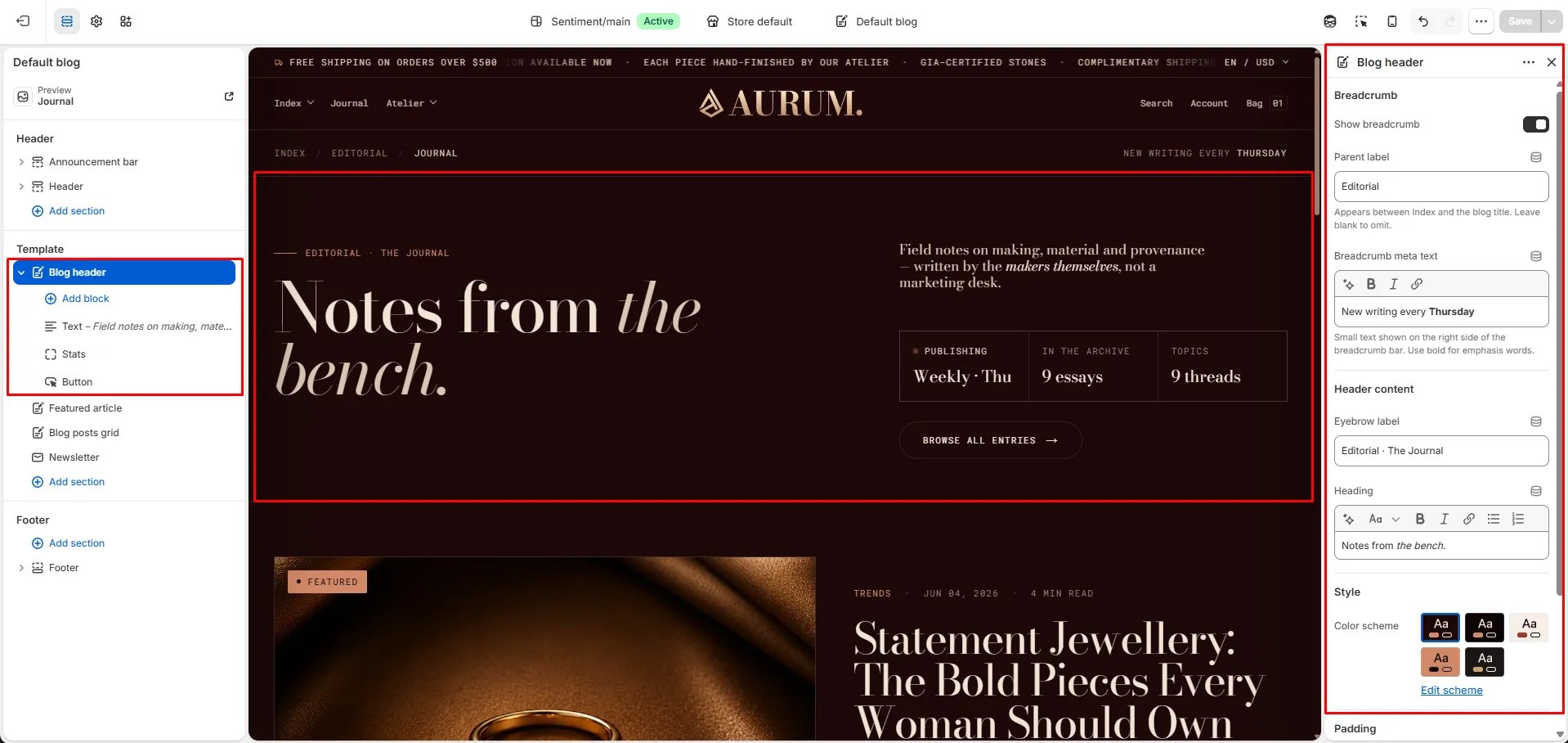
The Blog Header section is the masthead at the top of the listing page. It includes a breadcrumb, eyebrow, heading, and right-column blocks for text, stats, and a CTA button.
### How to Configure the Blog Page
1. From your Shopify admin, go to **Online Store → Themes** and click **Customize**.
2. From the top page dropdown, select **Blogs → Journal** (or your blog name).
3. Click any section in the left sidebar under **Template** to select and configure it.
4. Click **Save** when done.
The blog listing page template contains these sections:
* **Blog header** — editorial masthead with heading and breadcrumb
* **Featured article** — spotlight card for the most recent or pinned post
* **Blog posts grid** — paginated grid of all articles
* **Newsletter** — email signup at the bottom of the listing page
***
### Blog Header Section Settings
The Blog Header section is the masthead at the top of the listing page. It includes a breadcrumb, eyebrow, heading, and right-column blocks for text, stats, and a CTA button.
 #### Breadcrumb
* **Show breadcrumb:** Toggle to show or hide the breadcrumb navigation bar above the heading.
* **Parent label:** The label inserted between "Index" and the blog title in the breadcrumb path (e.g., "Editorial"). Leave blank to omit the parent step.
* **Breadcrumb meta text:** Small text shown on the right side of the breadcrumb bar. Use bold for emphasis words (e.g., "New writing every **Thursday**").
#### Header Content
* **Eyebrow label:** A small label displayed above the main heading (e.g., "Editorial · The Journal").
* **Heading:** The main blog masthead heading. Supports rich text and italic emphasis (e.g., "Notes from *the bench.*").
#### Style
* **Color scheme:** Choose a color scheme to control the section's background and text colors.
#### Spacing
* **Padding top / Padding bottom:** Control the vertical spacing around the Blog header section.
***
### Featured Article Section Settings
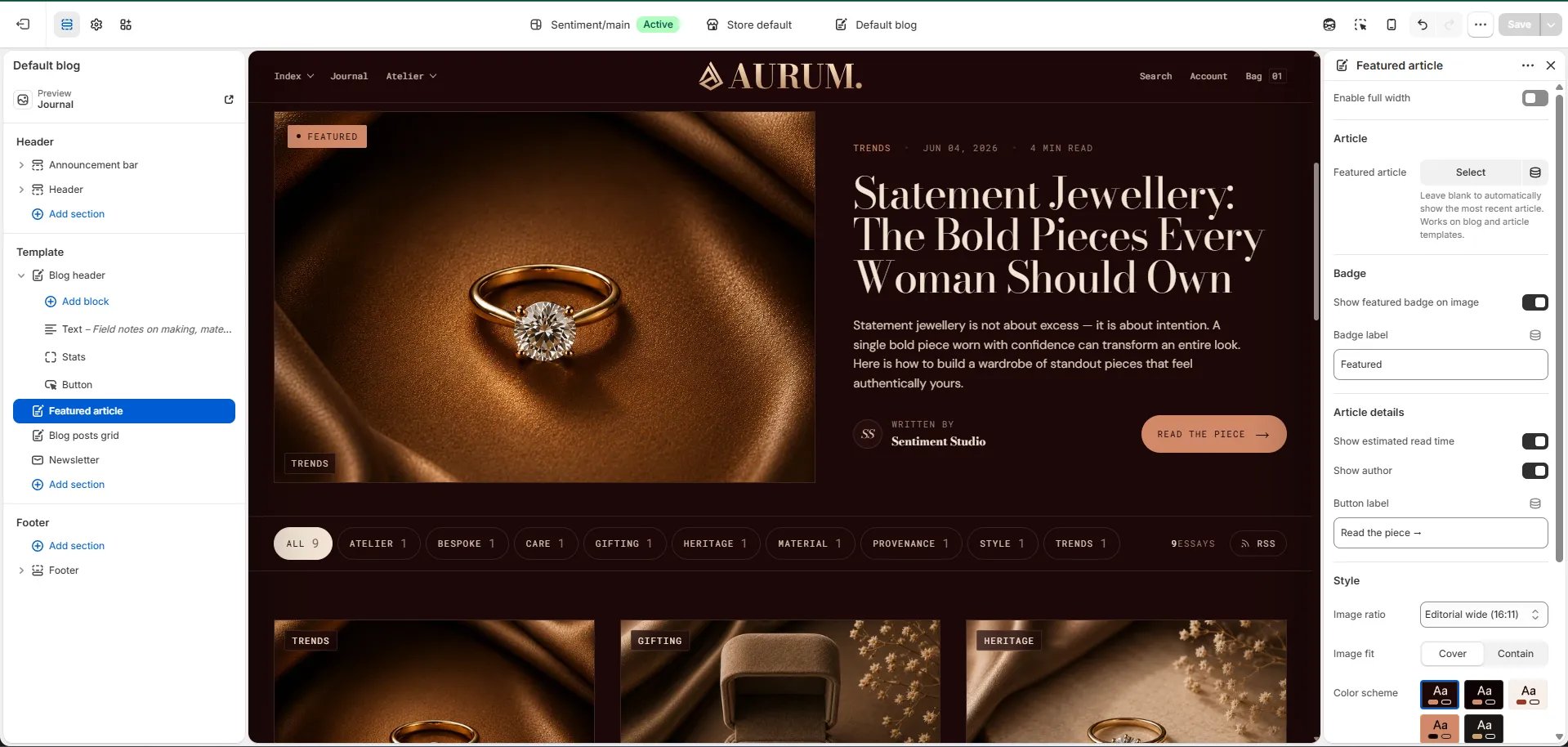
The Featured Article section displays a large spotlight card for one article — typically your most recent or most important post. It sits directly below the Blog header and above the posts grid.
For full configuration details, see the [Featured article](featured-article) section documentation.
Key settings:
* **Featured article:** Pin a specific article, or leave blank to auto-show the most recent post.
* **Show featured badge / label:** Toggle and customize the "Featured" badge on the card.
* **Show read time / Show author:** Toggle metadata shown on the card.
* **Image ratio / Image fit:** Control how the article image is displayed.
* **Color scheme / Padding:** Style and spacing controls.
***
### Blog Posts Grid Section Settings
The Blog Posts Grid section renders the full paginated grid of articles from your blog below the featured article spotlight.
#### Content
* **Eyebrow:** Small label above the heading.
* **Heading:** Section heading displayed above the grid.
* **Heading typography:** Select the typographic style for the heading.
* **View all label:** Text for the "view all" link at the bottom of the grid.
#### Source
* **Blog:** Select the blog to pull articles from.
* **Articles to show:** Number of articles to display per page before pagination (range: 2–12).
#### Display
* **Full width:** When enabled, the grid stretches edge-to-edge.
* **Columns desktop:** Number of columns on desktop (2, 3, or 4).
* **Image ratio:** Aspect ratio for article card images — Portrait, Tall portrait, Square, Landscape, or Adapt.
* **Image fit:** Controls how images fill their card — Cover or Contain.
* **Show author:** Toggle to display the author's name on each article card.
* **Show date:** Toggle to display the publish date on each card.
* **Show read time:** Toggle to display the estimated read time on each card.
* **Show tags:** Toggle to display the article's tags as chips on each card.
#### Style
* **Color scheme:** Choose a color scheme for the grid section.
#### Spacing
* **Padding top / Padding bottom:** Control the vertical spacing around the grid.
***
### Newsletter Section Settings
The Newsletter section appears at the bottom of the blog listing page as a full-width email signup area.
* **Heading:** Heading above the signup form.
* **Subtext:** Supporting description text below the heading.
* **Email placeholder:** Placeholder text inside the email input field.
* **Submit text:** Label on the submit button.
* **Success text:** Message shown after a successful subscription.
* **Color scheme:** Choose a color scheme for the newsletter section.
* **Padding top / Padding bottom:** Control vertical spacing.
#### Breadcrumb
* **Show breadcrumb:** Toggle to show or hide the breadcrumb navigation bar above the heading.
* **Parent label:** The label inserted between "Index" and the blog title in the breadcrumb path (e.g., "Editorial"). Leave blank to omit the parent step.
* **Breadcrumb meta text:** Small text shown on the right side of the breadcrumb bar. Use bold for emphasis words (e.g., "New writing every **Thursday**").
#### Header Content
* **Eyebrow label:** A small label displayed above the main heading (e.g., "Editorial · The Journal").
* **Heading:** The main blog masthead heading. Supports rich text and italic emphasis (e.g., "Notes from *the bench.*").
#### Style
* **Color scheme:** Choose a color scheme to control the section's background and text colors.
#### Spacing
* **Padding top / Padding bottom:** Control the vertical spacing around the Blog header section.
***
### Featured Article Section Settings
The Featured Article section displays a large spotlight card for one article — typically your most recent or most important post. It sits directly below the Blog header and above the posts grid.
For full configuration details, see the [Featured article](featured-article) section documentation.
Key settings:
* **Featured article:** Pin a specific article, or leave blank to auto-show the most recent post.
* **Show featured badge / label:** Toggle and customize the "Featured" badge on the card.
* **Show read time / Show author:** Toggle metadata shown on the card.
* **Image ratio / Image fit:** Control how the article image is displayed.
* **Color scheme / Padding:** Style and spacing controls.
***
### Blog Posts Grid Section Settings
The Blog Posts Grid section renders the full paginated grid of articles from your blog below the featured article spotlight.
#### Content
* **Eyebrow:** Small label above the heading.
* **Heading:** Section heading displayed above the grid.
* **Heading typography:** Select the typographic style for the heading.
* **View all label:** Text for the "view all" link at the bottom of the grid.
#### Source
* **Blog:** Select the blog to pull articles from.
* **Articles to show:** Number of articles to display per page before pagination (range: 2–12).
#### Display
* **Full width:** When enabled, the grid stretches edge-to-edge.
* **Columns desktop:** Number of columns on desktop (2, 3, or 4).
* **Image ratio:** Aspect ratio for article card images — Portrait, Tall portrait, Square, Landscape, or Adapt.
* **Image fit:** Controls how images fill their card — Cover or Contain.
* **Show author:** Toggle to display the author's name on each article card.
* **Show date:** Toggle to display the publish date on each card.
* **Show read time:** Toggle to display the estimated read time on each card.
* **Show tags:** Toggle to display the article's tags as chips on each card.
#### Style
* **Color scheme:** Choose a color scheme for the grid section.
#### Spacing
* **Padding top / Padding bottom:** Control the vertical spacing around the grid.
***
### Newsletter Section Settings
The Newsletter section appears at the bottom of the blog listing page as a full-width email signup area.
* **Heading:** Heading above the signup form.
* **Subtext:** Supporting description text below the heading.
* **Email placeholder:** Placeholder text inside the email input field.
* **Submit text:** Label on the submit button.
* **Success text:** Message shown after a successful subscription.
* **Color scheme:** Choose a color scheme for the newsletter section.
* **Padding top / Padding bottom:** Control vertical spacing.