> ## Documentation Index
> Fetch the complete documentation index at: https://sentiment-docs.arhamwebworks.com/llms.txt
> Use this file to discover all available pages before exploring further.
# Blog posts
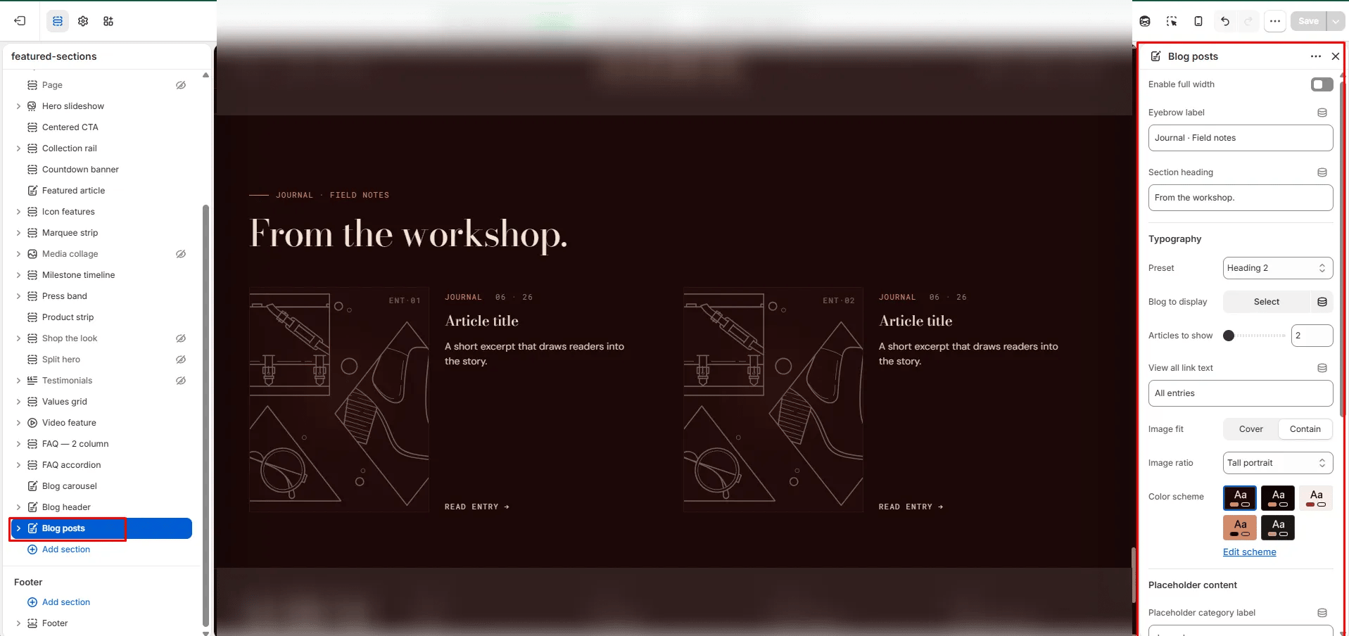
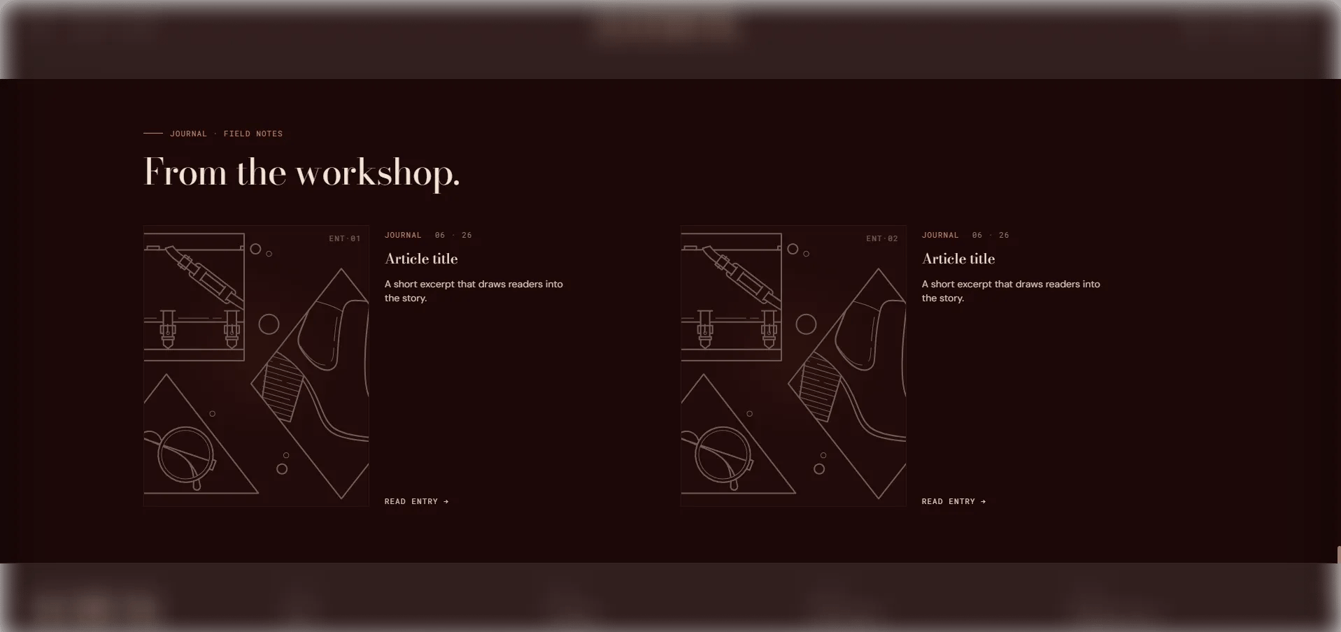
The **Blog Posts** section displays 2–6 featured articles from a selected blog in an editorial grid layout. You can let the section automatically pull the most recent posts, or manually pin specific articles using Article card blocks. It's suited for homepage editorial spotlights, curated reading lists, and content landing pages.
 ### How to Add the Section
1. From your Shopify admin, go to **Online Store → Themes** and click **Customize**.
2. Navigate to the page where you want to add this section.
3. Click **Add section** and select **Blog posts**.
4. Select a blog and configure the display options. Optionally, add **Article card** blocks to pin specific posts.
5. Click **Save**.
### Section Settings
#### Content
* **Eyebrow:** Small label displayed above the heading.
* **Heading:** Main section heading.
* **Heading typography:** Select the typographic style for the heading.
* **View all label:** Text for the "view all" link displayed at the bottom of the section.
#### Source
* **Blog:** Select the blog to pull articles from automatically.
* **Articles to show:** Number of articles to display in the grid (range: 2–6).
#### Display
* **Full width:** When enabled, the section stretches edge-to-edge.
* **Image fit:** Controls how article images fill their card — **Cover** fills and crops to the ratio, **Contain** shows the full image with no cropping.
* **Image ratio:** Aspect ratio for article card images — Portrait, Tall portrait, Square, Landscape, or Adapt.
#### Placeholder Content *(editor only)*
* **Placeholder category / title / excerpt:** Fallback text shown in the theme editor when no blog is selected.
#### Style
* **Color scheme:** Choose a color scheme for the section.
#### Spacing
* **Padding top / Padding bottom:** Control vertical spacing around the section.
***
### Article Card Block Settings
Each Article card block manually pins a specific article to the grid. Use these when you want to curate the selection rather than display the most recent posts.
* **Article:** Select the specific article to pin to this position in the grid.
### How to Add the Section
1. From your Shopify admin, go to **Online Store → Themes** and click **Customize**.
2. Navigate to the page where you want to add this section.
3. Click **Add section** and select **Blog posts**.
4. Select a blog and configure the display options. Optionally, add **Article card** blocks to pin specific posts.
5. Click **Save**.
### Section Settings
#### Content
* **Eyebrow:** Small label displayed above the heading.
* **Heading:** Main section heading.
* **Heading typography:** Select the typographic style for the heading.
* **View all label:** Text for the "view all" link displayed at the bottom of the section.
#### Source
* **Blog:** Select the blog to pull articles from automatically.
* **Articles to show:** Number of articles to display in the grid (range: 2–6).
#### Display
* **Full width:** When enabled, the section stretches edge-to-edge.
* **Image fit:** Controls how article images fill their card — **Cover** fills and crops to the ratio, **Contain** shows the full image with no cropping.
* **Image ratio:** Aspect ratio for article card images — Portrait, Tall portrait, Square, Landscape, or Adapt.
#### Placeholder Content *(editor only)*
* **Placeholder category / title / excerpt:** Fallback text shown in the theme editor when no blog is selected.
#### Style
* **Color scheme:** Choose a color scheme for the section.
#### Spacing
* **Padding top / Padding bottom:** Control vertical spacing around the section.
***
### Article Card Block Settings
Each Article card block manually pins a specific article to the grid. Use these when you want to curate the selection rather than display the most recent posts.
* **Article:** Select the specific article to pin to this position in the grid.