> ## Documentation Index
> Fetch the complete documentation index at: https://sentiment-docs.arhamwebworks.com/llms.txt
> Use this file to discover all available pages before exploring further.
# Collection list page
The **Collection list** page in the Sentiment theme is powered by a single **Collections** section that renders a full editorial masthead, a paginated mosaic grid of all store collections, and optional call-to-action cards at the bottom — ideal for directing customers who can't find what they're looking for toward bespoke enquiries or private viewings.
 ### How to Configure the Collection List Page
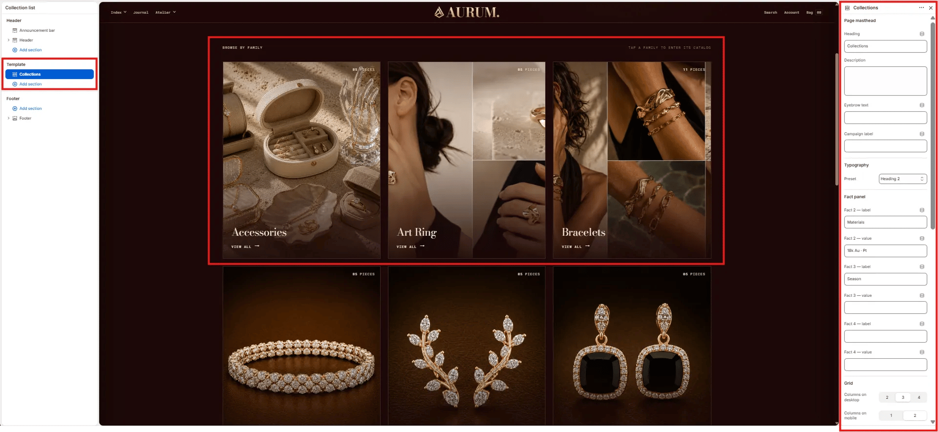
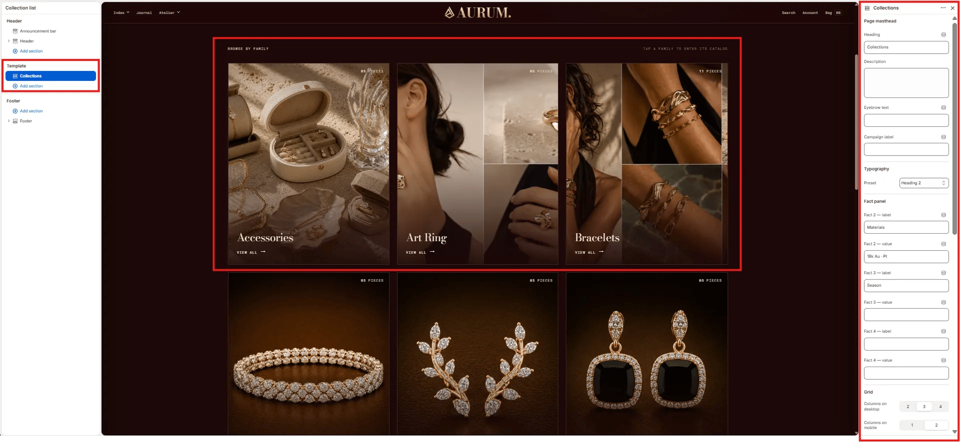
1. From your Shopify admin, go to **Online Store → Themes** and click **Customize**.
2. From the top page dropdown, select **Collections → Collection list**.
3. Click **Collections** in the left sidebar under **Template** to open its settings.
4. Click **Save** when done.
***
### Collections Section Settings
The Collections section controls everything on the collection list page — the page masthead (heading, stats, description), the collections grid layout, and the CTA cards shown after the grid.
### How to Configure the Collection List Page
1. From your Shopify admin, go to **Online Store → Themes** and click **Customize**.
2. From the top page dropdown, select **Collections → Collection list**.
3. Click **Collections** in the left sidebar under **Template** to open its settings.
4. Click **Save** when done.
***
### Collections Section Settings
The Collections section controls everything on the collection list page — the page masthead (heading, stats, description), the collections grid layout, and the CTA cards shown after the grid.
 #### Page Masthead
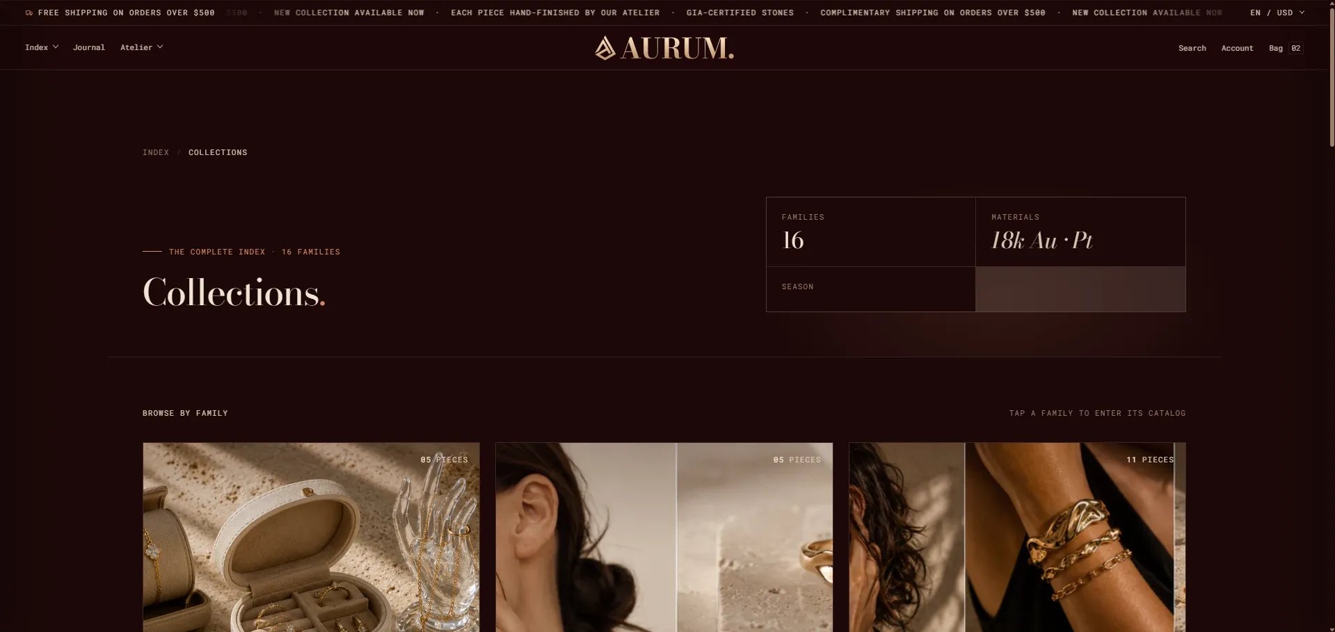
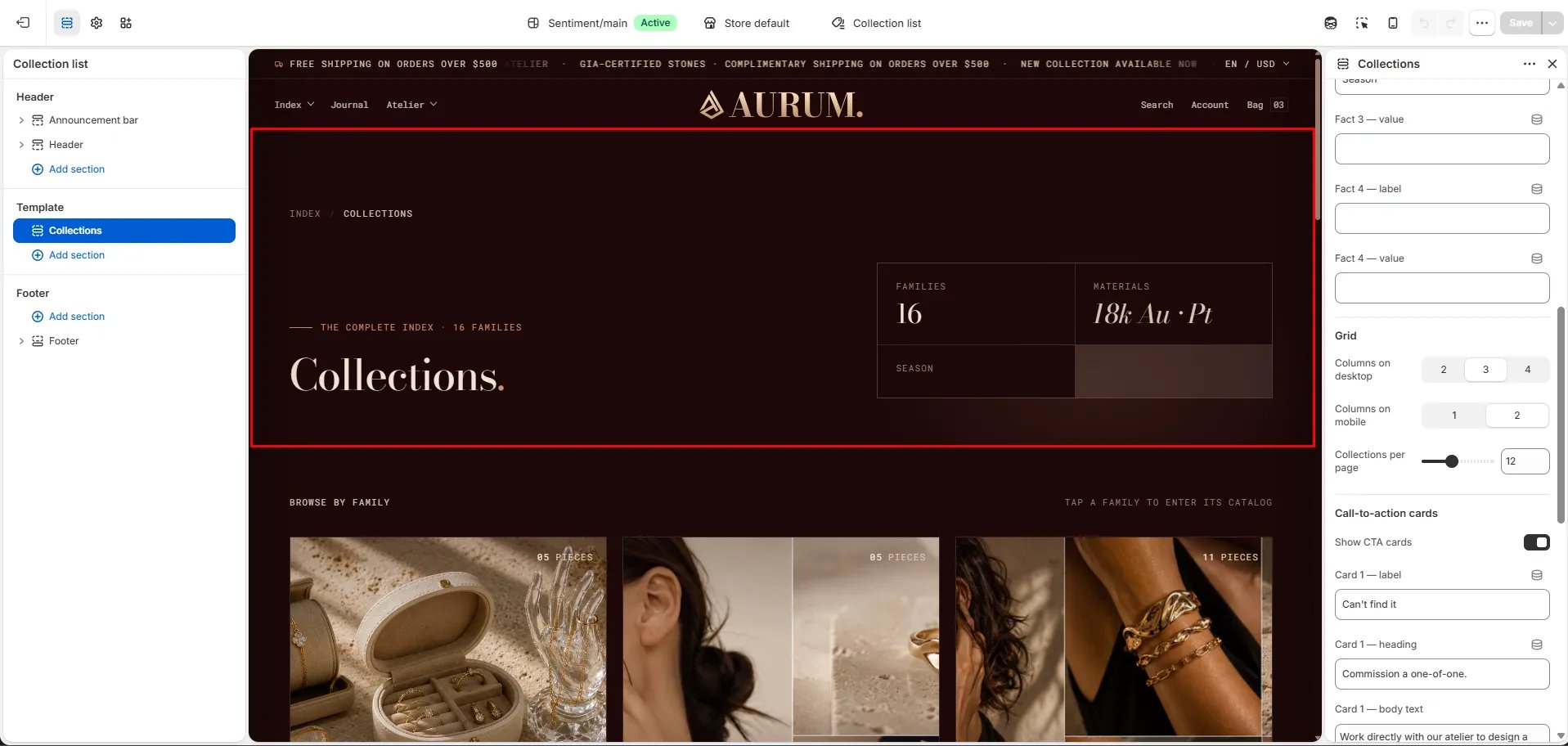
* **Heading:** The main page heading displayed in the masthead (e.g., "Collections."). Pulls from the section settings rather than Shopify admin.
* **Description:** Optional description text displayed below the heading in the masthead area.
* **Eyebrow text:** Small label displayed above the heading (e.g., "THE COMPLETE INDEX · 16 FAMILIES").
* **Campaign label:** Secondary small label displayed alongside the eyebrow — useful for drop or seasonal tags.
* **Typography:** Choose the typographic preset for the page heading (e.g., Heading 2).
#### Fact Panel
Up to four label/value stat pairs displayed in a panel to the right of the masthead heading — use these to communicate scope, materials, or season at a glance.
* **Fact 2 — label / value:** Second stat (e.g., label: "Materials", value: "18k Au · Pt").
* **Fact 3 — label / value:** Third stat (e.g., label: "Season", value: leave blank to hide).
* **Fact 4 — label / value:** Fourth stat (leave both blank to hide).
> **Note:** Fact 1 is auto-generated from the total number of collections (e.g., "FAMILIES / 16") and cannot be edited here.
#### Grid
* **Columns on desktop:** Number of collection card columns on desktop — **2**, **3**, or **4**.
* **Columns on mobile:** Number of columns on mobile — **1** or **2**.
* **Collections per page:** Number of collection cards shown per page before pagination (default: 12).
#### Call-to-Action Cards
Two optional CTA cards appear below the collection grid — useful for surfacing bespoke commissions, private viewings, or other services when customers don't find what they need in the standard catalog.
* **Show CTA cards:** Toggle to show or hide the CTA card pair below the grid.
**Card 1:**
* **Card 1 — label:** Small eyebrow label above the card heading (e.g., "Can't find it").
* **Card 1 — heading:** Main card heading (e.g., "Commission a one-of-one.").
* **Card 1 — body text:** Supporting description text (e.g., "Work directly with our atelier to design a piece around your own stones, sketches or heirloom gold.").
* **Card 1 — button text:** CTA button label (e.g., "Begin a bespoke enquiry →").
* **Card 1 — button URL:** Link destination for the button.
**Card 2:**
* **Card 2 — label:** Small eyebrow label (e.g., "In person").
* **Card 2 — heading:** Main card heading (e.g., "Book a private viewing.").
* **Card 2 — body text:** Supporting description text (e.g., "See the families in the metal before you decide.").
* **Card 2 — button text:** CTA button label (e.g., "Reserve an appointment →").
* **Card 2 — button URL:** Link destination for the button.
#### Page Masthead
* **Heading:** The main page heading displayed in the masthead (e.g., "Collections."). Pulls from the section settings rather than Shopify admin.
* **Description:** Optional description text displayed below the heading in the masthead area.
* **Eyebrow text:** Small label displayed above the heading (e.g., "THE COMPLETE INDEX · 16 FAMILIES").
* **Campaign label:** Secondary small label displayed alongside the eyebrow — useful for drop or seasonal tags.
* **Typography:** Choose the typographic preset for the page heading (e.g., Heading 2).
#### Fact Panel
Up to four label/value stat pairs displayed in a panel to the right of the masthead heading — use these to communicate scope, materials, or season at a glance.
* **Fact 2 — label / value:** Second stat (e.g., label: "Materials", value: "18k Au · Pt").
* **Fact 3 — label / value:** Third stat (e.g., label: "Season", value: leave blank to hide).
* **Fact 4 — label / value:** Fourth stat (leave both blank to hide).
> **Note:** Fact 1 is auto-generated from the total number of collections (e.g., "FAMILIES / 16") and cannot be edited here.
#### Grid
* **Columns on desktop:** Number of collection card columns on desktop — **2**, **3**, or **4**.
* **Columns on mobile:** Number of columns on mobile — **1** or **2**.
* **Collections per page:** Number of collection cards shown per page before pagination (default: 12).
#### Call-to-Action Cards
Two optional CTA cards appear below the collection grid — useful for surfacing bespoke commissions, private viewings, or other services when customers don't find what they need in the standard catalog.
* **Show CTA cards:** Toggle to show or hide the CTA card pair below the grid.
**Card 1:**
* **Card 1 — label:** Small eyebrow label above the card heading (e.g., "Can't find it").
* **Card 1 — heading:** Main card heading (e.g., "Commission a one-of-one.").
* **Card 1 — body text:** Supporting description text (e.g., "Work directly with our atelier to design a piece around your own stones, sketches or heirloom gold.").
* **Card 1 — button text:** CTA button label (e.g., "Begin a bespoke enquiry →").
* **Card 1 — button URL:** Link destination for the button.
**Card 2:**
* **Card 2 — label:** Small eyebrow label (e.g., "In person").
* **Card 2 — heading:** Main card heading (e.g., "Book a private viewing.").
* **Card 2 — body text:** Supporting description text (e.g., "See the families in the metal before you decide.").
* **Card 2 — button text:** CTA button label (e.g., "Reserve an appointment →").
* **Card 2 — button URL:** Link destination for the button.