> ## Documentation Index
> Fetch the complete documentation index at: https://sentiment-docs.arhamwebworks.com/llms.txt
> Use this file to discover all available pages before exploring further.
# Collection page
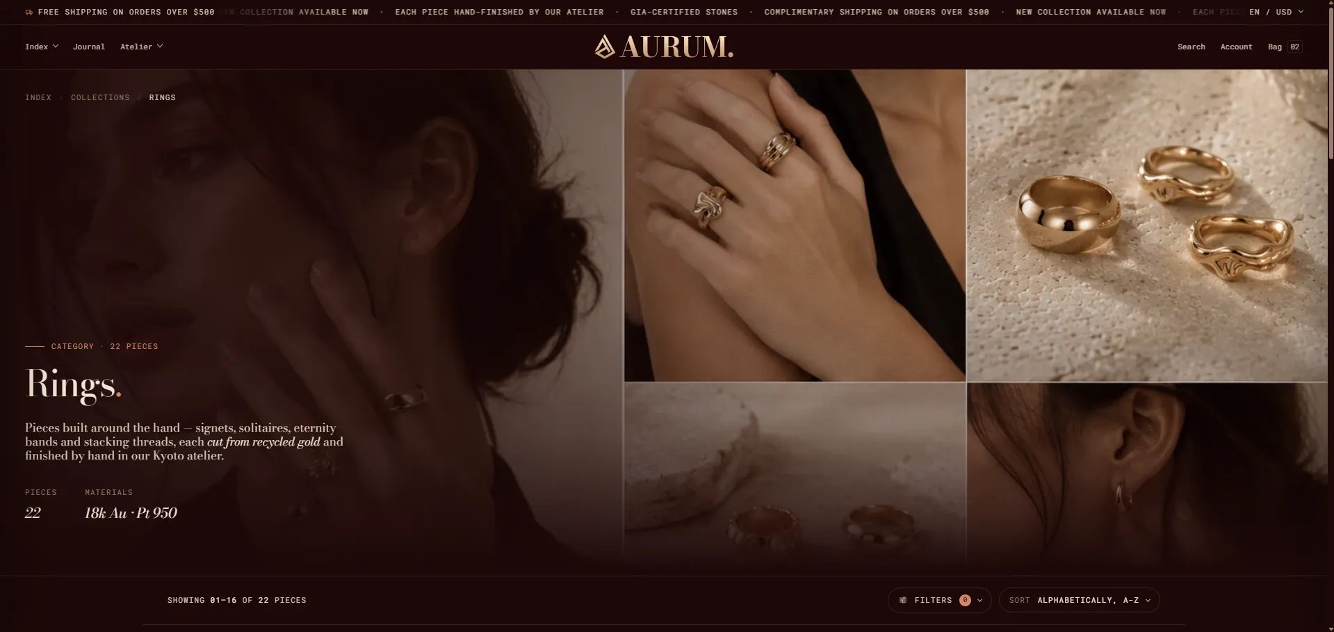
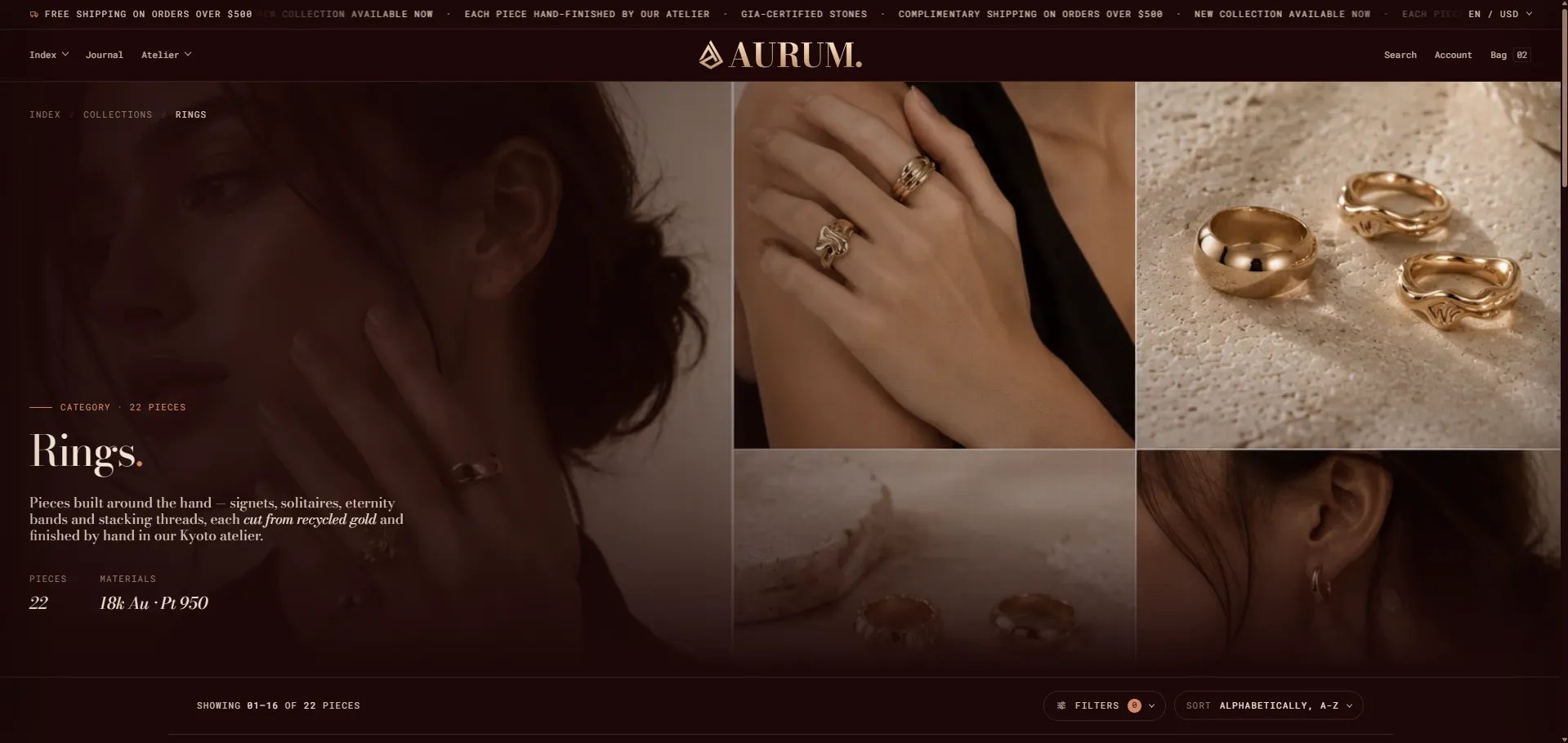
The **Default Collection** template in the Sentiment theme is built from two sections — a **Collection banner** masthead that displays the collection hero image, name, and metadata, and a **Collection** grid that renders the paginated product listing with filters and sort controls. Both sections are configured independently from the Theme Editor.
 ### How to Configure the Collection Page
1. From your Shopify admin, go to **Online Store → Themes** and click **Customize**.
2. From the top page dropdown, select **Collections → Default collection** (or navigate to a specific collection).
3. Click **Collection banner** or **Collection** in the left sidebar under **Template** to open each section's settings.
4. Click **Save** when done.
The collection page template contains these sections:
* **Collection banner** — hero image masthead with collection name, stats, and content overlay
* **Collection** — paginated product grid with filters and sort controls
***
### Collection Banner Section Settings
The Collection banner renders a full-bleed hero at the top of the collection page. It pulls the collection title and description from Shopify admin automatically, with additional options to overlay campaign labels, material stats, a release date, and a custom background image.
### How to Configure the Collection Page
1. From your Shopify admin, go to **Online Store → Themes** and click **Customize**.
2. From the top page dropdown, select **Collections → Default collection** (or navigate to a specific collection).
3. Click **Collection banner** or **Collection** in the left sidebar under **Template** to open each section's settings.
4. Click **Save** when done.
The collection page template contains these sections:
* **Collection banner** — hero image masthead with collection name, stats, and content overlay
* **Collection** — paginated product grid with filters and sort controls
***
### Collection Banner Section Settings
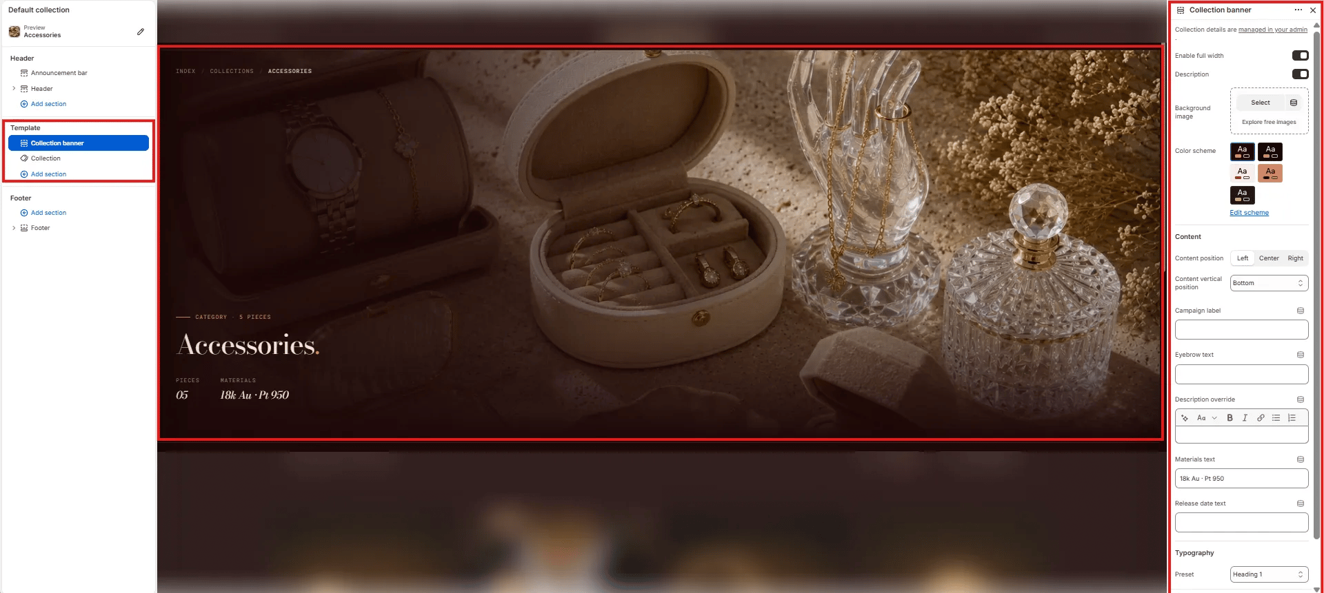
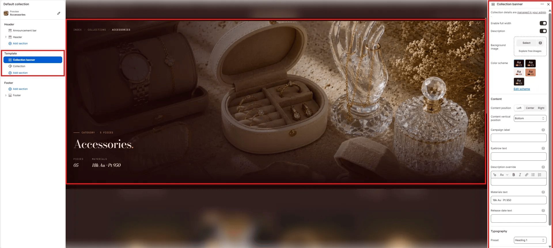
The Collection banner renders a full-bleed hero at the top of the collection page. It pulls the collection title and description from Shopify admin automatically, with additional options to overlay campaign labels, material stats, a release date, and a custom background image.
 #### Layout
* **Enable full width:** Toggle to extend the banner edge-to-edge across the viewport (default: on).
#### Content Toggles
* **Description:** Toggle to show or hide the collection description text pulled from Shopify admin below the heading.
#### Background
* **Background image:** Upload a custom background image for the banner. If no image is uploaded, the banner uses the collection image set in Shopify admin.
#### Style
* **Color scheme:** Choose a color scheme to control the banner's text and overlay colors.
#### Content
* **Content position:** Horizontal alignment of the overlay content — **Left**, **Center**, or **Right**.
* **Content vertical position:** Vertical alignment of the overlay content — **Bottom** (default), Center, or Top.
* **Campaign label:** Small label displayed above the collection name (e.g., "CATEGORY · 5 PIECES"). Use this for seasonal campaign tags or piece counts.
* **Eyebrow text:** A secondary small label above the main heading, separate from the campaign label.
* **Description override:** Rich text field to override the collection description from Shopify admin with custom copy for this template.
* **Materials text:** Short materials line displayed in the stats row below the heading (e.g., "18k Au · Pt 950").
* **Release date text:** Optional date or drop information displayed in the stats row (e.g., "Spring 2025").
#### Typography
* **Preset:** Choose the typographic style for the collection name heading (e.g., Heading 1).
***
### Collection Section Settings
The Collection section renders the full product grid below the banner — including the filter sidebar, sort controls, pagination, and all product cards.
#### Layout
* **Enable full width:** Toggle to extend the banner edge-to-edge across the viewport (default: on).
#### Content Toggles
* **Description:** Toggle to show or hide the collection description text pulled from Shopify admin below the heading.
#### Background
* **Background image:** Upload a custom background image for the banner. If no image is uploaded, the banner uses the collection image set in Shopify admin.
#### Style
* **Color scheme:** Choose a color scheme to control the banner's text and overlay colors.
#### Content
* **Content position:** Horizontal alignment of the overlay content — **Left**, **Center**, or **Right**.
* **Content vertical position:** Vertical alignment of the overlay content — **Bottom** (default), Center, or Top.
* **Campaign label:** Small label displayed above the collection name (e.g., "CATEGORY · 5 PIECES"). Use this for seasonal campaign tags or piece counts.
* **Eyebrow text:** A secondary small label above the main heading, separate from the campaign label.
* **Description override:** Rich text field to override the collection description from Shopify admin with custom copy for this template.
* **Materials text:** Short materials line displayed in the stats row below the heading (e.g., "18k Au · Pt 950").
* **Release date text:** Optional date or drop information displayed in the stats row (e.g., "Spring 2025").
#### Typography
* **Preset:** Choose the typographic style for the collection name heading (e.g., Heading 1).
***
### Collection Section Settings
The Collection section renders the full product grid below the banner — including the filter sidebar, sort controls, pagination, and all product cards.
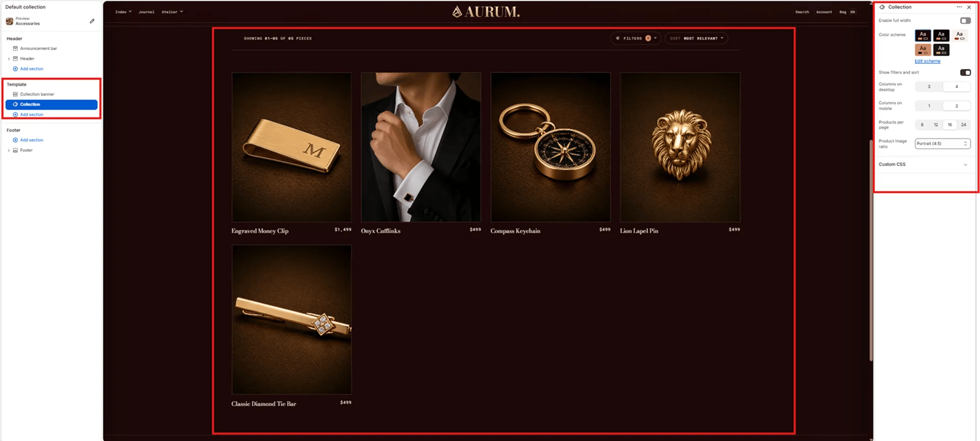 #### Layout
* **Enable full width:** Toggle to extend the product grid edge-to-edge (default: off — grid uses standard page margins).
#### Style
* **Color scheme:** Choose a color scheme for the grid section background and text.
#### Display
* **Show filters and sort:** Toggle to show or hide the filter bar and sort dropdown above the product grid. Requires the Shopify **Search & Discovery** app to be installed and configured for filtering to work.
* **Columns on desktop:** Number of product columns on desktop — **3** or **4**.
* **Columns on mobile:** Number of product columns on mobile — **1** or **2**.
* **Products per page:** Number of products shown per page before pagination — **8**, **12**, **16**, or **24**.
* **Product image ratio:** Aspect ratio for all product card images — **Portrait (4:5)**, Square, Landscape, or Adapt.
#### Layout
* **Enable full width:** Toggle to extend the product grid edge-to-edge (default: off — grid uses standard page margins).
#### Style
* **Color scheme:** Choose a color scheme for the grid section background and text.
#### Display
* **Show filters and sort:** Toggle to show or hide the filter bar and sort dropdown above the product grid. Requires the Shopify **Search & Discovery** app to be installed and configured for filtering to work.
* **Columns on desktop:** Number of product columns on desktop — **3** or **4**.
* **Columns on mobile:** Number of product columns on mobile — **1** or **2**.
* **Products per page:** Number of products shown per page before pagination — **8**, **12**, **16**, or **24**.
* **Product image ratio:** Aspect ratio for all product card images — **Portrait (4:5)**, Square, Landscape, or Adapt.