> ## Documentation Index
> Fetch the complete documentation index at: https://sentiment-docs.arhamwebworks.com/llms.txt
> Use this file to discover all available pages before exploring further.
# Contact page
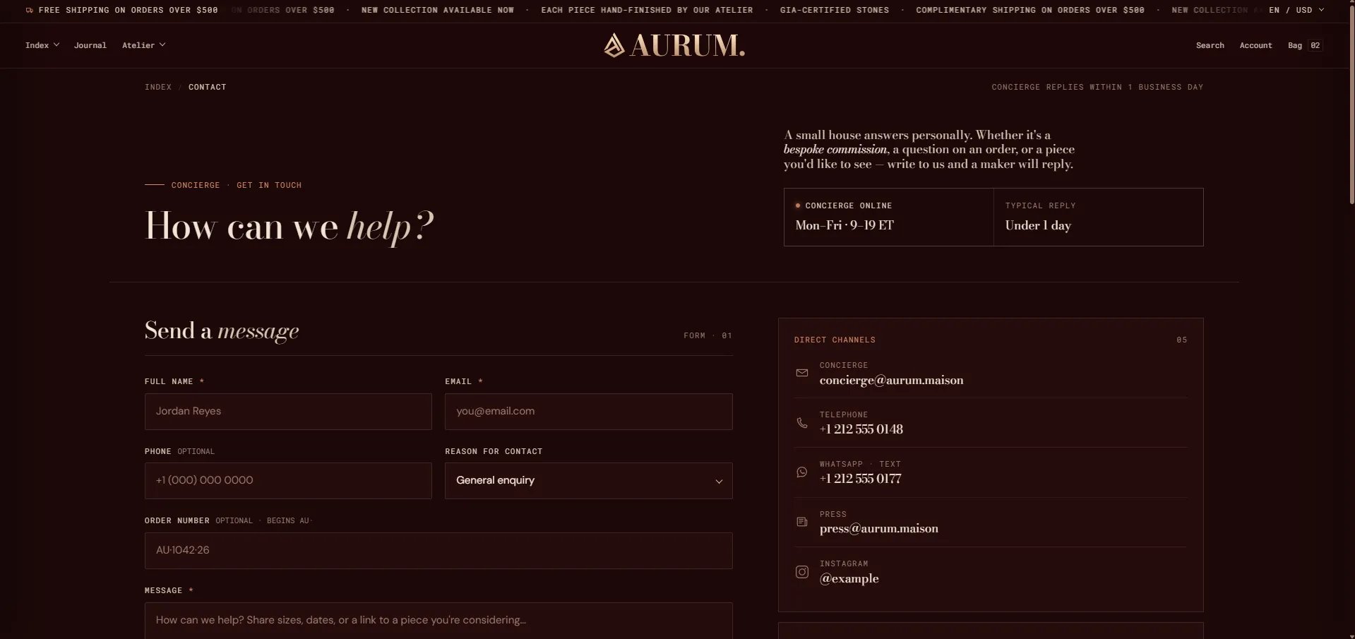
The **Contact** page in the Sentiment theme is built from four sections: a **Contact header** with a lede and availability stats, a **Contact form** with direct channels, concierge hours, and a promo card, an **Ateliers** location grid, and a **FAQ — 2 column** section with quick answers. Every label, field, and block is configurable from the Theme Editor.
 ### How to Configure the Contact Page
1. From your Shopify admin, go to **Online Store → Themes** and click **Customize**.
2. From the top page dropdown, select **Pages → Contact**.
3. Click any section or block in the left sidebar under **Template** to open its settings.
4. Click **Save** when done.
The contact page template contains these sections:
* **Contact header** — masthead with breadcrumb, heading, lede paragraph, and meta stats blocks
* **Contact form** — message form with direct channels, concierge hours, and promo card blocks
* **Ateliers** — atelier location cards
* **FAQ — 2 column** — quick answers accordion with a full-FAQ link
***
### Contact Header Section Settings
The Contact Header is the page masthead — it shows the breadcrumb, an eyebrow label, the main heading, and optional side-column blocks for a lede paragraph and availability stats.
### How to Configure the Contact Page
1. From your Shopify admin, go to **Online Store → Themes** and click **Customize**.
2. From the top page dropdown, select **Pages → Contact**.
3. Click any section or block in the left sidebar under **Template** to open its settings.
4. Click **Save** when done.
The contact page template contains these sections:
* **Contact header** — masthead with breadcrumb, heading, lede paragraph, and meta stats blocks
* **Contact form** — message form with direct channels, concierge hours, and promo card blocks
* **Ateliers** — atelier location cards
* **FAQ — 2 column** — quick answers accordion with a full-FAQ link
***
### Contact Header Section Settings
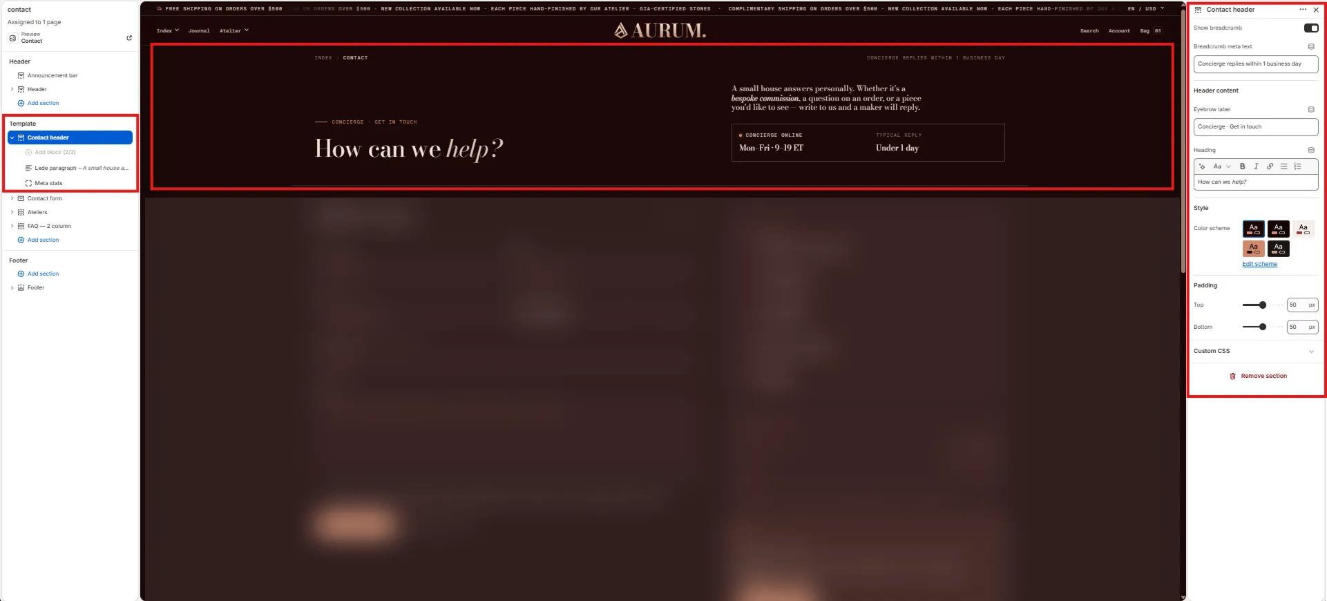
The Contact Header is the page masthead — it shows the breadcrumb, an eyebrow label, the main heading, and optional side-column blocks for a lede paragraph and availability stats.
 #### Breadcrumb
* **Show breadcrumb:** Toggle to show or hide the breadcrumb navigation bar above the heading.
* **Breadcrumb meta text:** Short text shown on the right side of the breadcrumb bar (e.g., "Concierge replies within 1 business day").
#### Header Content
* **Eyebrow label:** Small label displayed above the heading (e.g., "Concierge · Get in touch").
* **Heading:** Main page heading. Supports rich text and italic emphasis (e.g., "How can we *help?*").
#### Style
* **Color scheme:** Choose a color scheme for the section.
#### Spacing
* **Padding top / Padding bottom:** Control vertical spacing.
***
### Lede Paragraph Block Settings
The Lede Paragraph block renders an introductory text paragraph in the right side column of the Contact header.
#### Breadcrumb
* **Show breadcrumb:** Toggle to show or hide the breadcrumb navigation bar above the heading.
* **Breadcrumb meta text:** Short text shown on the right side of the breadcrumb bar (e.g., "Concierge replies within 1 business day").
#### Header Content
* **Eyebrow label:** Small label displayed above the heading (e.g., "Concierge · Get in touch").
* **Heading:** Main page heading. Supports rich text and italic emphasis (e.g., "How can we *help?*").
#### Style
* **Color scheme:** Choose a color scheme for the section.
#### Spacing
* **Padding top / Padding bottom:** Control vertical spacing.
***
### Lede Paragraph Block Settings
The Lede Paragraph block renders an introductory text paragraph in the right side column of the Contact header.
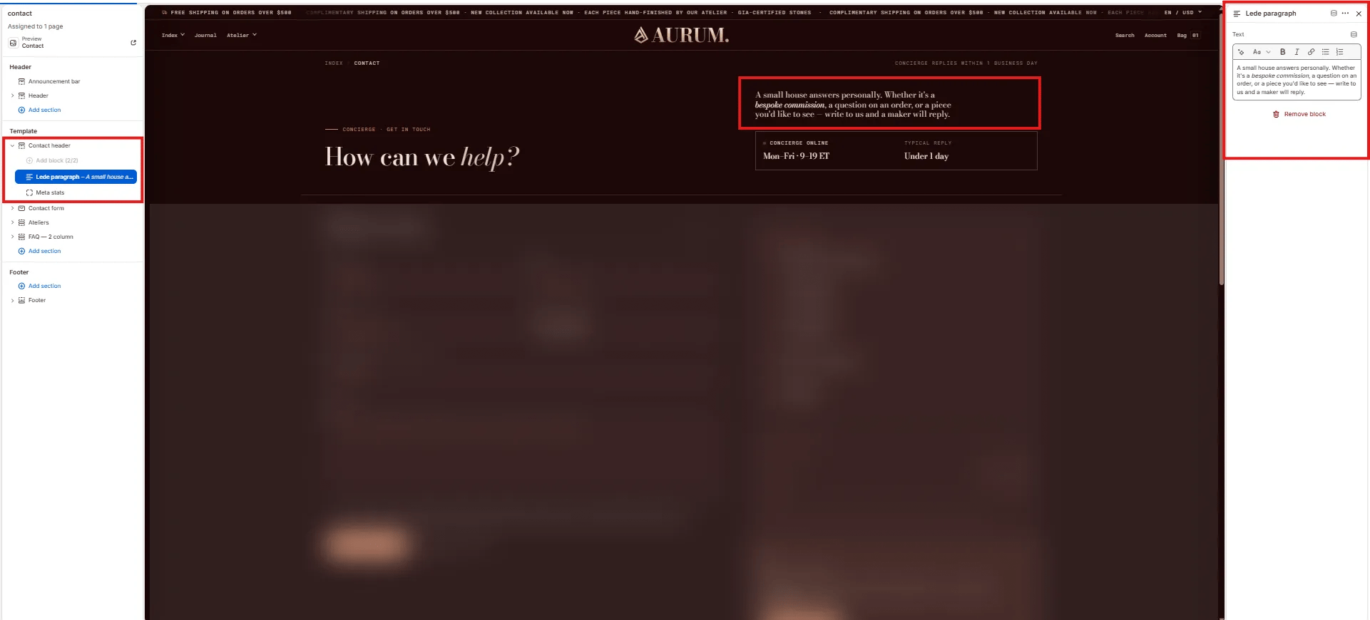 * **Text:** Rich text introductory paragraph displayed in the header's right column (e.g., "A small house answers personally. Whether it's a *bespoke commission*, a question on an order, or a piece you'd like to see — write to us and a maker will reply.").
***
### Meta Stats Block Settings
The Meta Stats block displays a two-cell availability panel in the right column of the Contact header — showing concierge online hours and typical reply time.
* **Text:** Rich text introductory paragraph displayed in the header's right column (e.g., "A small house answers personally. Whether it's a *bespoke commission*, a question on an order, or a piece you'd like to see — write to us and a maker will reply.").
***
### Meta Stats Block Settings
The Meta Stats block displays a two-cell availability panel in the right column of the Contact header — showing concierge online hours and typical reply time.
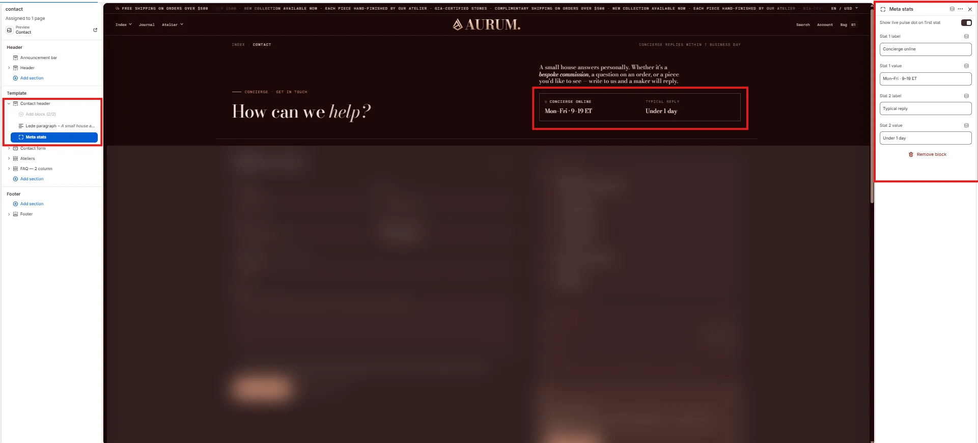 * **Show live pulse dot on first stat:** Toggle to display an animated green live-dot next to the first stat label, indicating real-time availability.
* **Stat 1 label:** Label for the first stat cell (e.g., "Concierge online").
* **Stat 1 value:** Value for the first stat (e.g., "Mon–Fri · 9–19 ET").
* **Stat 2 label:** Label for the second stat cell (e.g., "Typical reply").
* **Stat 2 value:** Value for the second stat (e.g., "Under 1 day").
***
### Contact Form Section Settings
The Contact Form section renders the two-column message form and its right-side panel (direct channels, concierge hours, promo card).
* **Show live pulse dot on first stat:** Toggle to display an animated green live-dot next to the first stat label, indicating real-time availability.
* **Stat 1 label:** Label for the first stat cell (e.g., "Concierge online").
* **Stat 1 value:** Value for the first stat (e.g., "Mon–Fri · 9–19 ET").
* **Stat 2 label:** Label for the second stat cell (e.g., "Typical reply").
* **Stat 2 value:** Value for the second stat (e.g., "Under 1 day").
***
### Contact Form Section Settings
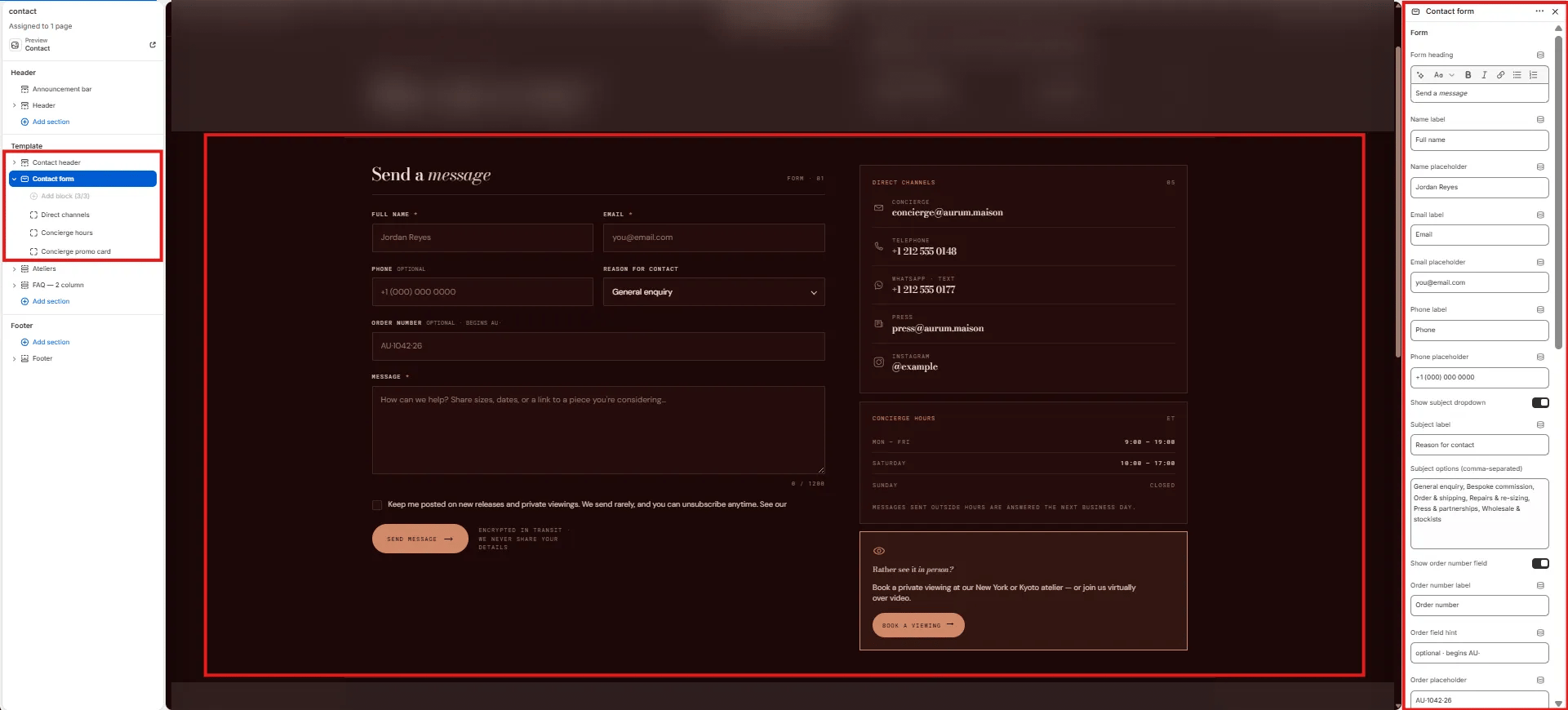
The Contact Form section renders the two-column message form and its right-side panel (direct channels, concierge hours, promo card).
 #### Form
* **Form heading:** Heading displayed above the form (e.g., "Send a *message*"). Supports italic/accent colour.
* **Name label:** Label for the full name field (e.g., "Full name").
* **Name placeholder:** Placeholder text inside the name field (e.g., "Jordan Reyes").
* **Email label:** Label for the email field (e.g., "Email").
* **Email placeholder:** Placeholder text inside the email field (e.g., "[you@email.com](mailto:you@email.com)").
* **Phone label:** Label for the phone field (e.g., "Phone").
* **Phone placeholder:** Placeholder text inside the phone field (e.g., "+1 (000) 000 0000").
* **Show subject dropdown:** Toggle to show or hide the "Reason for contact" subject dropdown.
* **Subject label:** Label for the subject dropdown (e.g., "Reason for contact").
* **Subject options:** Comma-separated list of dropdown options (e.g., "General enquiry, Bespoke commission, Order & shipping, Repairs & re-sizing, Press & partnerships, Wholesale & stockists").
* **Show order number field:** Toggle to show or hide the optional order number field.
* **Order number label:** Label for the order number field (e.g., "Order number").
* **Order field hint:** Helper text shown next to the label (e.g., "optional · begins AU-").
* **Order placeholder:** Placeholder inside the order number field (e.g., "AU-1042·26").
***
### Direct Channels Block Settings
The Direct Channels block displays a list of up to four direct contact methods (email, phone, WhatsApp, press) in the right column of the form.
#### Form
* **Form heading:** Heading displayed above the form (e.g., "Send a *message*"). Supports italic/accent colour.
* **Name label:** Label for the full name field (e.g., "Full name").
* **Name placeholder:** Placeholder text inside the name field (e.g., "Jordan Reyes").
* **Email label:** Label for the email field (e.g., "Email").
* **Email placeholder:** Placeholder text inside the email field (e.g., "[you@email.com](mailto:you@email.com)").
* **Phone label:** Label for the phone field (e.g., "Phone").
* **Phone placeholder:** Placeholder text inside the phone field (e.g., "+1 (000) 000 0000").
* **Show subject dropdown:** Toggle to show or hide the "Reason for contact" subject dropdown.
* **Subject label:** Label for the subject dropdown (e.g., "Reason for contact").
* **Subject options:** Comma-separated list of dropdown options (e.g., "General enquiry, Bespoke commission, Order & shipping, Repairs & re-sizing, Press & partnerships, Wholesale & stockists").
* **Show order number field:** Toggle to show or hide the optional order number field.
* **Order number label:** Label for the order number field (e.g., "Order number").
* **Order field hint:** Helper text shown next to the label (e.g., "optional · begins AU-").
* **Order placeholder:** Placeholder inside the order number field (e.g., "AU-1042·26").
***
### Direct Channels Block Settings
The Direct Channels block displays a list of up to four direct contact methods (email, phone, WhatsApp, press) in the right column of the form.
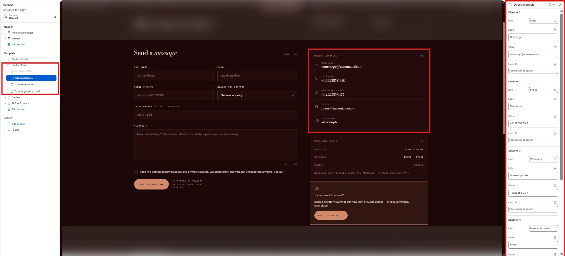 Each channel has three fields:
* **Icon:** Select a built-in icon from the dropdown — Email, Phone, WhatsApp, Press / document, Instagram, etc.
* **Label:** The channel category label (e.g., "Concierge", "Telephone", "WhatsApp · text", "Press").
* **Value:** The contact detail displayed (e.g., "[concierge@aurum.maison](mailto:concierge@aurum.maison)", "+1 212 555 0148").
* **Link URL:** Optional URL to make the value a clickable link (e.g., `mailto:`, `tel:`, or a WhatsApp link).
Up to four channels (Channel 1–4) can be configured independently.
***
### Concierge Hours Block Settings
The Concierge Hours block displays a structured hours table in the right column — showing day, hours, and closed status for up to five rows.
Each channel has three fields:
* **Icon:** Select a built-in icon from the dropdown — Email, Phone, WhatsApp, Press / document, Instagram, etc.
* **Label:** The channel category label (e.g., "Concierge", "Telephone", "WhatsApp · text", "Press").
* **Value:** The contact detail displayed (e.g., "[concierge@aurum.maison](mailto:concierge@aurum.maison)", "+1 212 555 0148").
* **Link URL:** Optional URL to make the value a clickable link (e.g., `mailto:`, `tel:`, or a WhatsApp link).
Up to four channels (Channel 1–4) can be configured independently.
***
### Concierge Hours Block Settings
The Concierge Hours block displays a structured hours table in the right column — showing day, hours, and closed status for up to five rows.
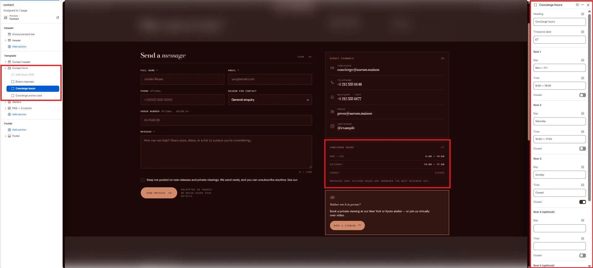 * **Heading:** Label displayed above the hours table (e.g., "Concierge hours").
* **Timezone label:** Short timezone indicator shown next to the heading (e.g., "ET").
Each row (up to 5, rows 4 and 5 are optional):
* **Day:** Day or day range label (e.g., "Mon — Fri", "Saturday", "Sunday").
* **Time:** Hours string displayed in the right column (e.g., "9:00 — 19:00", "10:00 — 17:00").
* **Closed:** Toggle to mark this row as closed — replaces the time with "CLOSED" styling.
***
### Concierge Promo Card Block Settings
The Concierge Promo Card is a highlighted card shown at the bottom of the right column, encouraging customers to book a private viewing instead of (or in addition to) writing.
* **Heading:** Label displayed above the hours table (e.g., "Concierge hours").
* **Timezone label:** Short timezone indicator shown next to the heading (e.g., "ET").
Each row (up to 5, rows 4 and 5 are optional):
* **Day:** Day or day range label (e.g., "Mon — Fri", "Saturday", "Sunday").
* **Time:** Hours string displayed in the right column (e.g., "9:00 — 19:00", "10:00 — 17:00").
* **Closed:** Toggle to mark this row as closed — replaces the time with "CLOSED" styling.
***
### Concierge Promo Card Block Settings
The Concierge Promo Card is a highlighted card shown at the bottom of the right column, encouraging customers to book a private viewing instead of (or in addition to) writing.
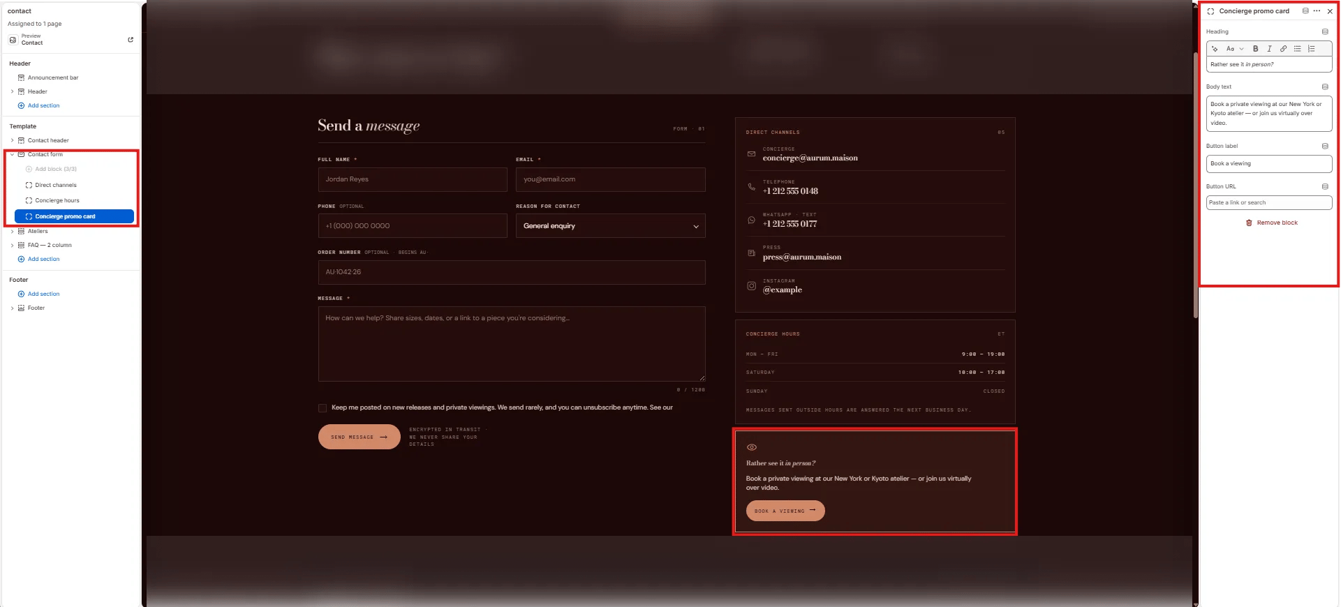 * **Heading:** Card heading (e.g., "Rather see it in person?").
* **Body text:** Supporting description (e.g., "Book a private viewing at our New York or Kyoto atelier — or join us virtually over video.").
* **Button label:** CTA button text (e.g., "Book a viewing").
* **Button URL:** Link destination for the button.
***
### Ateliers Section Settings
The Ateliers section on the contact page renders the same side-by-side location card grid as the about page — giving customers directions, hours, and booking links for each atelier.
* **Heading:** Card heading (e.g., "Rather see it in person?").
* **Body text:** Supporting description (e.g., "Book a private viewing at our New York or Kyoto atelier — or join us virtually over video.").
* **Button label:** CTA button text (e.g., "Book a viewing").
* **Button URL:** Link destination for the button.
***
### Ateliers Section Settings
The Ateliers section on the contact page renders the same side-by-side location card grid as the about page — giving customers directions, hours, and booking links for each atelier.
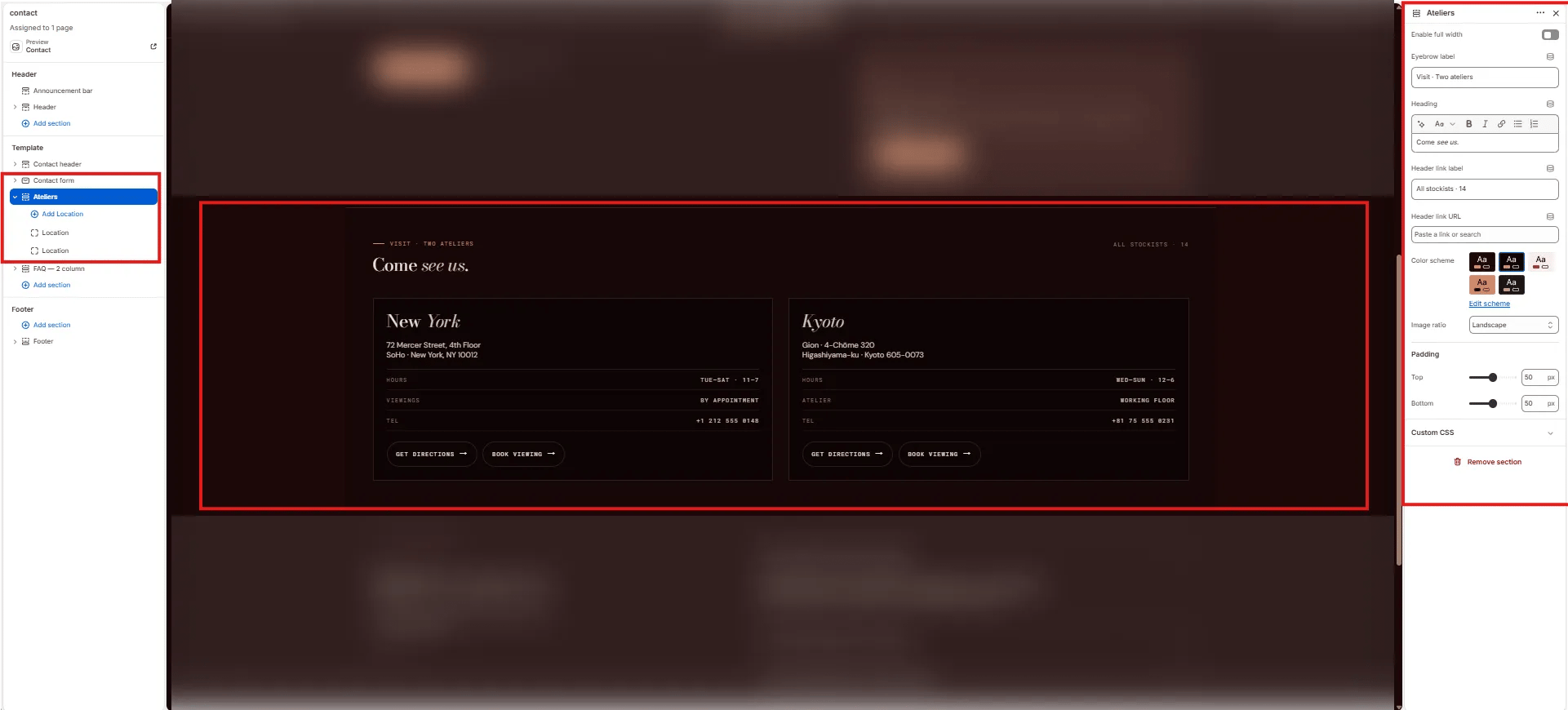 * **Enable full width:** Toggle to extend the section edge-to-edge.
* **Eyebrow label:** Small label above the heading (e.g., "Visit · Two ateliers").
* **Heading:** Section heading (e.g., "Come *see us.*"). Supports italic/accent colour.
* **Header link label:** Label for the link on the right side of the heading (e.g., "All stockists · 14"). Leave blank to hide.
* **Header link URL:** URL destination for the header link.
* **Color scheme:** Choose a color scheme for the section.
* **Image ratio:** Aspect ratio for atelier images — Landscape, Portrait, or Square.
* **Padding top / Padding bottom:** Control vertical spacing.
***
### Location Block Settings
Each Location block is one atelier card. The Location block on the contact page includes the same fields as on the about page, plus a telephone detail row.
* **Enable full width:** Toggle to extend the section edge-to-edge.
* **Eyebrow label:** Small label above the heading (e.g., "Visit · Two ateliers").
* **Heading:** Section heading (e.g., "Come *see us.*"). Supports italic/accent colour.
* **Header link label:** Label for the link on the right side of the heading (e.g., "All stockists · 14"). Leave blank to hide.
* **Header link URL:** URL destination for the header link.
* **Color scheme:** Choose a color scheme for the section.
* **Image ratio:** Aspect ratio for atelier images — Landscape, Portrait, or Square.
* **Padding top / Padding bottom:** Control vertical spacing.
***
### Location Block Settings
Each Location block is one atelier card. The Location block on the contact page includes the same fields as on the about page, plus a telephone detail row.
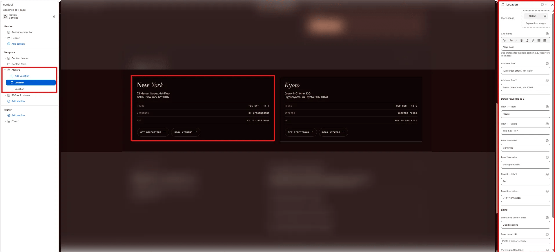 * **Store image:** Upload a photo of the atelier.
* **City name:** Card heading with italic support (e.g., "*New York*", "*Kyoto*").
* **Address line 1 / 2:** Two-line address (e.g., "72 Mercer Street, 4th Floor" / "SoHo · New York, NY 10012").
**Detail rows (up to 3):**
* Row 1–3 label / value (e.g., "Hours / Tue–Sat · 11–7", "Viewings / By appointment", "Tel / +1 212 555 0148").
**Links:**
* **Directions button label / URL:** Label and link for the directions CTA.
* **Viewing button label / URL:** Label and link for the booking CTA.
***
### FAQ — 2 Column Section Settings
The FAQ — 2 column section renders a two-column layout with editorial copy on the left and an expandable FAQ accordion on the right — perfect for answering common pre-contact questions without the customer needing to write in.
* **Store image:** Upload a photo of the atelier.
* **City name:** Card heading with italic support (e.g., "*New York*", "*Kyoto*").
* **Address line 1 / 2:** Two-line address (e.g., "72 Mercer Street, 4th Floor" / "SoHo · New York, NY 10012").
**Detail rows (up to 3):**
* Row 1–3 label / value (e.g., "Hours / Tue–Sat · 11–7", "Viewings / By appointment", "Tel / +1 212 555 0148").
**Links:**
* **Directions button label / URL:** Label and link for the directions CTA.
* **Viewing button label / URL:** Label and link for the booking CTA.
***
### FAQ — 2 Column Section Settings
The FAQ — 2 column section renders a two-column layout with editorial copy on the left and an expandable FAQ accordion on the right — perfect for answering common pre-contact questions without the customer needing to write in.
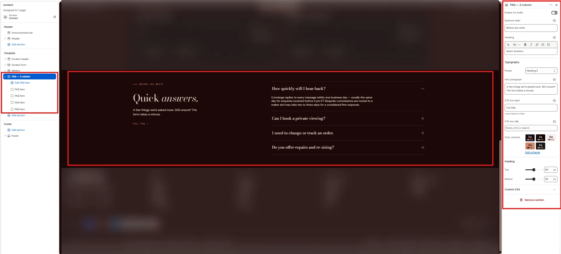 #### Content
* **Enable full width:** Toggle to extend the section edge-to-edge.
* **Eyebrow label:** Small label above the heading (e.g., "Before you write").
* **Heading:** Section heading (e.g., "Quick *answers.*"). Supports italic/accent colour.
* **Typography:** Choose the typographic preset for the heading (e.g., Heading 2).
* **Intro paragraph:** Short supporting text displayed below the heading in the left column (e.g., "A few things we're asked most. Still unsure? The form takes a minute.").
* **CTA link label:** Label for an optional link below the intro (e.g., "Full FAQ"). Leave blank to hide.
* **CTA link URL:** Destination for the CTA link.
#### Style
* **Color scheme:** Choose a color scheme for the section.
#### Spacing
* **Padding top / Padding bottom:** Control vertical spacing.
***
### FAQ Item Block Settings
Each FAQ Item block is one question/answer row in the accordion on the right column.
#### Content
* **Enable full width:** Toggle to extend the section edge-to-edge.
* **Eyebrow label:** Small label above the heading (e.g., "Before you write").
* **Heading:** Section heading (e.g., "Quick *answers.*"). Supports italic/accent colour.
* **Typography:** Choose the typographic preset for the heading (e.g., Heading 2).
* **Intro paragraph:** Short supporting text displayed below the heading in the left column (e.g., "A few things we're asked most. Still unsure? The form takes a minute.").
* **CTA link label:** Label for an optional link below the intro (e.g., "Full FAQ"). Leave blank to hide.
* **CTA link URL:** Destination for the CTA link.
#### Style
* **Color scheme:** Choose a color scheme for the section.
#### Spacing
* **Padding top / Padding bottom:** Control vertical spacing.
***
### FAQ Item Block Settings
Each FAQ Item block is one question/answer row in the accordion on the right column.
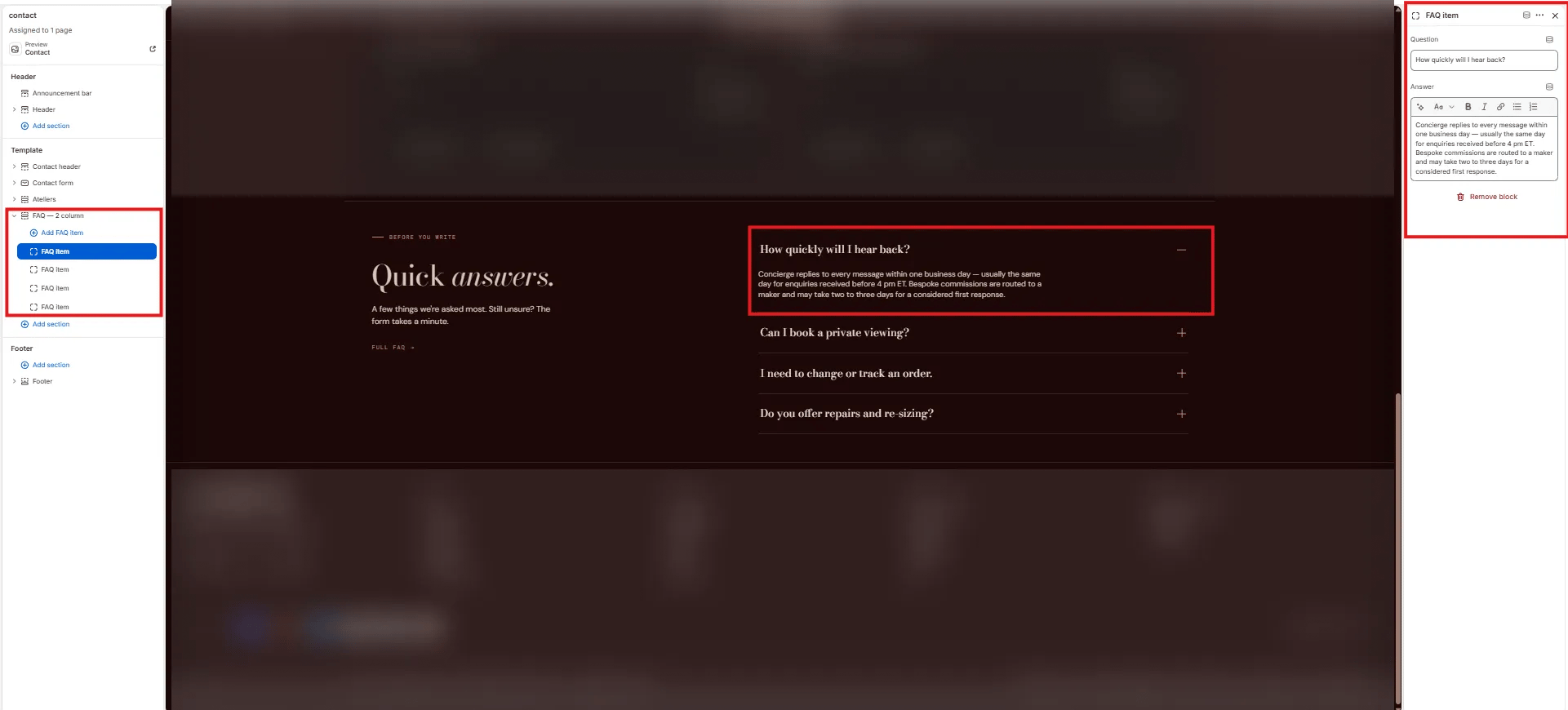 * **Question:** The accordion row heading — the customer question (e.g., "How quickly will I hear back?").
* **Answer:** Rich text answer displayed when the row is expanded (e.g., "Concierge replies to every message within one business day — usually the same day for enquiries received before 4 pm ET.").
* **Question:** The accordion row heading — the customer question (e.g., "How quickly will I hear back?").
* **Answer:** Rich text answer displayed when the row is expanded (e.g., "Concierge replies to every message within one business day — usually the same day for enquiries received before 4 pm ET.").