> ## Documentation Index
> Fetch the complete documentation index at: https://sentiment-docs.arhamwebworks.com/llms.txt
> Use this file to discover all available pages before exploring further.
# Footer
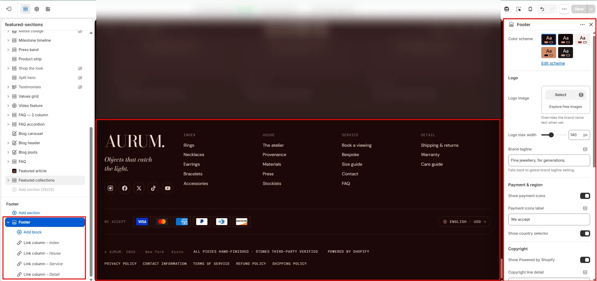
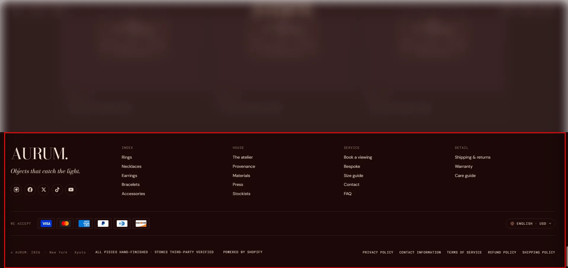
The **Footer** section is the site-wide footer that appears at the bottom of every page. It supports a dedicated footer logo and tagline, configurable link columns and rich text columns, a newsletter signup form, accepted payment method icons, a country/language selector, and policy links — all within a fully branded layout.
 ### How to Configure the Footer
1. From your Shopify admin, go to **Online Store → Themes** and click **Customize**.
2. Scroll to the bottom of any page and select the **Footer** section in the left sidebar.
3. Add blocks (Link column, Text column, Newsletter) to build the footer columns.
4. Configure the section settings and click **Save**.
### Section Settings
#### Brand Identity
* **Footer logo:** Upload a logo specifically for the footer. Falls back to the global logo from Brand settings if left blank.
* **Logo width:** Control how wide the footer logo appears (range: 40–300px).
* **Tagline:** A short brand tagline displayed below the logo. Falls back to the global tagline from Brand settings if left blank.
#### Payment & Compliance
* **Show payment icons:** Toggle to display accepted payment method icons in the footer.
* **Payments label:** Label displayed next to the payment icons (default: "We accept").
* **Show country selector:** Toggle to display a country/region and language selector.
* **Show powered by:** Toggle to display the "Powered by Shopify" link.
#### Bottom Bar
* **Copyright detail:** Additional text displayed after the copyright year and store name.
* **Bottom detail:** A secondary line of text in the footer bottom bar. Supports inline rich text.
* **Show policy links:** Toggle to display shop policy links (Privacy, Terms, Refund, etc.).
* **Policy menu:** Select a navigation menu to use for policy links. Falls back to your Shopify shop policies if left blank.
#### Spacing
* **Padding top / Padding bottom:** Control the vertical spacing of the footer.
***
### Link Column Block Settings
A navigation link column in the footer. Add one block per column.
* **Heading:** The column heading text displayed above the links.
* **Menu:** Select a Shopify navigation menu to populate the column's links automatically.
***
### Text Column Block Settings
A free-form text column in the footer. Add one block per column.
* **Heading:** The column heading text.
* **Content:** Rich text content for the column — useful for addresses, descriptions, or brand copy.
***
### Newsletter Block Settings *(limit 1)*
An email signup form embedded in the footer.
* **Heading:** Heading above the signup form (default: "Letters").
* **Subtext:** Supporting text below the heading (default: "Four letters a year, nothing more.").
* **Placeholder:** Placeholder text inside the email input field.
* **Submit text:** Label on the submit button.
* **Success text:** Confirmation message shown after a successful subscription.
* **Email label:** Accessible label for the email input field (used by screen readers).
### How to Configure the Footer
1. From your Shopify admin, go to **Online Store → Themes** and click **Customize**.
2. Scroll to the bottom of any page and select the **Footer** section in the left sidebar.
3. Add blocks (Link column, Text column, Newsletter) to build the footer columns.
4. Configure the section settings and click **Save**.
### Section Settings
#### Brand Identity
* **Footer logo:** Upload a logo specifically for the footer. Falls back to the global logo from Brand settings if left blank.
* **Logo width:** Control how wide the footer logo appears (range: 40–300px).
* **Tagline:** A short brand tagline displayed below the logo. Falls back to the global tagline from Brand settings if left blank.
#### Payment & Compliance
* **Show payment icons:** Toggle to display accepted payment method icons in the footer.
* **Payments label:** Label displayed next to the payment icons (default: "We accept").
* **Show country selector:** Toggle to display a country/region and language selector.
* **Show powered by:** Toggle to display the "Powered by Shopify" link.
#### Bottom Bar
* **Copyright detail:** Additional text displayed after the copyright year and store name.
* **Bottom detail:** A secondary line of text in the footer bottom bar. Supports inline rich text.
* **Show policy links:** Toggle to display shop policy links (Privacy, Terms, Refund, etc.).
* **Policy menu:** Select a navigation menu to use for policy links. Falls back to your Shopify shop policies if left blank.
#### Spacing
* **Padding top / Padding bottom:** Control the vertical spacing of the footer.
***
### Link Column Block Settings
A navigation link column in the footer. Add one block per column.
* **Heading:** The column heading text displayed above the links.
* **Menu:** Select a Shopify navigation menu to populate the column's links automatically.
***
### Text Column Block Settings
A free-form text column in the footer. Add one block per column.
* **Heading:** The column heading text.
* **Content:** Rich text content for the column — useful for addresses, descriptions, or brand copy.
***
### Newsletter Block Settings *(limit 1)*
An email signup form embedded in the footer.
* **Heading:** Heading above the signup form (default: "Letters").
* **Subtext:** Supporting text below the heading (default: "Four letters a year, nothing more.").
* **Placeholder:** Placeholder text inside the email input field.
* **Submit text:** Label on the submit button.
* **Success text:** Confirmation message shown after a successful subscription.
* **Email label:** Accessible label for the email input field (used by screen readers).