> ## Documentation Index
> Fetch the complete documentation index at: https://sentiment-docs.arhamwebworks.com/llms.txt
> Use this file to discover all available pages before exploring further.
# Hero
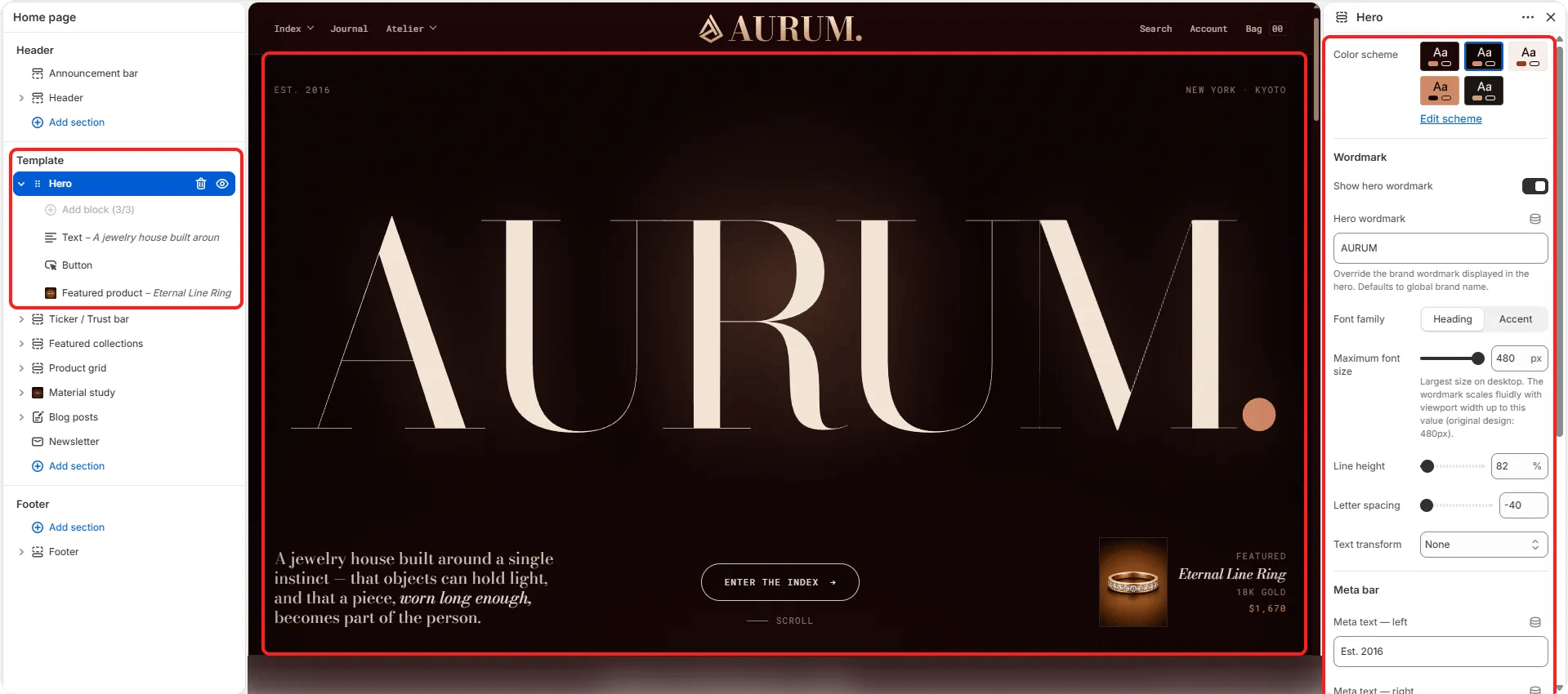
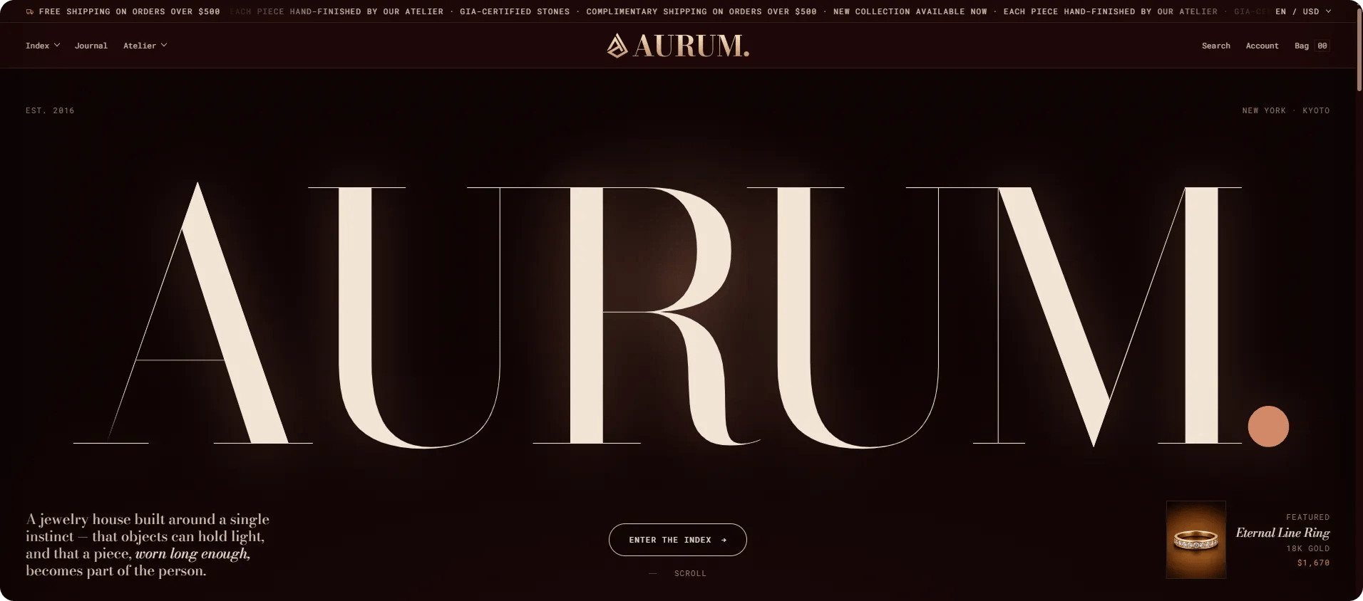
The **Hero** section is the primary full-width visual statement at the top of your homepage. It supports a large background image or video, an optional oversized text wordmark, bottom metadata labels, and a flexible set of content blocks — including heading, body text, a CTA button, and a floating featured product card.
 ### How to Add the Section
1. From your Shopify admin, go to **Online Store → Themes** and click **Customize**.
2. Navigate to your homepage.
3. Select the **Hero** section from the left sidebar, or click **Add section** to add it.
4. Add content blocks (Heading, Text, Button, Featured product) and configure each one.
5. Click **Save**.
### Section Settings
#### Style
* **Color scheme:** Choose a color scheme for the hero's UI elements and overlay text.
* **Mobile alignment:** Set how block content aligns on mobile — Left, Center, or Right.
#### Wordmark
* **Show wordmark:** Toggle to display a large typographic wordmark overlaying the hero background.
* **Wordmark:** The text displayed as the wordmark (typically your brand name in a large display style).
* **Wordmark font family:** Choose between the heading font or the accent font.
* **Wordmark font size:** Set the wordmark size in pixels (range: 120–480px).
* **Wordmark line height:** Adjust the line height percentage.
* **Wordmark letter spacing:** Fine-tune letter spacing.
* **Wordmark text transform:** Set case transformation — None, Uppercase, Lowercase, or Capitalize.
#### Metadata
* **Meta left:** A text label displayed in the bottom-left corner of the hero.
* **Meta right:** A text label displayed in the bottom-right corner of the hero.
* **Collection:** Optionally link the hero to a collection for contextual navigation.
#### Spacing
* **Padding top / Padding bottom:** Control the vertical spacing around the hero section.
***
### Content Block Settings
Content blocks are added inside the Hero section to build the overlay copy. Each block type has its own settings.
#### Heading Block
* **Text:** The heading text. Supports inline rich text and italic emphasis.
* **Heading tag:** HTML heading level for the text (H2–H6).
* **Alignment:** Horizontal alignment of the heading on desktop.
* **Typography:** Select the typographic style for the heading.
#### Text Block
* **Text:** The body or lede paragraph. Supports full rich text formatting.
* **Alignment / Mobile alignment:** Horizontal alignment on desktop and mobile independently.
* **Typography:** Select the typographic style (default: lede).
#### Button Block
* **Label:** The button text.
* **URL:** The link destination.
* **Open in new tab:** When enabled, the link opens in a new browser tab.
* **Show arrow:** Toggle to display an arrow icon on the button.
* **Show scroll cue:** Toggle to display a subtle scroll-down animation cue.
#### Featured Product Block *(limit 1)*
A floating product card overlay displayed in the corner of the hero image.
* **Product:** Select the product to display in the card.
* **Featured label:** A small label shown on the card (e.g., "Featured").
* **Material:** A material or detail line shown on the card.
* **Title typography:** Select the typographic style for the product title on the card.
### How to Add the Section
1. From your Shopify admin, go to **Online Store → Themes** and click **Customize**.
2. Navigate to your homepage.
3. Select the **Hero** section from the left sidebar, or click **Add section** to add it.
4. Add content blocks (Heading, Text, Button, Featured product) and configure each one.
5. Click **Save**.
### Section Settings
#### Style
* **Color scheme:** Choose a color scheme for the hero's UI elements and overlay text.
* **Mobile alignment:** Set how block content aligns on mobile — Left, Center, or Right.
#### Wordmark
* **Show wordmark:** Toggle to display a large typographic wordmark overlaying the hero background.
* **Wordmark:** The text displayed as the wordmark (typically your brand name in a large display style).
* **Wordmark font family:** Choose between the heading font or the accent font.
* **Wordmark font size:** Set the wordmark size in pixels (range: 120–480px).
* **Wordmark line height:** Adjust the line height percentage.
* **Wordmark letter spacing:** Fine-tune letter spacing.
* **Wordmark text transform:** Set case transformation — None, Uppercase, Lowercase, or Capitalize.
#### Metadata
* **Meta left:** A text label displayed in the bottom-left corner of the hero.
* **Meta right:** A text label displayed in the bottom-right corner of the hero.
* **Collection:** Optionally link the hero to a collection for contextual navigation.
#### Spacing
* **Padding top / Padding bottom:** Control the vertical spacing around the hero section.
***
### Content Block Settings
Content blocks are added inside the Hero section to build the overlay copy. Each block type has its own settings.
#### Heading Block
* **Text:** The heading text. Supports inline rich text and italic emphasis.
* **Heading tag:** HTML heading level for the text (H2–H6).
* **Alignment:** Horizontal alignment of the heading on desktop.
* **Typography:** Select the typographic style for the heading.
#### Text Block
* **Text:** The body or lede paragraph. Supports full rich text formatting.
* **Alignment / Mobile alignment:** Horizontal alignment on desktop and mobile independently.
* **Typography:** Select the typographic style (default: lede).
#### Button Block
* **Label:** The button text.
* **URL:** The link destination.
* **Open in new tab:** When enabled, the link opens in a new browser tab.
* **Show arrow:** Toggle to display an arrow icon on the button.
* **Show scroll cue:** Toggle to display a subtle scroll-down animation cue.
#### Featured Product Block *(limit 1)*
A floating product card overlay displayed in the corner of the hero image.
* **Product:** Select the product to display in the card.
* **Featured label:** A small label shown on the card (e.g., "Featured").
* **Material:** A material or detail line shown on the card.
* **Title typography:** Select the typographic style for the product title on the card.