> ## Documentation Index
> Fetch the complete documentation index at: https://sentiment-docs.arhamwebworks.com/llms.txt
> Use this file to discover all available pages before exploring further.
# Material study
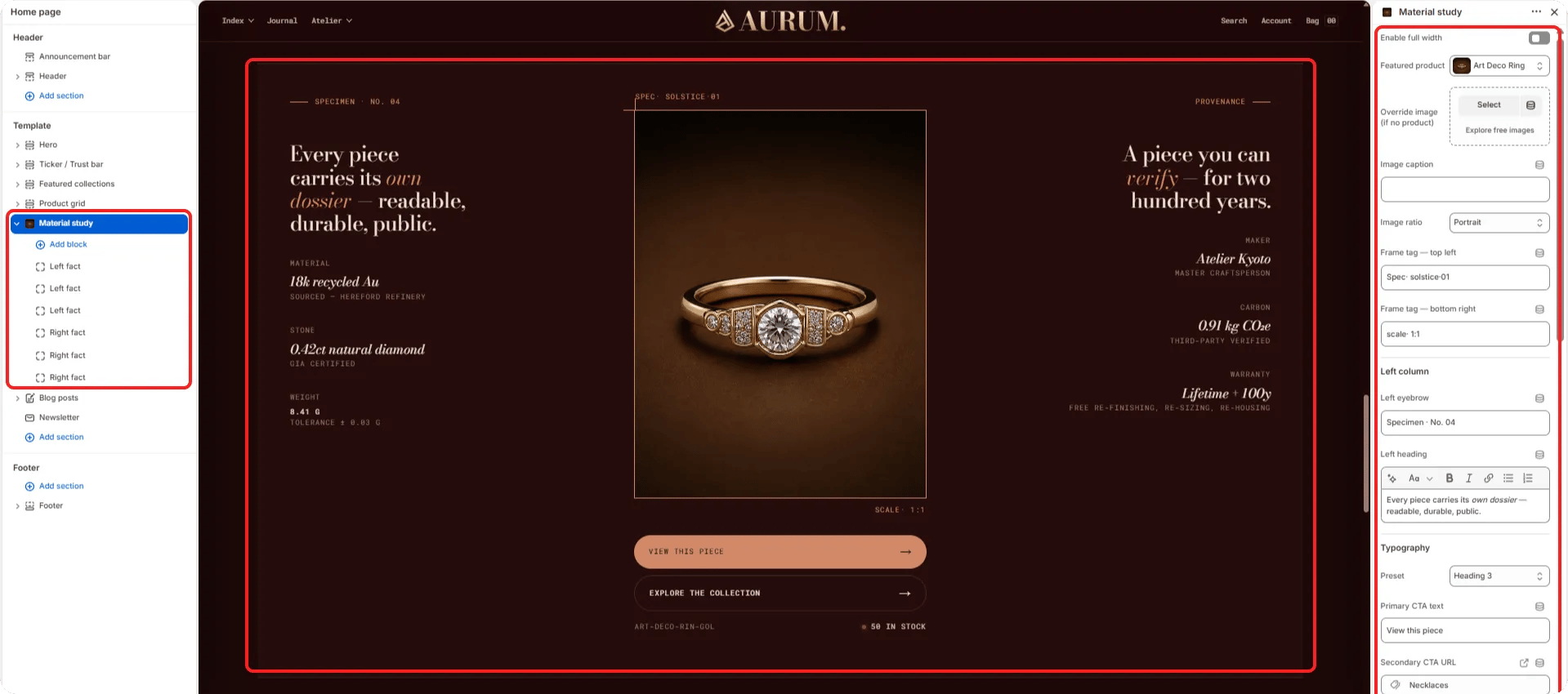
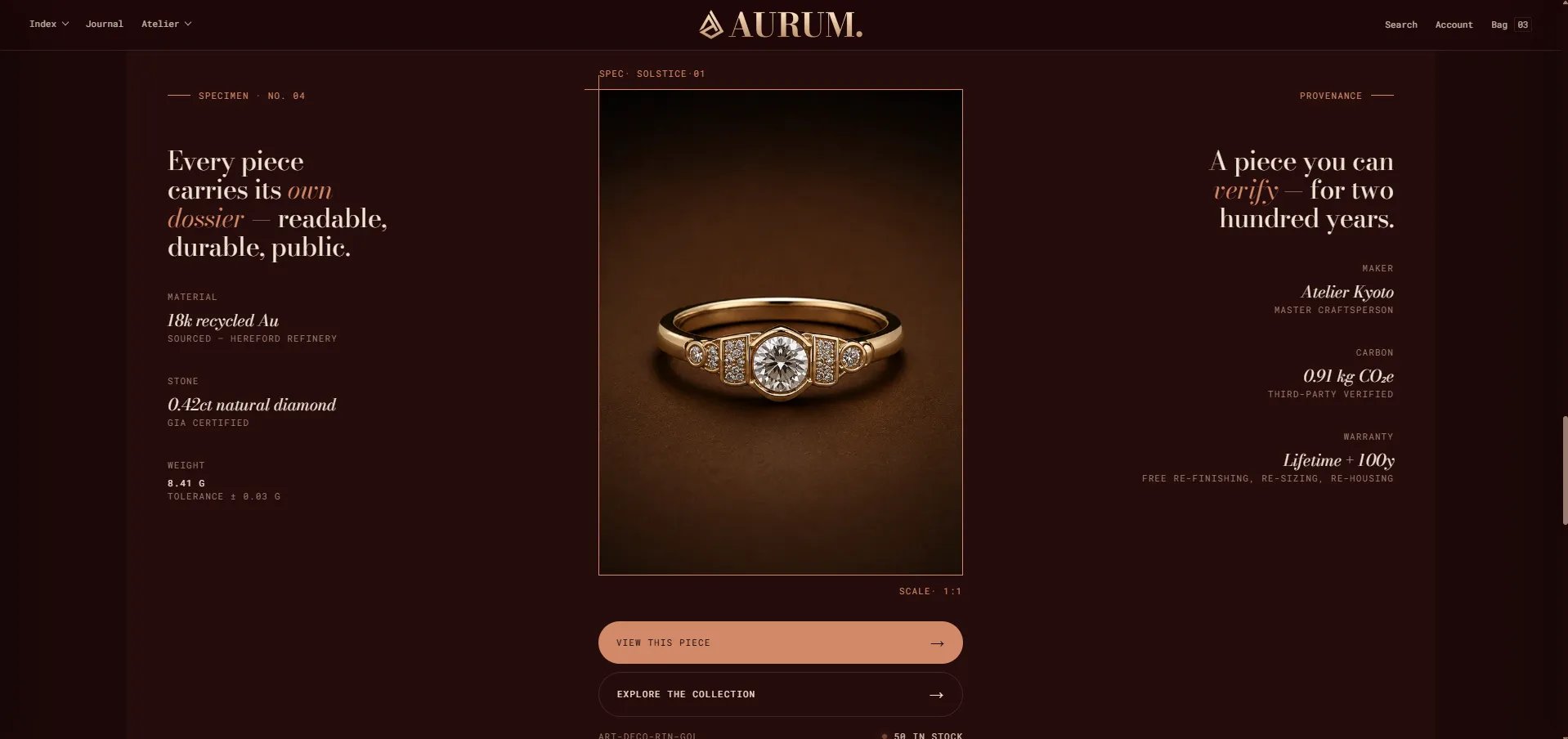
The **Material Study** section is a two-column reference layout pairing a product or editorial image with structured fact grids on both the left and right. It's designed to present material provenance, technical specifications, and craftsmanship details in an organized, reference-quality layout — ideal for brand story pages, material pages, or product deep-dives.
 ### How to Add the Section
1. From your Shopify admin, go to **Online Store → Themes** and click **Customize**.
2. Navigate to the page where you want to add this section.
3. Click **Add section** and select **Material study**.
4. Add **Fact left** and **Fact right** blocks to populate the data grids on each side.
5. Click **Save**.
### Section Settings
#### Layout
* **Full width:** When enabled, the section stretches edge-to-edge across the viewport.
#### Image
* **Product:** Select a product to use its media as the central image panel.
* **Image:** Upload a custom image to use instead of the product media. If both are set, the image takes priority.
* **Image caption:** A small caption displayed below the image.
* **Image ratio:** Aspect ratio for the image — Portrait, Square, Landscape, or Adapt.
* **Tag top-left:** A label displayed in the top-left corner of the image (e.g., "18k Au").
* **Tag bottom-right:** A label displayed in the bottom-right corner of the image (e.g., "Recycled gold").
#### Left Column
* **Eyebrow:** Small label above the left column heading.
* **Heading:** Main heading for the left column. Supports rich text and italic emphasis.
* **Heading typography:** Select the typographic style for the left heading.
* **CTA primary:** Primary CTA button label.
* **CTA secondary label / URL:** Secondary CTA link label and destination.
#### Right Column
* **Eyebrow right:** Small label above the right column heading.
* **Heading right:** Heading for the right column. Supports rich text.
* **Heading right typography:** Typographic style for the right heading.
#### Alignment
* **Desktop left / right alignment:** Horizontal alignment of content in the left and right columns (Start, Center, or End).
* **Mobile left / right alignment:** Horizontal alignment on mobile.
#### Style
* **Color scheme:** Choose a color scheme for the section.
#### Spacing
* **Padding top / Padding bottom:** Control vertical spacing around the section.
***
### Fact Left Block Settings
Each Fact Left block adds one data cell to the left column's fact grid.
* **Label:** The category or key label (e.g., "Origin").
* **Value:** The primary value. Displayed in italic or number style depending on the Value display setting.
* **Value display:** Choose between **Italic** (editorial style) or **Number** (tabular/data style).
* **Sub:** A sub-label displayed below the value (e.g., a qualifier or unit).
***
### Fact Right Block Settings
Each Fact Right block adds one data cell to the right column's fact grid. Uses the same settings as Fact Left.
* **Label / Value / Value display / Sub:** Same fields as the Fact Left block.
### How to Add the Section
1. From your Shopify admin, go to **Online Store → Themes** and click **Customize**.
2. Navigate to the page where you want to add this section.
3. Click **Add section** and select **Material study**.
4. Add **Fact left** and **Fact right** blocks to populate the data grids on each side.
5. Click **Save**.
### Section Settings
#### Layout
* **Full width:** When enabled, the section stretches edge-to-edge across the viewport.
#### Image
* **Product:** Select a product to use its media as the central image panel.
* **Image:** Upload a custom image to use instead of the product media. If both are set, the image takes priority.
* **Image caption:** A small caption displayed below the image.
* **Image ratio:** Aspect ratio for the image — Portrait, Square, Landscape, or Adapt.
* **Tag top-left:** A label displayed in the top-left corner of the image (e.g., "18k Au").
* **Tag bottom-right:** A label displayed in the bottom-right corner of the image (e.g., "Recycled gold").
#### Left Column
* **Eyebrow:** Small label above the left column heading.
* **Heading:** Main heading for the left column. Supports rich text and italic emphasis.
* **Heading typography:** Select the typographic style for the left heading.
* **CTA primary:** Primary CTA button label.
* **CTA secondary label / URL:** Secondary CTA link label and destination.
#### Right Column
* **Eyebrow right:** Small label above the right column heading.
* **Heading right:** Heading for the right column. Supports rich text.
* **Heading right typography:** Typographic style for the right heading.
#### Alignment
* **Desktop left / right alignment:** Horizontal alignment of content in the left and right columns (Start, Center, or End).
* **Mobile left / right alignment:** Horizontal alignment on mobile.
#### Style
* **Color scheme:** Choose a color scheme for the section.
#### Spacing
* **Padding top / Padding bottom:** Control vertical spacing around the section.
***
### Fact Left Block Settings
Each Fact Left block adds one data cell to the left column's fact grid.
* **Label:** The category or key label (e.g., "Origin").
* **Value:** The primary value. Displayed in italic or number style depending on the Value display setting.
* **Value display:** Choose between **Italic** (editorial style) or **Number** (tabular/data style).
* **Sub:** A sub-label displayed below the value (e.g., a qualifier or unit).
***
### Fact Right Block Settings
Each Fact Right block adds one data cell to the right column's fact grid. Uses the same settings as Fact Left.
* **Label / Value / Value display / Sub:** Same fields as the Fact Left block.