> ## Documentation Index
> Fetch the complete documentation index at: https://sentiment-docs.arhamwebworks.com/llms.txt
> Use this file to discover all available pages before exploring further.
# Mobile menu
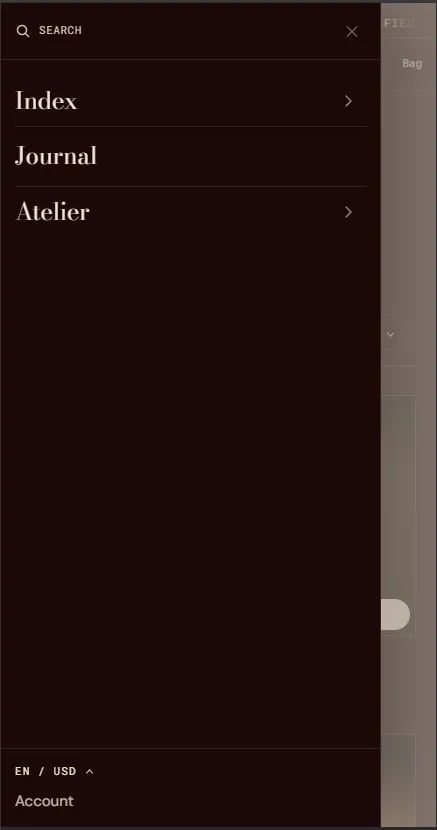
The **Mobile Menu** is the navigation drawer that slides in from the side on mobile and tablet devices when a customer taps the hamburger menu icon in the header. It renders the same navigation menu configured in the Header section, along with account and search links.
The mobile menu is a built-in component embedded within the **Header** section — it is not a standalone section and does not have its own separate settings panel.
 ### How to Configure the Mobile Menu
The mobile menu automatically mirrors the navigation menu set in the Header section. To update it:
* From your Shopify admin, go to **Online Store → Themes** and click **Customize**.
* Select the **Header** section in the left sidebar.
* Change the **Navigation menu** setting to update the links shown in both the desktop header and the mobile menu.
* Click **Save**.
To edit the menu items themselves, go to **Shopify Admin → Content → Menus** and update your header menu.
### How to Configure the Mobile Menu
The mobile menu automatically mirrors the navigation menu set in the Header section. To update it:
* From your Shopify admin, go to **Online Store → Themes** and click **Customize**.
* Select the **Header** section in the left sidebar.
* Change the **Navigation menu** setting to update the links shown in both the desktop header and the mobile menu.
* Click **Save**.
To edit the menu items themselves, go to **Shopify Admin → Content → Menus** and update your header menu.