> ## Documentation Index
> Fetch the complete documentation index at: https://sentiment-docs.arhamwebworks.com/llms.txt
> Use this file to discover all available pages before exploring further.
# Product grid
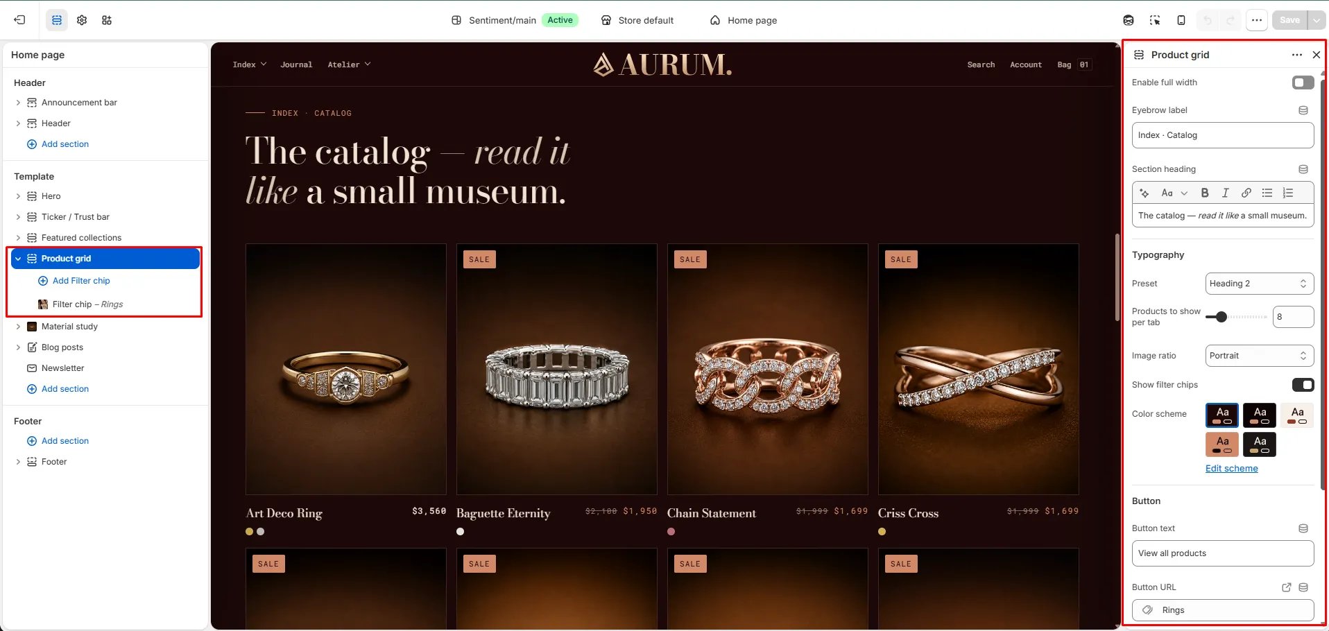
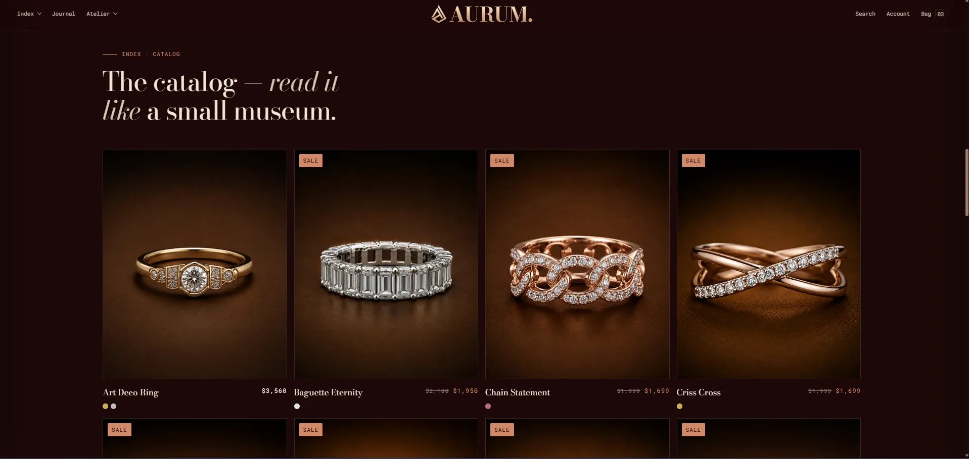
The **Product Grid** section displays a tabbed product grid that allows customers to switch between collections using filter chip tabs — without leaving the page. When two or more collection blocks are added, the filter tabs appear automatically above the grid, making it easy to feature multiple edits or categories in a single section.
 ### How to Add the Section
1. From your Shopify admin, go to **Online Store → Themes** and click **Customize**.
2. Navigate to the page where you want to add this section.
3. Click **Add section** and select **Product grid**.
4. Add **Filter chip** blocks to define which collections appear as tabs.
5. Click **Save**.
### Section Settings
#### Content
* **Eyebrow:** Small label above the heading.
* **Heading:** Main section heading. Supports rich text and italic emphasis.
* **Heading typography:** Select the typographic style for the heading.
* **CTA text / URL:** An optional call-to-action link displayed below the product grid.
#### Display
* **Full width:** When enabled, the section stretches edge-to-edge.
* **Products to show:** Number of products to display per collection tab (range: 4–24, step 4).
* **Image ratio:** Aspect ratio for product card images — Portrait, Square, Landscape, or Adapt.
* **Show filters:** When enabled, collection filter chip tabs appear above the grid when 2 or more Filter chip blocks are added.
#### Style
* **Color scheme:** Choose a color scheme for the section.
#### Spacing
* **Padding top / Padding bottom:** Control vertical spacing around the section.
***
### Filter Chip Block Settings
Each Filter chip block adds one collection tab to the grid. Add two or more blocks to activate the tabbed filter.
* **Collection:** Select the Shopify collection whose products will be displayed when this tab is active.
* **Label:** A custom label for the tab chip. Defaults to the collection title if left blank.
### How to Add the Section
1. From your Shopify admin, go to **Online Store → Themes** and click **Customize**.
2. Navigate to the page where you want to add this section.
3. Click **Add section** and select **Product grid**.
4. Add **Filter chip** blocks to define which collections appear as tabs.
5. Click **Save**.
### Section Settings
#### Content
* **Eyebrow:** Small label above the heading.
* **Heading:** Main section heading. Supports rich text and italic emphasis.
* **Heading typography:** Select the typographic style for the heading.
* **CTA text / URL:** An optional call-to-action link displayed below the product grid.
#### Display
* **Full width:** When enabled, the section stretches edge-to-edge.
* **Products to show:** Number of products to display per collection tab (range: 4–24, step 4).
* **Image ratio:** Aspect ratio for product card images — Portrait, Square, Landscape, or Adapt.
* **Show filters:** When enabled, collection filter chip tabs appear above the grid when 2 or more Filter chip blocks are added.
#### Style
* **Color scheme:** Choose a color scheme for the section.
#### Spacing
* **Padding top / Padding bottom:** Control vertical spacing around the section.
***
### Filter Chip Block Settings
Each Filter chip block adds one collection tab to the grid. Add two or more blocks to activate the tabbed filter.
* **Collection:** Select the Shopify collection whose products will be displayed when this tab is active.
* **Label:** A custom label for the tab chip. Defaults to the collection title if left blank.