> ## Documentation Index
> Fetch the complete documentation index at: https://sentiment-docs.arhamwebworks.com/llms.txt
> Use this file to discover all available pages before exploring further.
# Product page
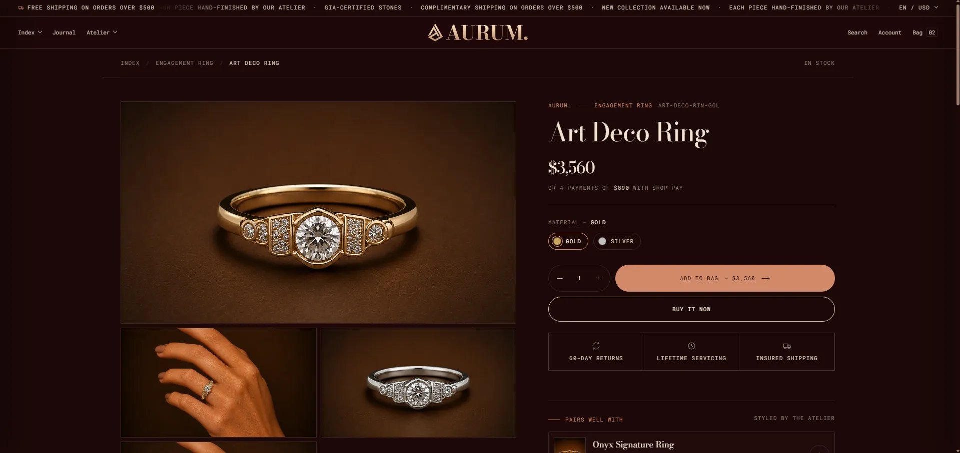
The **Default Product** template in the Sentiment theme is a fully modular product detail page built from four template sections: a **Product** section (containing all purchase-related blocks), a **Craftsmanship band** editorial strip, a **Related products** grid, and an **Apps** section for third-party integrations like reviews. Every block within the Product section can be individually configured, reordered, or removed from the Theme Editor.
 ### How to Configure the Product Page
1. From your Shopify admin, go to **Online Store → Themes** and click **Customize**.
2. From the top page dropdown, select **Products → Default product** (or navigate to a specific product).
3. Click any section or block in the left sidebar under **Template** to open its settings.
4. Adjust settings in the right panel, then click **Save**.
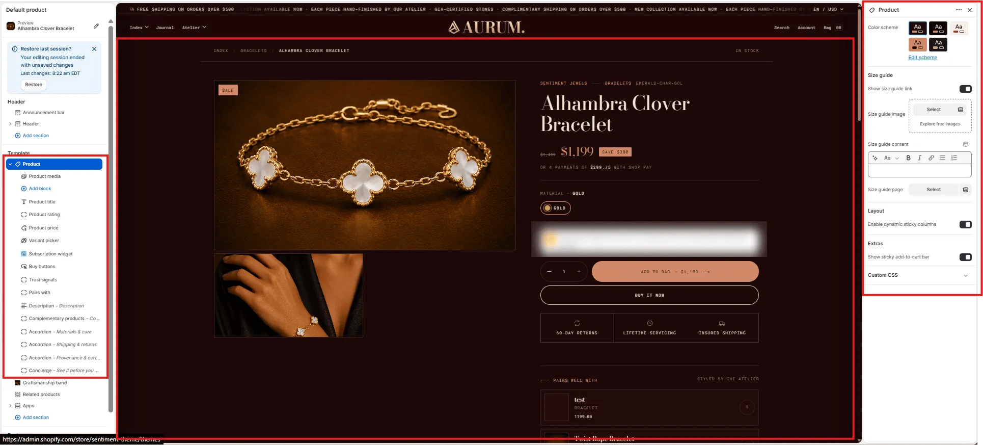
The product page template contains these sections and blocks:
**Product section blocks:**
* **Product media** — image gallery / carousel
* **Product title** — name, vendor, SKU, collection
* **Product rating** — star rating display
* **Product price** — price, compare-at price, installments
* **Variant picker** — material/color/size selectors
* **Buy buttons** — add to bag + buy now
* **Trust signals** — icon + label trust bar
* **Pairs with** — curated product pairings
* **Description** — collapsible product description
* **Complementary products** — app-powered recommendations
* **Accordion** — expandable content rows (Materials & care, Shipping & returns, Provenance & certification)
* **Concierge** — private viewing CTA
**Additional sections:**
* **Craftsmanship band** — editorial brand strip
* **Related products** — "You may also like" grid
***
### Product Section Settings
The top-level Product section controls the size guide panel, sticky layout behaviour, and the add-to-cart bar.
### How to Configure the Product Page
1. From your Shopify admin, go to **Online Store → Themes** and click **Customize**.
2. From the top page dropdown, select **Products → Default product** (or navigate to a specific product).
3. Click any section or block in the left sidebar under **Template** to open its settings.
4. Adjust settings in the right panel, then click **Save**.
The product page template contains these sections and blocks:
**Product section blocks:**
* **Product media** — image gallery / carousel
* **Product title** — name, vendor, SKU, collection
* **Product rating** — star rating display
* **Product price** — price, compare-at price, installments
* **Variant picker** — material/color/size selectors
* **Buy buttons** — add to bag + buy now
* **Trust signals** — icon + label trust bar
* **Pairs with** — curated product pairings
* **Description** — collapsible product description
* **Complementary products** — app-powered recommendations
* **Accordion** — expandable content rows (Materials & care, Shipping & returns, Provenance & certification)
* **Concierge** — private viewing CTA
**Additional sections:**
* **Craftsmanship band** — editorial brand strip
* **Related products** — "You may also like" grid
***
### Product Section Settings
The top-level Product section controls the size guide panel, sticky layout behaviour, and the add-to-cart bar.
 #### Size Guide
* **Show size guide link:** Toggle to display a size guide link near the variant picker. When enabled, clicking it opens the size guide panel.
* **Size guide image:** Upload an image (e.g., a measurement chart) to display inside the size guide panel.
* **Size guide content:** Rich text field for size guide copy — include measurements, fit notes, or material care tips.
* **Size guide page:** Optionally link to a full size guide page for a "View full guide" link inside the panel.
#### Layout
* **Enable dynamic sticky columns:** When enabled, the product info column sticks to the viewport as the customer scrolls through the media gallery on desktop.
#### Extras
* **Show sticky add-to-cart bar:** Displays a persistent bottom bar with the product name, price, and add-to-bag button as the customer scrolls past the main buy buttons.
***
### Product Media Block Settings
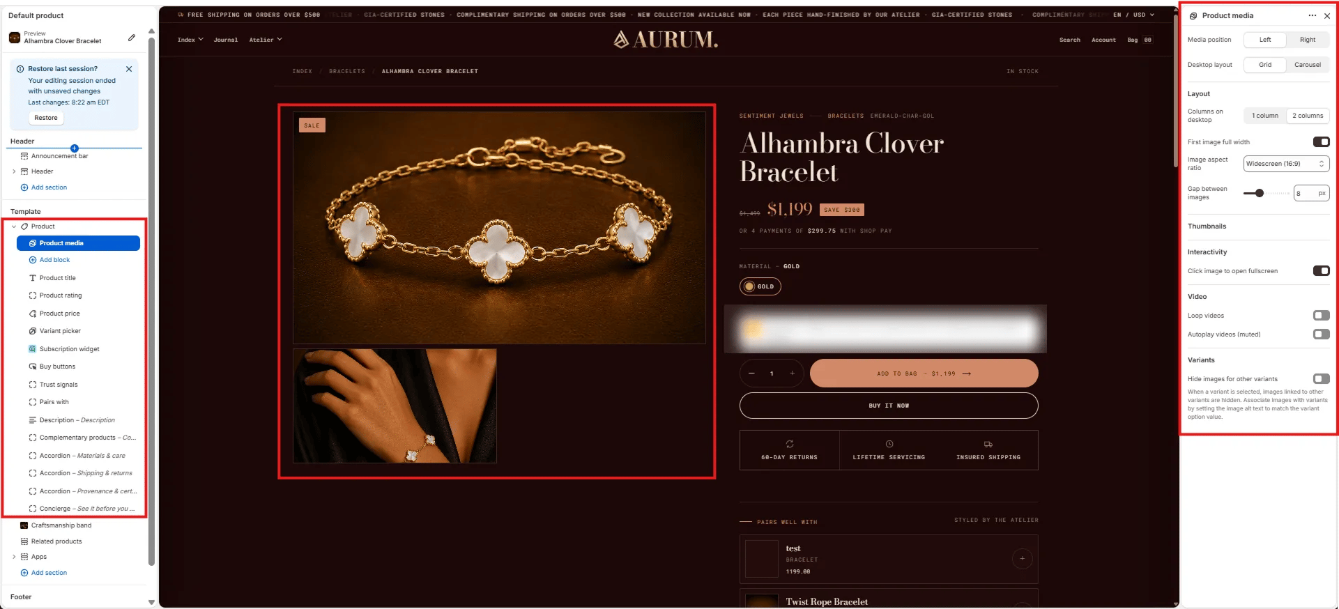
The Product Media block controls the image gallery on the left side of the product layout — including layout style, aspect ratio, video behaviour, and variant image filtering.
#### Size Guide
* **Show size guide link:** Toggle to display a size guide link near the variant picker. When enabled, clicking it opens the size guide panel.
* **Size guide image:** Upload an image (e.g., a measurement chart) to display inside the size guide panel.
* **Size guide content:** Rich text field for size guide copy — include measurements, fit notes, or material care tips.
* **Size guide page:** Optionally link to a full size guide page for a "View full guide" link inside the panel.
#### Layout
* **Enable dynamic sticky columns:** When enabled, the product info column sticks to the viewport as the customer scrolls through the media gallery on desktop.
#### Extras
* **Show sticky add-to-cart bar:** Displays a persistent bottom bar with the product name, price, and add-to-bag button as the customer scrolls past the main buy buttons.
***
### Product Media Block Settings
The Product Media block controls the image gallery on the left side of the product layout — including layout style, aspect ratio, video behaviour, and variant image filtering.
 #### Position
* **Media position:** Choose **Left** (default) or **Right** to place the gallery on either side of the product info column.
* **Desktop layout:** **Grid** displays all images in a stacked grid; **Carousel** shows one image at a time with navigation arrows.
#### Layout
* **Columns on desktop:** Show the gallery in **1 column** (single wide) or **2 columns** (mosaic grid).
* **First image full width:** When enabled in 2-column layout, the first image spans the full width before the grid begins.
* **Image aspect ratio:** Sets the crop ratio for all gallery images — Widescreen (16:9), Landscape, Square, Portrait, or Adapt (original).
* **Gap between images:** Controls the pixel gap between images in the grid (range: 0–20 px).
#### Thumbnails
Thumbnail strip navigation appears automatically in Carousel layout mode.
#### Interactivity
* **Click image to open fullscreen:** When enabled, clicking any image opens a fullscreen lightbox viewer.
#### Video
* **Loop videos:** When enabled, product videos loop continuously.
* **Autoplay videos (muted):** When enabled, videos auto-play without sound when the gallery loads.
#### Variants
* **Hide images for other variants:** When a variant is selected, images linked to other variants are hidden. To associate images with a specific variant, set the image alt text to match the variant option value exactly.
***
### Product Title Block Settings
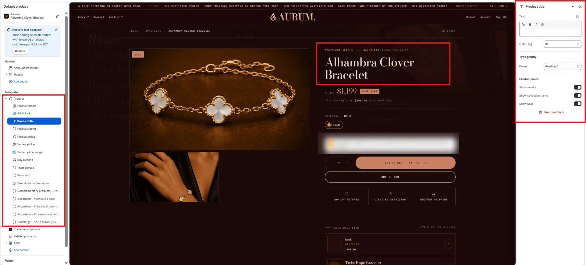
The Product Title block renders the product name, breadcrumb meta (vendor, collection, SKU), and the HTML heading tag used for SEO.
#### Position
* **Media position:** Choose **Left** (default) or **Right** to place the gallery on either side of the product info column.
* **Desktop layout:** **Grid** displays all images in a stacked grid; **Carousel** shows one image at a time with navigation arrows.
#### Layout
* **Columns on desktop:** Show the gallery in **1 column** (single wide) or **2 columns** (mosaic grid).
* **First image full width:** When enabled in 2-column layout, the first image spans the full width before the grid begins.
* **Image aspect ratio:** Sets the crop ratio for all gallery images — Widescreen (16:9), Landscape, Square, Portrait, or Adapt (original).
* **Gap between images:** Controls the pixel gap between images in the grid (range: 0–20 px).
#### Thumbnails
Thumbnail strip navigation appears automatically in Carousel layout mode.
#### Interactivity
* **Click image to open fullscreen:** When enabled, clicking any image opens a fullscreen lightbox viewer.
#### Video
* **Loop videos:** When enabled, product videos loop continuously.
* **Autoplay videos (muted):** When enabled, videos auto-play without sound when the gallery loads.
#### Variants
* **Hide images for other variants:** When a variant is selected, images linked to other variants are hidden. To associate images with a specific variant, set the image alt text to match the variant option value exactly.
***
### Product Title Block Settings
The Product Title block renders the product name, breadcrumb meta (vendor, collection, SKU), and the HTML heading tag used for SEO.
 #### Content
* **Text:** Override the product title text displayed on the page (leave blank to use the Shopify product title).
* **HTML tag:** Select the heading tag for the product name — **H1** (recommended for SEO) or H2.
#### Typography
* **Preset:** Choose the typographic style for the title from your theme's heading presets (e.g., Heading 1, Heading 2).
#### Product Meta
* **Show vendor:** Toggle to display the product vendor name above the title.
* **Show collection name:** Toggle to display the primary collection name above the title.
* **Show SKU:** Toggle to display the product SKU below the title.
***
### Product Price Block Settings
The Product Price block displays the current price, compare-at (original) price, any active sale badge, and an optional installment payment message.
#### Content
* **Text:** Override the product title text displayed on the page (leave blank to use the Shopify product title).
* **HTML tag:** Select the heading tag for the product name — **H1** (recommended for SEO) or H2.
#### Typography
* **Preset:** Choose the typographic style for the title from your theme's heading presets (e.g., Heading 1, Heading 2).
#### Product Meta
* **Show vendor:** Toggle to display the product vendor name above the title.
* **Show collection name:** Toggle to display the primary collection name above the title.
* **Show SKU:** Toggle to display the product SKU below the title.
***
### Product Price Block Settings
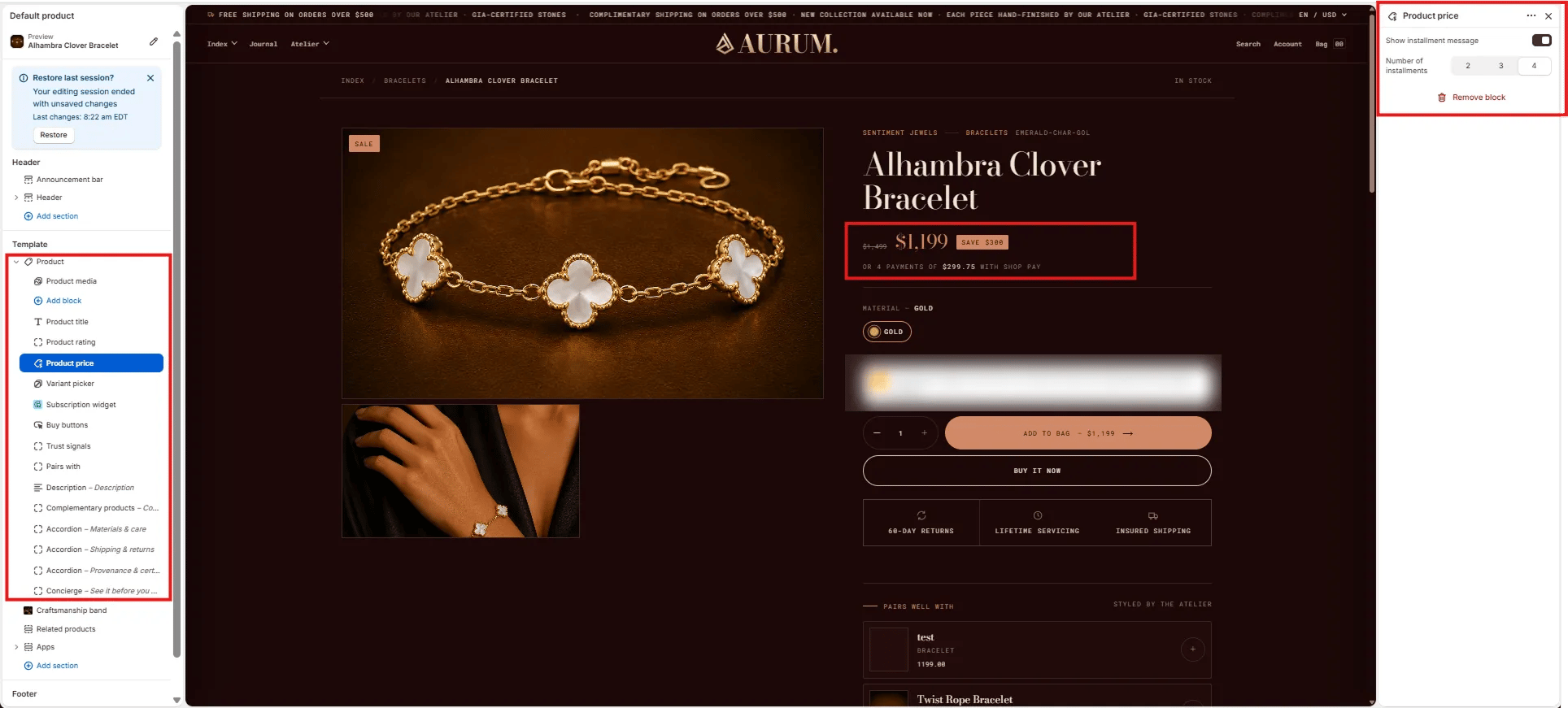
The Product Price block displays the current price, compare-at (original) price, any active sale badge, and an optional installment payment message.
 #### Installments
* **Show installment message:** Toggle to display a "or X payments of \$Y with Shop Pay" message below the price. Requires Shop Pay Installments to be active on your store.
* **Number of installments:** Set the number of installment payments shown in the message — **2**, **3**, or **4**.
***
### Variant Picker Block Settings
The Variant Picker block renders the product option selectors (e.g., Material, Size, Color) that customers use to choose a specific variant before adding to bag.
#### Installments
* **Show installment message:** Toggle to display a "or X payments of \$Y with Shop Pay" message below the price. Requires Shop Pay Installments to be active on your store.
* **Number of installments:** Set the number of installment payments shown in the message — **2**, **3**, or **4**.
***
### Variant Picker Block Settings
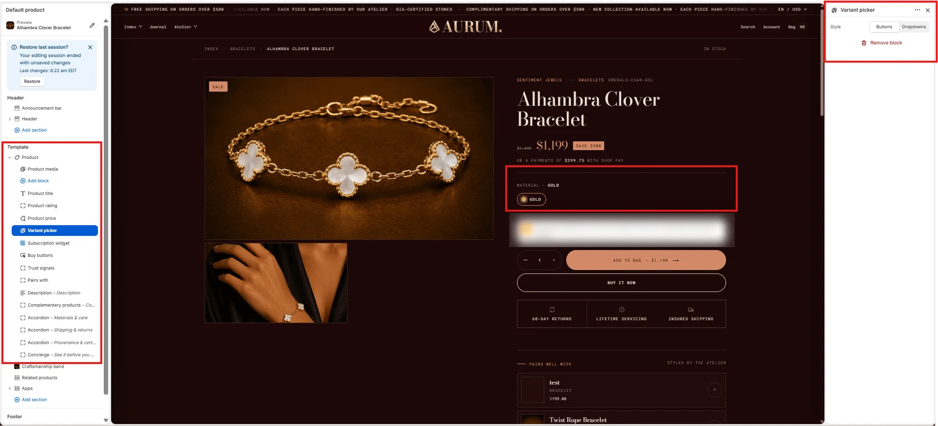
The Variant Picker block renders the product option selectors (e.g., Material, Size, Color) that customers use to choose a specific variant before adding to bag.
 #### Style
* **Style:** Choose between **Buttons** (visual swatches or pill buttons) or **Dropdowns** (select menus). Buttons work best for color/material options; dropdowns suit options with many values.
***
### Buy Buttons Block Settings
The Buy Buttons block renders the main purchase actions — the quantity selector, Add to Bag button, and Buy It Now button.
#### Style
* **Style:** Choose between **Buttons** (visual swatches or pill buttons) or **Dropdowns** (select menus). Buttons work best for color/material options; dropdowns suit options with many values.
***
### Buy Buttons Block Settings
The Buy Buttons block renders the main purchase actions — the quantity selector, Add to Bag button, and Buy It Now button.
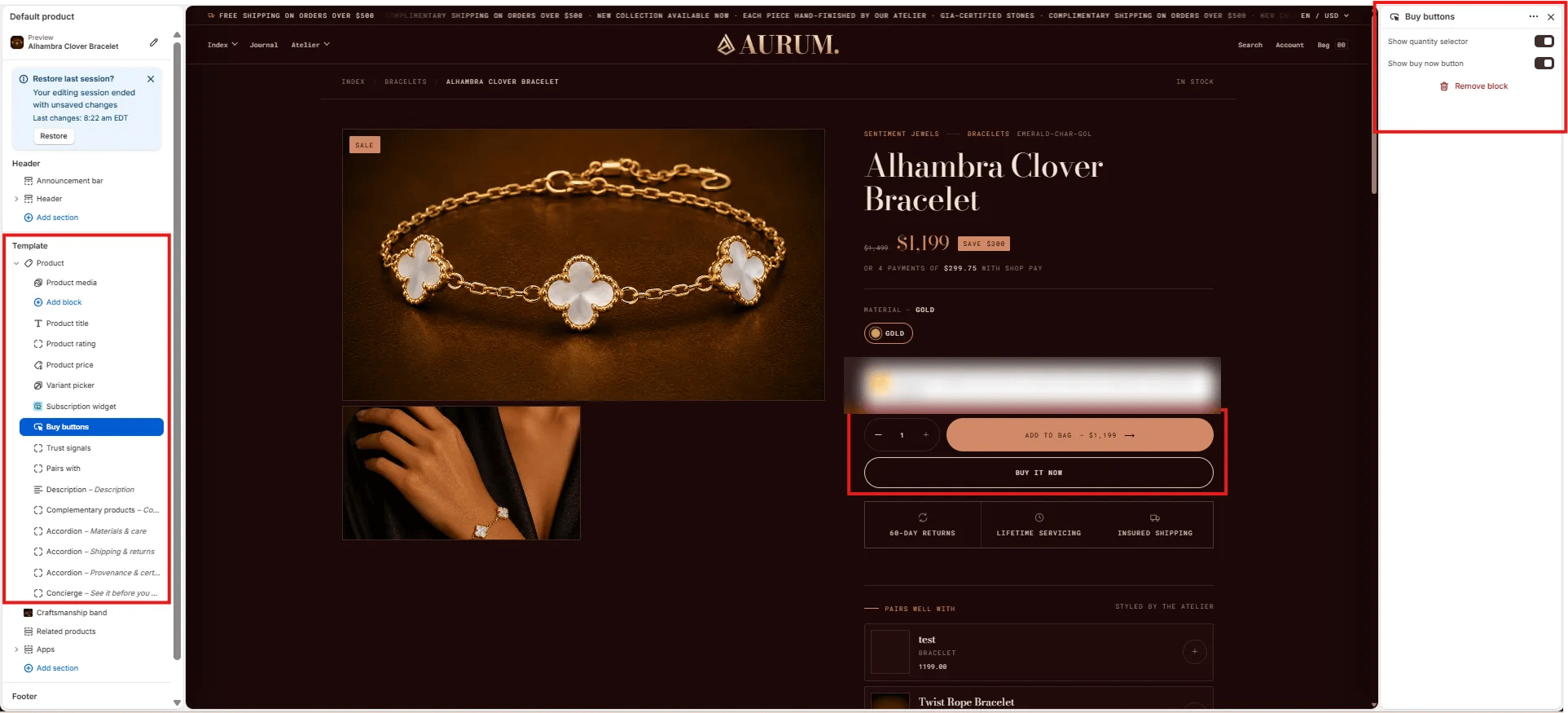 * **Show quantity selector:** Toggle to show or hide the quantity +/− stepper next to the add-to-bag button.
* **Show buy now button:** Toggle to show or hide the **Buy It Now** accelerated checkout button below the add-to-bag button.
***
### Trust Signals Block Settings
The Trust Signals block renders a row of up to three icon + label trust indicators below the buy buttons — such as return policy, servicing, and shipping guarantees.
* **Show quantity selector:** Toggle to show or hide the quantity +/− stepper next to the add-to-bag button.
* **Show buy now button:** Toggle to show or hide the **Buy It Now** accelerated checkout button below the add-to-bag button.
***
### Trust Signals Block Settings
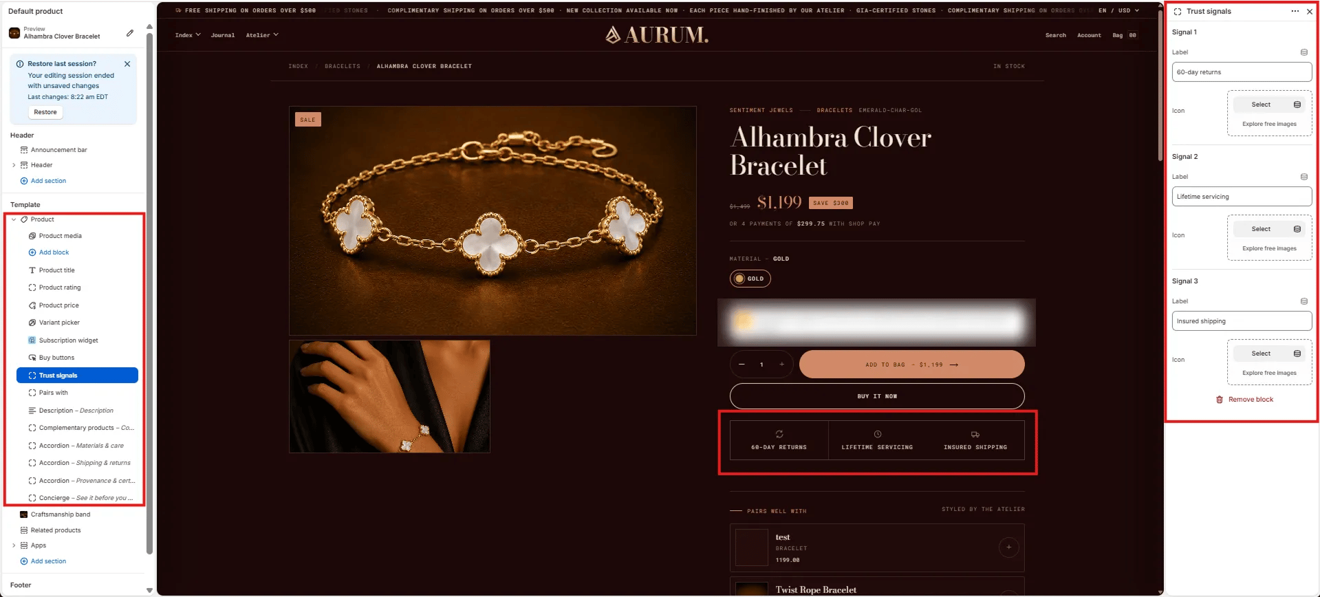
The Trust Signals block renders a row of up to three icon + label trust indicators below the buy buttons — such as return policy, servicing, and shipping guarantees.
 Each signal has two fields:
* **Label:** Short trust statement displayed below the icon (e.g., "60-day returns", "Lifetime servicing", "Insured shipping").
* **Icon:** Upload a custom icon image for this signal. Use simple, outlined icons at a small size for best results.
Up to three signals (Signal 1, Signal 2, Signal 3) can be configured independently.
***
### Pairs With Block Settings
The Pairs With block renders a curated "Pairs well with" product panel below the trust signals, showing complementary items that can be added together in one action.
Each signal has two fields:
* **Label:** Short trust statement displayed below the icon (e.g., "60-day returns", "Lifetime servicing", "Insured shipping").
* **Icon:** Upload a custom icon image for this signal. Use simple, outlined icons at a small size for best results.
Up to three signals (Signal 1, Signal 2, Signal 3) can be configured independently.
***
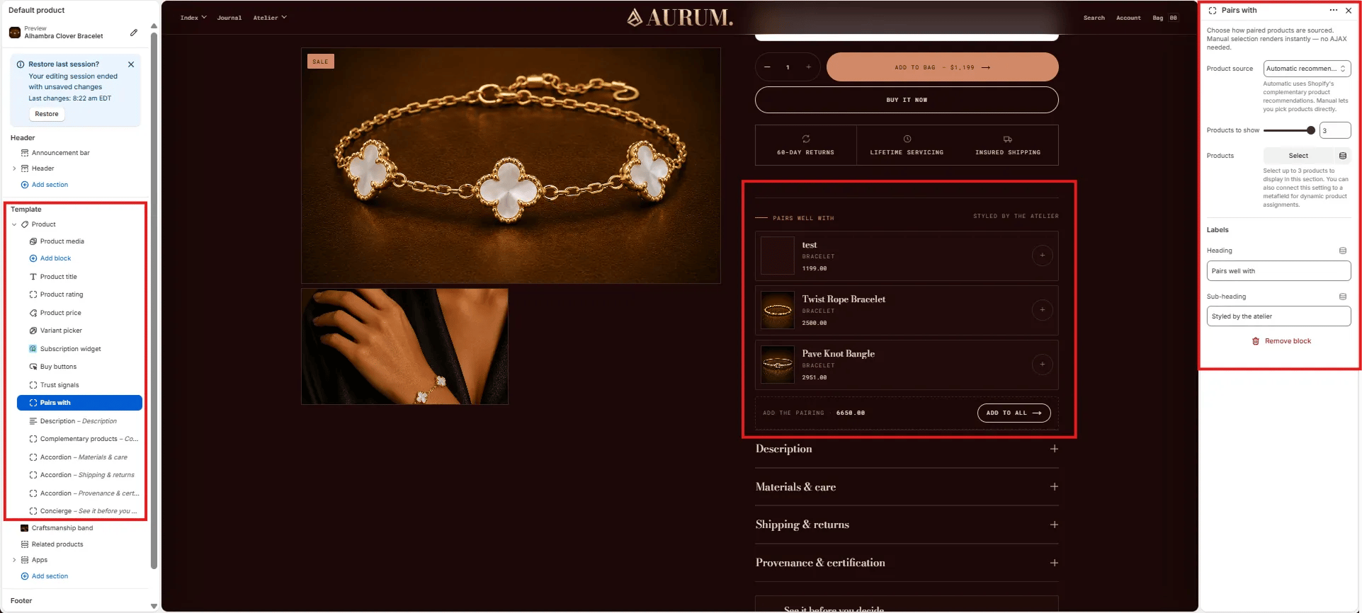
### Pairs With Block Settings
The Pairs With block renders a curated "Pairs well with" product panel below the trust signals, showing complementary items that can be added together in one action.
 #### Source
* **Product source:** Choose **Automatic** (uses Shopify's complementary product recommendations — no AJAX required) or **Manual** to hand-pick specific products. Manual selection renders instantly without additional API calls.
* **Products to show:** Number of paired products displayed (range: 1–3).
* **Products:** If using Manual source, select the specific products to feature as pairings.
#### Labels
* **Heading:** Label displayed above the pairing list (e.g., "Pairs well with").
* **Sub-heading:** Secondary label on the right side of the heading row (e.g., "Styled by the atelier").
***
### Description Block Settings
The Description block renders the product's Shopify description in a collapsible accordion row within the product info column.
#### Source
* **Product source:** Choose **Automatic** (uses Shopify's complementary product recommendations — no AJAX required) or **Manual** to hand-pick specific products. Manual selection renders instantly without additional API calls.
* **Products to show:** Number of paired products displayed (range: 1–3).
* **Products:** If using Manual source, select the specific products to feature as pairings.
#### Labels
* **Heading:** Label displayed above the pairing list (e.g., "Pairs well with").
* **Sub-heading:** Secondary label on the right side of the heading row (e.g., "Styled by the atelier").
***
### Description Block Settings
The Description block renders the product's Shopify description in a collapsible accordion row within the product info column.
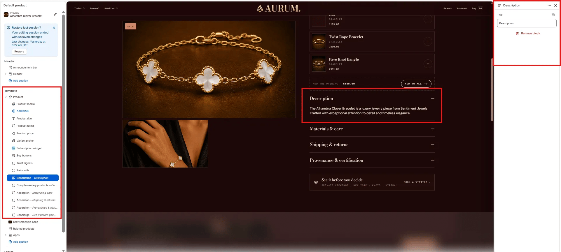 * **Title:** The accordion row label displayed as the toggle heading (default: "Description"). Customize this label to match your brand voice.
***
### Complementary Products Block Settings
The Complementary Products block renders a collapsible panel of algorithm-driven product recommendations sourced from the Shopify **Search & Discovery** app. Complementary products must be configured in the app before this block shows products on the storefront.
* **Title:** The accordion row label displayed as the toggle heading (default: "Description"). Customize this label to match your brand voice.
***
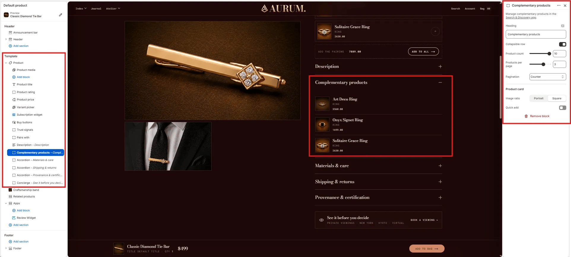
### Complementary Products Block Settings
The Complementary Products block renders a collapsible panel of algorithm-driven product recommendations sourced from the Shopify **Search & Discovery** app. Complementary products must be configured in the app before this block shows products on the storefront.
 #### Content
* **Heading:** The accordion row label for the complementary products panel (default: "Complementary products").
* **Collapsible row:** Toggle to render the block as a collapsible accordion row (on) or always-expanded (off).
#### Display
* **Product count:** Total number of complementary products to fetch (range: 1–10).
* **Products per page:** Number of products shown per page within the panel (range: 1–5).
* **Pagination:** Choose the pagination style — **Counter** (e.g., "1 / 3") or dots.
#### Product Card
* **Image ratio:** Aspect ratio for product thumbnail images — **Portrait** or **Square**.
* **Quick add:** Toggle to show a quick add-to-cart button on each product card.
***
### Accordion Block Settings
The Accordion block creates a collapsible content row within the product info column. Multiple Accordion blocks can be added to build a full product details panel — commonly used for Materials & care, Shipping & returns, and Provenance & certification.
#### Content
* **Heading:** The accordion row label for the complementary products panel (default: "Complementary products").
* **Collapsible row:** Toggle to render the block as a collapsible accordion row (on) or always-expanded (off).
#### Display
* **Product count:** Total number of complementary products to fetch (range: 1–10).
* **Products per page:** Number of products shown per page within the panel (range: 1–5).
* **Pagination:** Choose the pagination style — **Counter** (e.g., "1 / 3") or dots.
#### Product Card
* **Image ratio:** Aspect ratio for product thumbnail images — **Portrait** or **Square**.
* **Quick add:** Toggle to show a quick add-to-cart button on each product card.
***
### Accordion Block Settings
The Accordion block creates a collapsible content row within the product info column. Multiple Accordion blocks can be added to build a full product details panel — commonly used for Materials & care, Shipping & returns, and Provenance & certification.
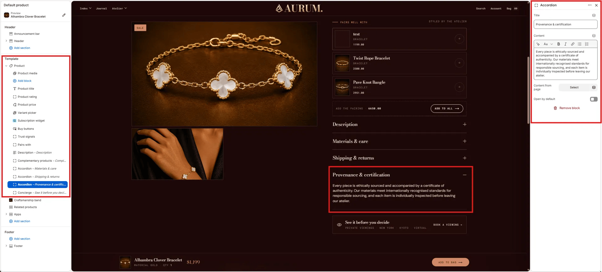 * **Title:** The accordion row heading (e.g., "Materials & care", "Shipping & returns", "Provenance & certification").
* **Content:** Rich text content displayed when the accordion row is expanded. Supports bold, italic, links, and lists.
* **Content from page:** Optionally pull the accordion content from a Shopify page — useful for managing long-form policy content centrally.
* **Open by default:** Toggle to have this accordion row expanded when the page loads (default: collapsed).
***
### Concierge Block Settings
The Concierge block renders a full-width "see it before you decide" CTA bar at the bottom of the product info column, inviting customers to book a private viewing appointment.
* **Title:** The accordion row heading (e.g., "Materials & care", "Shipping & returns", "Provenance & certification").
* **Content:** Rich text content displayed when the accordion row is expanded. Supports bold, italic, links, and lists.
* **Content from page:** Optionally pull the accordion content from a Shopify page — useful for managing long-form policy content centrally.
* **Open by default:** Toggle to have this accordion row expanded when the page loads (default: collapsed).
***
### Concierge Block Settings
The Concierge block renders a full-width "see it before you decide" CTA bar at the bottom of the product info column, inviting customers to book a private viewing appointment.
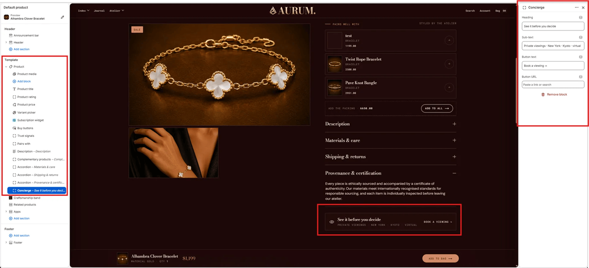 * **Heading:** The primary text for the concierge bar (e.g., "See it before you decide").
* **Sub-text:** Secondary text below the heading, typically listing viewing locations (e.g., "Private viewings · New York · Kyoto · virtual").
* **Button text:** Label on the CTA button (e.g., "Book a viewing →").
* **Button URL:** Link destination for the button — paste a URL or search for a page.
***
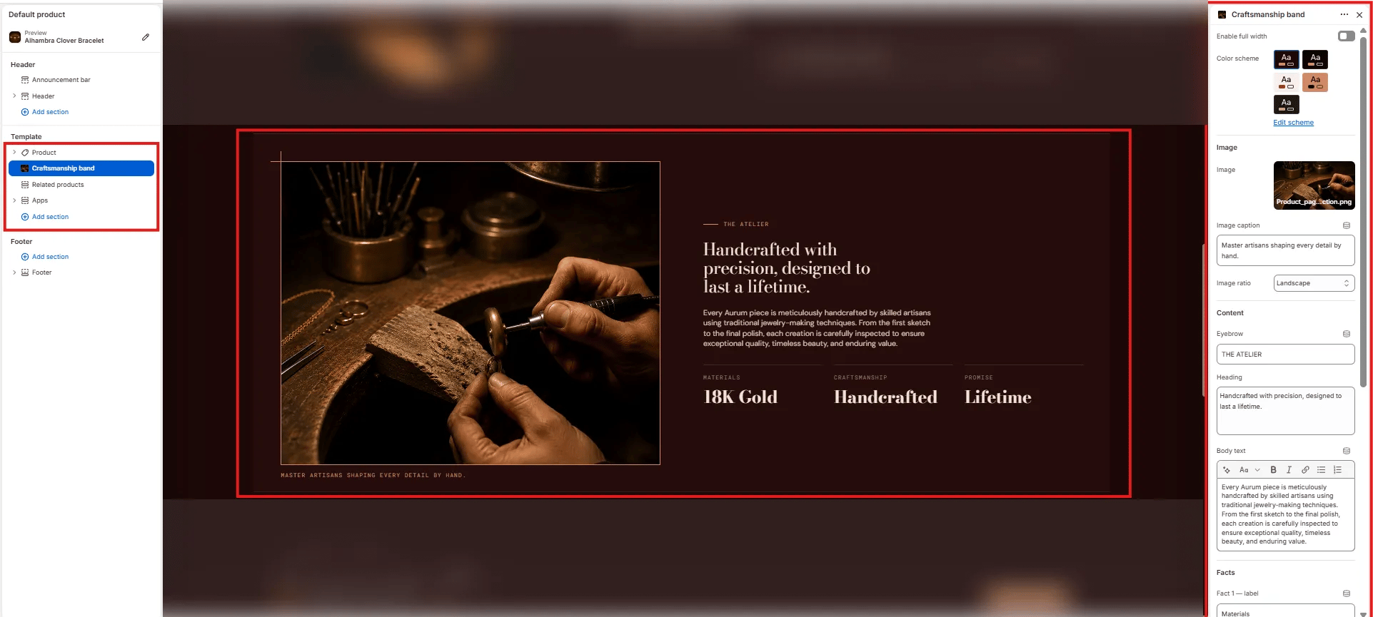
### Craftsmanship Band Section Settings
The Craftsmanship Band section renders a full-width editorial strip below the product info column, combining an artisan image, an eyebrow label, a heading, body text, and a three-column facts row — communicating brand craft values directly on the product page.
* **Heading:** The primary text for the concierge bar (e.g., "See it before you decide").
* **Sub-text:** Secondary text below the heading, typically listing viewing locations (e.g., "Private viewings · New York · Kyoto · virtual").
* **Button text:** Label on the CTA button (e.g., "Book a viewing →").
* **Button URL:** Link destination for the button — paste a URL or search for a page.
***
### Craftsmanship Band Section Settings
The Craftsmanship Band section renders a full-width editorial strip below the product info column, combining an artisan image, an eyebrow label, a heading, body text, and a three-column facts row — communicating brand craft values directly on the product page.
 #### Layout
* **Enable full width:** Toggle to extend the section edge-to-edge across the viewport.
#### Style
* **Color scheme:** Choose a color scheme for the section background and text.
#### Image
* **Image:** Upload an artisan or process image for the left column.
* **Image caption:** Small caption text displayed below the image (e.g., "Master artisans shaping every detail by hand.").
* **Image ratio:** Aspect ratio for the image — Landscape, Portrait, Square, or Adapt.
#### Content
* **Eyebrow:** Small label above the heading (e.g., "THE ATELIER").
* **Heading:** Main editorial heading (e.g., "Handcrafted with precision, designed to last a lifetime.").
* **Body text:** Supporting paragraph text below the heading.
#### Facts
* **Fact label / value pairs:** Up to three short stat columns displayed below the body text (e.g., "Materials / 18K Gold", "Craftsmanship / Handcrafted", "Promise / Lifetime").
***
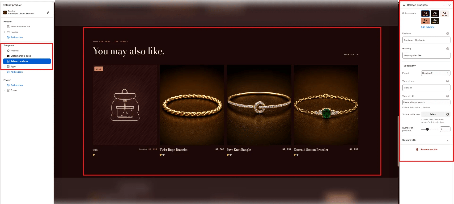
### Related Products Section Settings
The Related Products section renders a full-width product grid below the craftsmanship band, showing items from the same collection under a "You may also like" heading.
#### Layout
* **Enable full width:** Toggle to extend the section edge-to-edge across the viewport.
#### Style
* **Color scheme:** Choose a color scheme for the section background and text.
#### Image
* **Image:** Upload an artisan or process image for the left column.
* **Image caption:** Small caption text displayed below the image (e.g., "Master artisans shaping every detail by hand.").
* **Image ratio:** Aspect ratio for the image — Landscape, Portrait, Square, or Adapt.
#### Content
* **Eyebrow:** Small label above the heading (e.g., "THE ATELIER").
* **Heading:** Main editorial heading (e.g., "Handcrafted with precision, designed to last a lifetime.").
* **Body text:** Supporting paragraph text below the heading.
#### Facts
* **Fact label / value pairs:** Up to three short stat columns displayed below the body text (e.g., "Materials / 18K Gold", "Craftsmanship / Handcrafted", "Promise / Lifetime").
***
### Related Products Section Settings
The Related Products section renders a full-width product grid below the craftsmanship band, showing items from the same collection under a "You may also like" heading.
 #### Content
* **Eyebrow:** Small label above the heading (e.g., "Continue · The family").
* **Heading:** Main section heading (e.g., "You may also like.").
* **Typography:** Typographic preset for the heading (e.g., Heading 2).
* **View all text:** Label for the "View all" link (default: "View all").
* **View all URL:** Destination for the "View all" link. Leave blank to auto-link to the source collection.
#### Source
* **Source collection:** Select a specific collection to pull related products from. If left blank, the section uses the current product's first collection automatically.
* **Number of products:** Number of product cards to show in the grid (range: 2–8, default: 4).
#### Content
* **Eyebrow:** Small label above the heading (e.g., "Continue · The family").
* **Heading:** Main section heading (e.g., "You may also like.").
* **Typography:** Typographic preset for the heading (e.g., Heading 2).
* **View all text:** Label for the "View all" link (default: "View all").
* **View all URL:** Destination for the "View all" link. Leave blank to auto-link to the source collection.
#### Source
* **Source collection:** Select a specific collection to pull related products from. If left blank, the section uses the current product's first collection automatically.
* **Number of products:** Number of product cards to show in the grid (range: 2–8, default: 4).