> ## Documentation Index
> Fetch the complete documentation index at: https://sentiment-docs.arhamwebworks.com/llms.txt
> Use this file to discover all available pages before exploring further.
# Shop the look
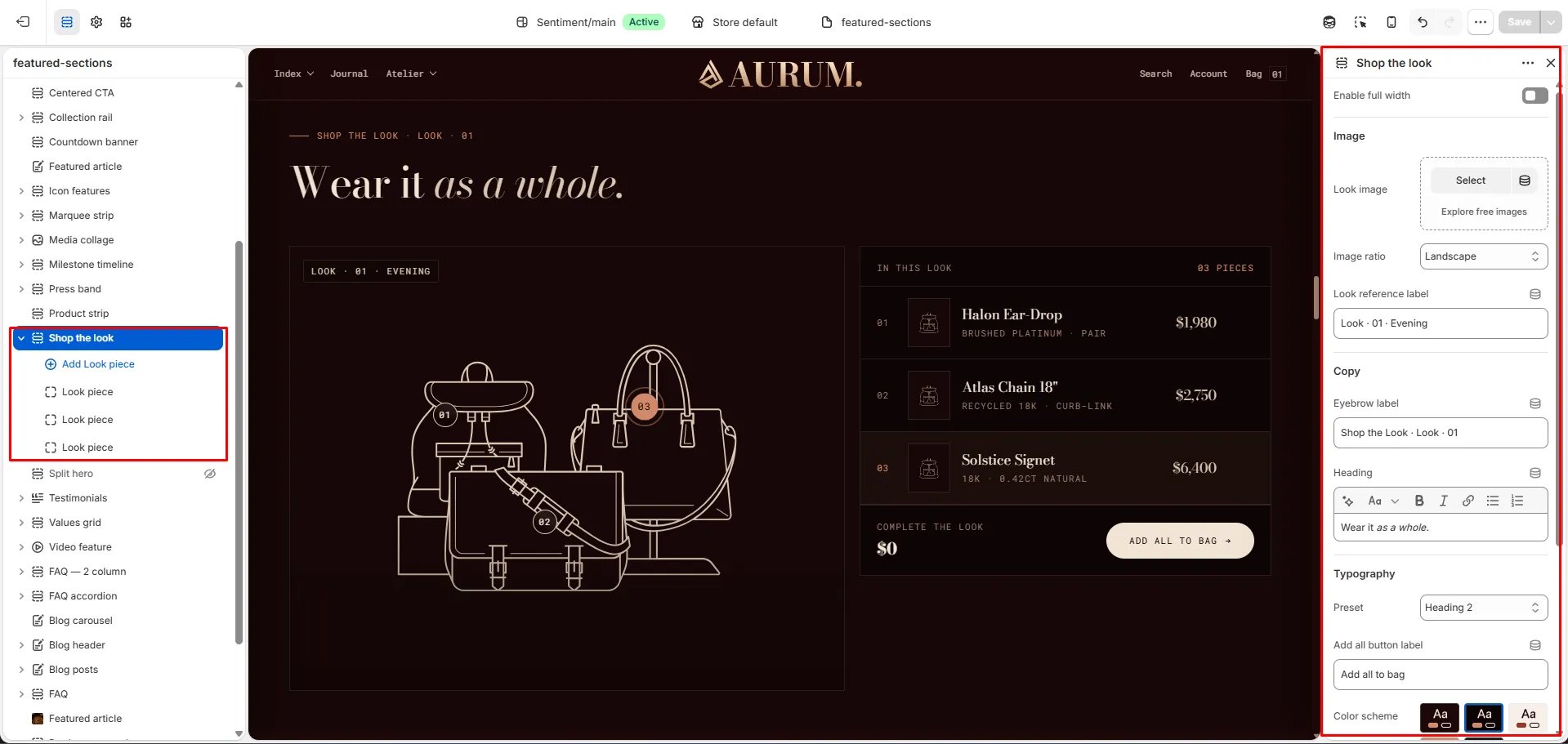
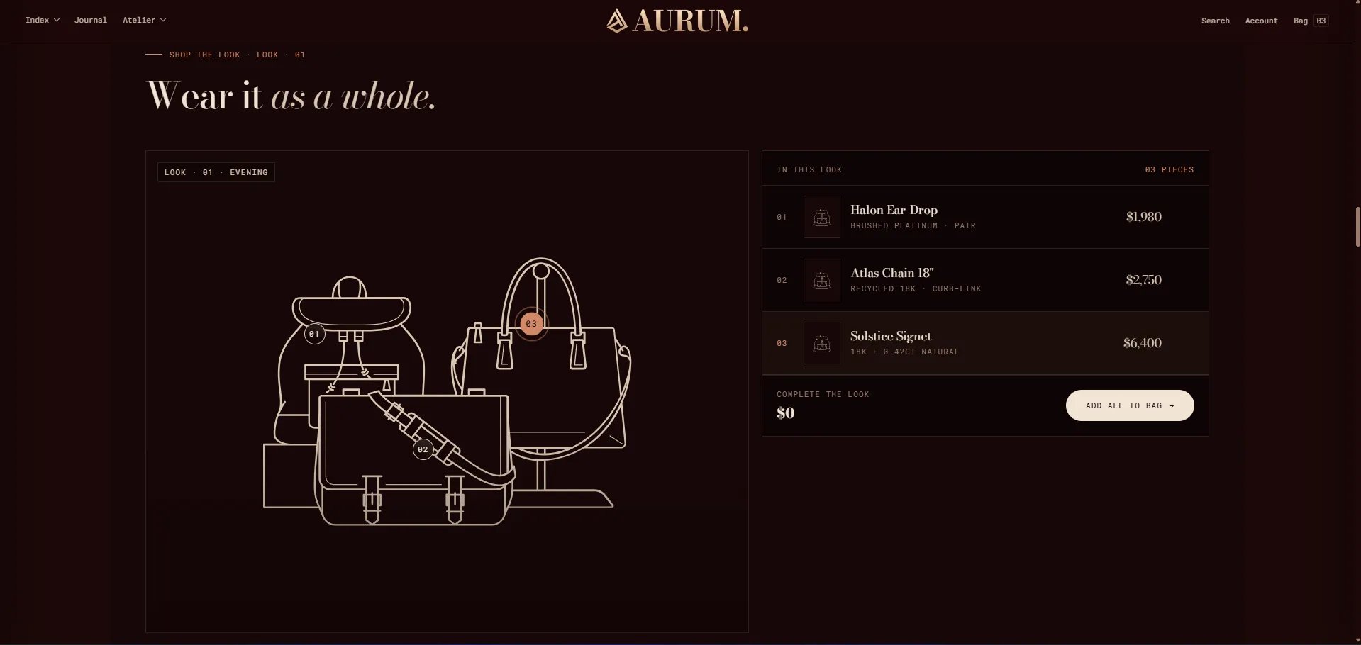
The **Shop the Look** section is an interactive lookbook experience featuring a large editorial image with numbered dot markers for each product in the look. Customers click or tap a dot to reveal a slide-out product credits panel with individual add-to-cart buttons and an "Add all to bag" option. Supports up to 8 product pins on a single look image.
 ### How to Add the Section
1. From your Shopify admin, go to **Online Store → Themes** and click **Customize**.
2. Navigate to the page where you want to add this section.
3. Click **Add section** and select **Shop the look**.
4. Upload a look image, then add **Piece** blocks and position each dot pin on the image using the X and Y position sliders.
5. Click **Save**.
### Section Settings
#### Content
* **Eyebrow:** Small label displayed above the heading.
* **Heading:** Main section heading. Supports rich text and italic emphasis.
* **Heading typography:** Select the typographic style for the heading.
* **Add all text:** Label for the "Add all to bag" button in the product credits panel (default: "Add all to bag").
#### Image
* **Image:** Upload the main lookbook or editorial image that the dot pins will be placed on.
* **Image ratio:** Aspect ratio for the look image — Portrait, Square, Landscape, or Adapt.
* **Ref label:** A reference label displayed on the look image (e.g., "Look · 01 · Evening").
#### Style
* **Color scheme:** Choose a color scheme for the section.
#### Spacing
* **Padding top / Padding bottom:** Control the vertical spacing around the section.
***
### Piece Block Settings
Each Piece block pins one product onto the look image. You can add up to 8 pieces. Each pin appears as a numbered dot on the image.
#### Product
* **Product:** Select the Shopify product this pin links to. The product's price and variants will be shown in the credits panel.
#### Card Content
* **Thumbnail:** Upload a custom thumbnail image for this product in the credits panel. Used as a fallback if the product has no image.
* **Piece name:** Display name for the product in the credits panel.
* **Spec text:** A specification detail line shown below the name (e.g., "Brushed platinum · pair").
* **Price display:** A manual price string shown in the credits panel if no product is linked.
#### Pin Position
* **X position:** Horizontal position of the dot pin on the look image, expressed as a percentage (0–100%). Drag the slider to position the pin left or right.
* **Y position:** Vertical position of the dot pin on the look image, expressed as a percentage (0–100%). Drag the slider to position the pin up or down.
### How to Add the Section
1. From your Shopify admin, go to **Online Store → Themes** and click **Customize**.
2. Navigate to the page where you want to add this section.
3. Click **Add section** and select **Shop the look**.
4. Upload a look image, then add **Piece** blocks and position each dot pin on the image using the X and Y position sliders.
5. Click **Save**.
### Section Settings
#### Content
* **Eyebrow:** Small label displayed above the heading.
* **Heading:** Main section heading. Supports rich text and italic emphasis.
* **Heading typography:** Select the typographic style for the heading.
* **Add all text:** Label for the "Add all to bag" button in the product credits panel (default: "Add all to bag").
#### Image
* **Image:** Upload the main lookbook or editorial image that the dot pins will be placed on.
* **Image ratio:** Aspect ratio for the look image — Portrait, Square, Landscape, or Adapt.
* **Ref label:** A reference label displayed on the look image (e.g., "Look · 01 · Evening").
#### Style
* **Color scheme:** Choose a color scheme for the section.
#### Spacing
* **Padding top / Padding bottom:** Control the vertical spacing around the section.
***
### Piece Block Settings
Each Piece block pins one product onto the look image. You can add up to 8 pieces. Each pin appears as a numbered dot on the image.
#### Product
* **Product:** Select the Shopify product this pin links to. The product's price and variants will be shown in the credits panel.
#### Card Content
* **Thumbnail:** Upload a custom thumbnail image for this product in the credits panel. Used as a fallback if the product has no image.
* **Piece name:** Display name for the product in the credits panel.
* **Spec text:** A specification detail line shown below the name (e.g., "Brushed platinum · pair").
* **Price display:** A manual price string shown in the credits panel if no product is linked.
#### Pin Position
* **X position:** Horizontal position of the dot pin on the look image, expressed as a percentage (0–100%). Drag the slider to position the pin left or right.
* **Y position:** Vertical position of the dot pin on the look image, expressed as a percentage (0–100%). Drag the slider to position the pin up or down.