> ## Documentation Index
> Fetch the complete documentation index at: https://sentiment-docs.arhamwebworks.com/llms.txt
> Use this file to discover all available pages before exploring further.
# Values grid
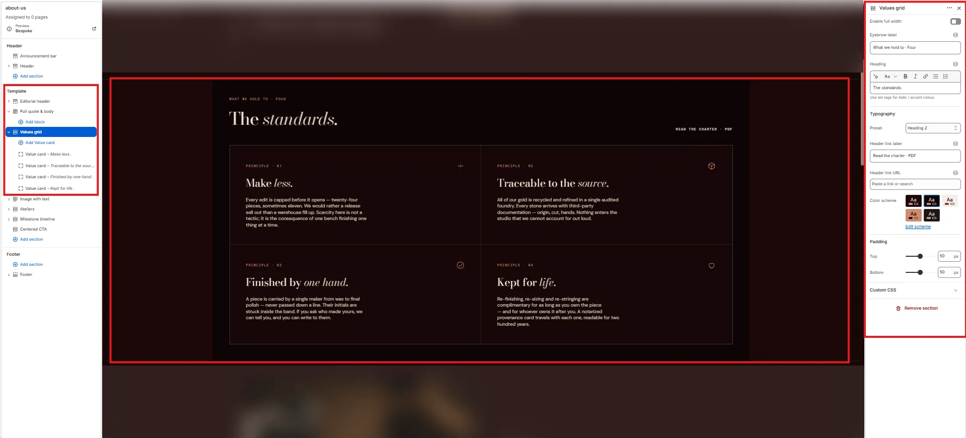
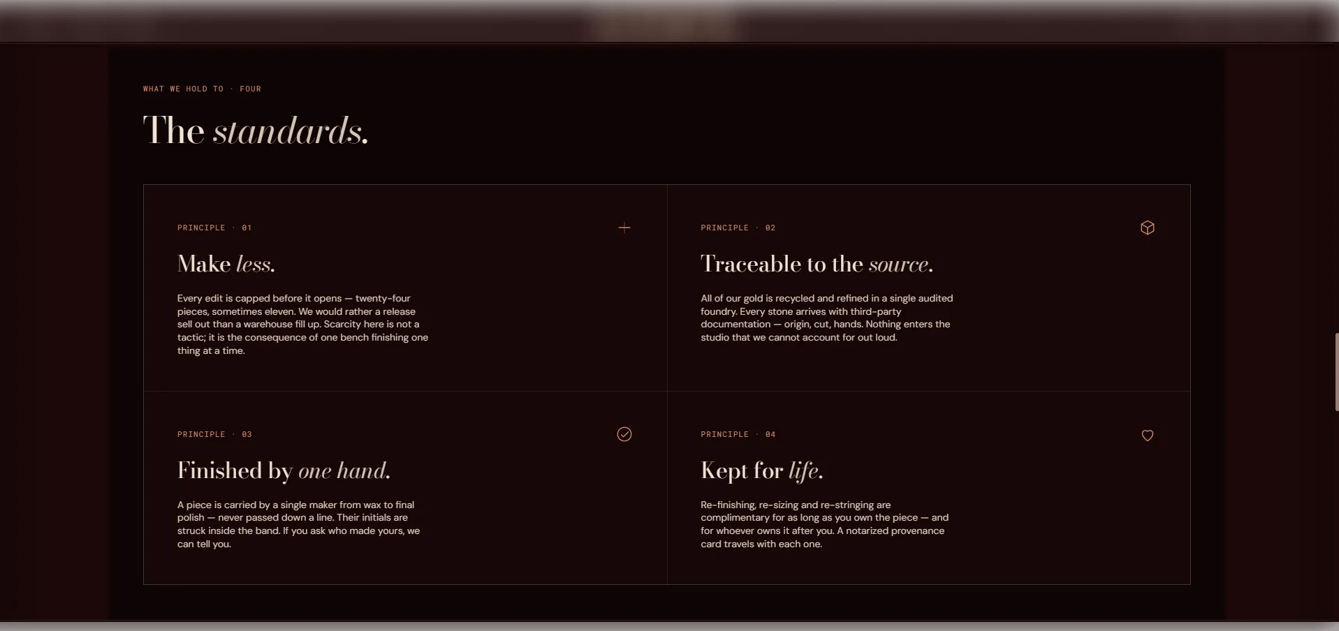
The **Values Grid** section presents your brand's core principles or commitments in a structured card grid. Each card features a numbered label, an icon (image, custom SVG, or preset), a title with italic support, and body text. It's designed for about pages, brand story pages, or anywhere you want to articulate your values in a visual and organized way.
 ### How to Add the Section
1. From your Shopify admin, go to **Online Store → Themes** and click **Customize**.
2. Navigate to the page where you want to add this section.
3. Click **Add section** and select **Values grid**.
4. Add **Value** blocks for each principle or commitment.
5. Click **Save**.
### Section Settings
#### Content
* **Eyebrow:** Small label above the heading.
* **Heading:** Main section heading. Supports rich text and italic emphasis.
* **Heading typography:** Select the typographic style. Includes a lede option for larger, editorial-style headings.
* **Link label / Link URL:** An optional CTA link displayed beside the heading.
#### Style
* **Full width:** When enabled, the section stretches edge-to-edge.
* **Color scheme:** Choose a color scheme for the section.
#### Spacing
* **Padding top / Padding bottom:** Control vertical spacing around the section.
***
### Value Block Settings
Each Value block is one principle card in the grid.
#### Identity
* **Number label:** A label or number for the principle (e.g., "Principle · 01").
#### Icon
* **Icon image:** Upload an image to use as the icon. Takes priority over SVG and preset icons.
* **Icon SVG:** Paste custom SVG path data for the icon. Takes priority over preset icons.
* **Icon:** Select a preset icon if no image or SVG is provided. Options: None, Minus-plus, Hexagon, Check-circle, Heart, Leaf, Star, Clock, or Shield.
#### Content
* **Title:** The principle heading. Supports rich text and italic emphasis.
* **Body:** Supporting description text for this principle.
### How to Add the Section
1. From your Shopify admin, go to **Online Store → Themes** and click **Customize**.
2. Navigate to the page where you want to add this section.
3. Click **Add section** and select **Values grid**.
4. Add **Value** blocks for each principle or commitment.
5. Click **Save**.
### Section Settings
#### Content
* **Eyebrow:** Small label above the heading.
* **Heading:** Main section heading. Supports rich text and italic emphasis.
* **Heading typography:** Select the typographic style. Includes a lede option for larger, editorial-style headings.
* **Link label / Link URL:** An optional CTA link displayed beside the heading.
#### Style
* **Full width:** When enabled, the section stretches edge-to-edge.
* **Color scheme:** Choose a color scheme for the section.
#### Spacing
* **Padding top / Padding bottom:** Control vertical spacing around the section.
***
### Value Block Settings
Each Value block is one principle card in the grid.
#### Identity
* **Number label:** A label or number for the principle (e.g., "Principle · 01").
#### Icon
* **Icon image:** Upload an image to use as the icon. Takes priority over SVG and preset icons.
* **Icon SVG:** Paste custom SVG path data for the icon. Takes priority over preset icons.
* **Icon:** Select a preset icon if no image or SVG is provided. Options: None, Minus-plus, Hexagon, Check-circle, Heart, Leaf, Star, Clock, or Shield.
#### Content
* **Title:** The principle heading. Supports rich text and italic emphasis.
* **Body:** Supporting description text for this principle.