How to Configure the About Us Page
- From your Shopify admin, go to Online Store → Themes and click Customize.
- From the top page dropdown, select Pages → About us (or your equivalent page).
- Click any section in the left sidebar under Template to open its settings.
- Click Save when done.
- Editorial header — masthead with heading, lede copy, and stat blocks
- Pull quote & body — large editorial quote with optional body blocks
- Values grid — principles grid with Value card blocks
- Image with text — alternating image/text rows
- Ateliers — atelier location cards
- Milestone timeline — brand history timeline
- Centered CTA — closing call-to-action with two buttons
Editorial Header Section Settings
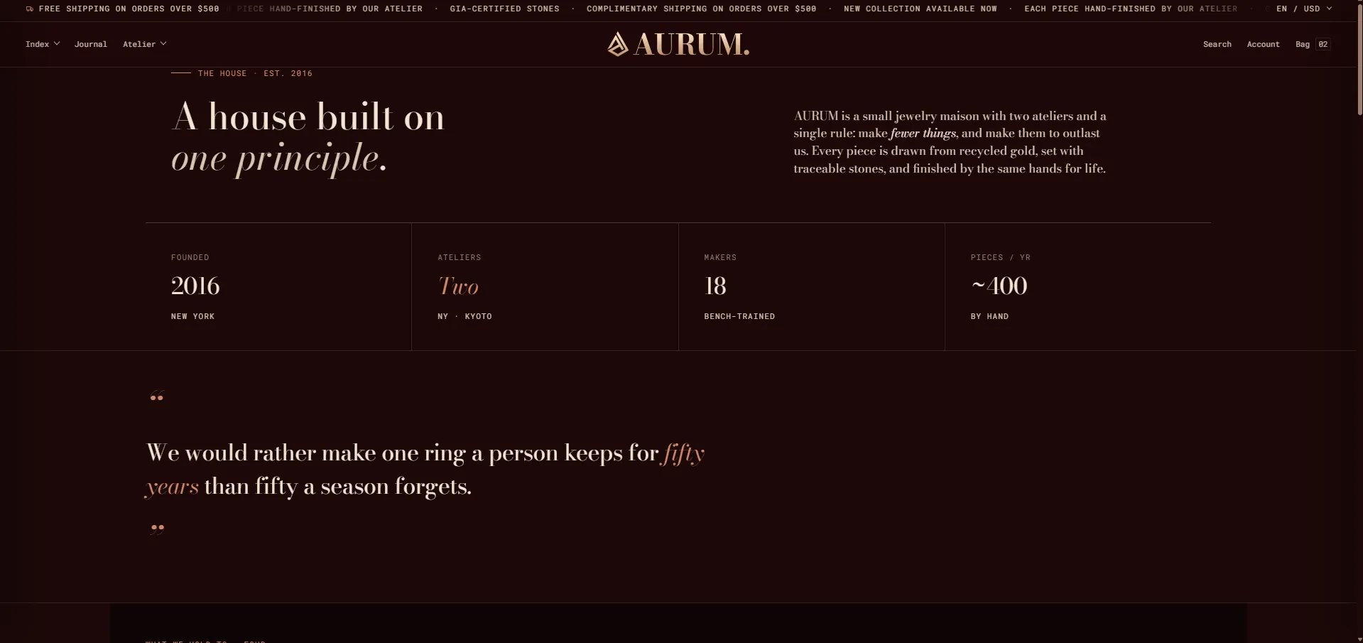
The Editorial Header is the masthead at the top of the about page — combining an eyebrow, heading, lede paragraph, and a row of Stat blocks that display key brand figures (year founded, number of ateliers, makers, annual pieces).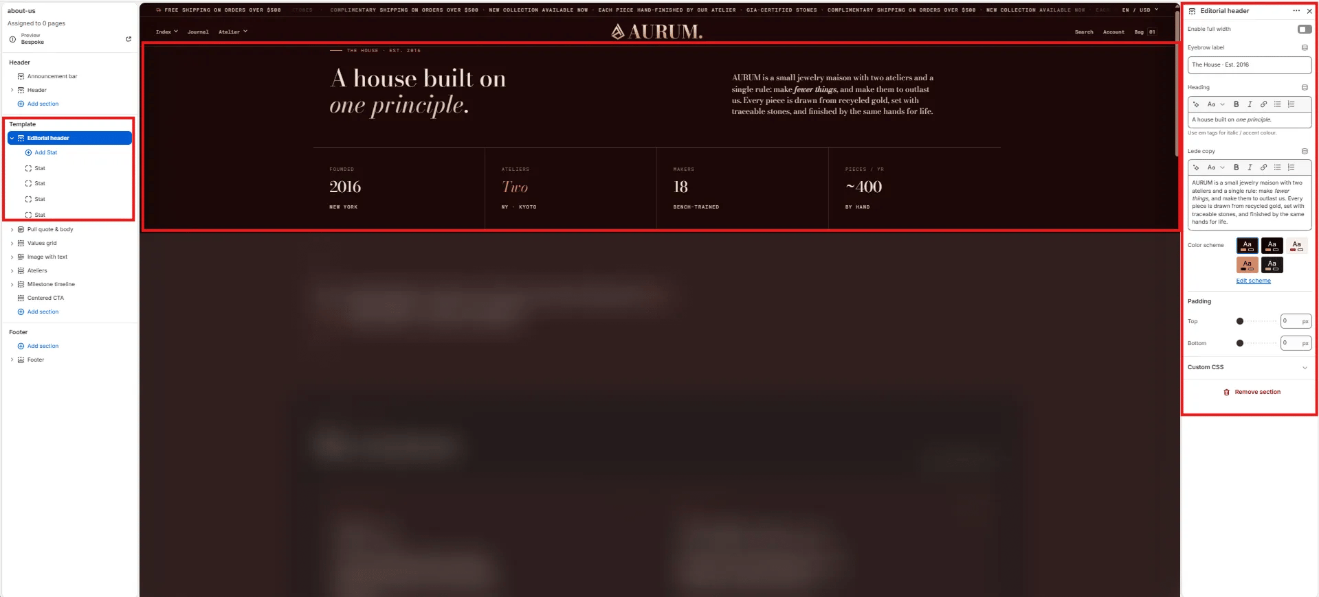
Content
- Enable full width: Toggle to extend the section edge-to-edge across the viewport.
- Eyebrow label: Small label above the heading (e.g., “The House · Est. 2016”).
- Heading: Main page heading. Supports rich text and italic emphasis (e.g., “A house built on one principle.”).
- Lede copy: Opening paragraph displayed to the right of the heading (e.g., “AURUM is a small jewelry maison with two ateliers and a single rule: make fewer things, and make them to outlast us.”).
Style
- Color scheme: Choose a color scheme for the section.
Spacing
- Padding top / Padding bottom: Control vertical spacing around the section.
Stat Block Settings
Each Stat block is one figure displayed in the horizontal stats row below the heading. Add multiple Stat blocks to build out your brand facts bar.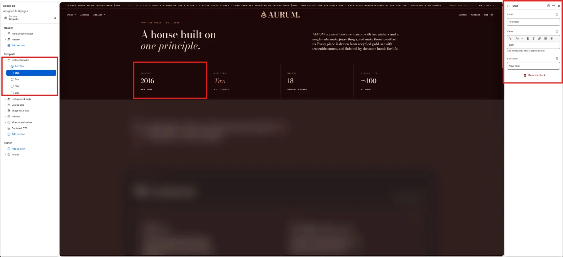
- Label: The stat category label shown above the value (e.g., “Founded”, “Ateliers”, “Makers”, “Pieces / yr”).
- Value: The main stat value, supports rich text and italic/accent color styling (e.g., “2016”, “Two”, “18”, “~400”).
- Sub-label: Secondary small text shown below the value (e.g., “New York”, “By · Kyoto”, “Bench-trained”, “By hand”).
Pull Quote & Body Section Settings
The Pull Quote & Body section renders a full-width large editorial quote — ideal for communicating a brand manifesto or founding philosophy in a single striking statement.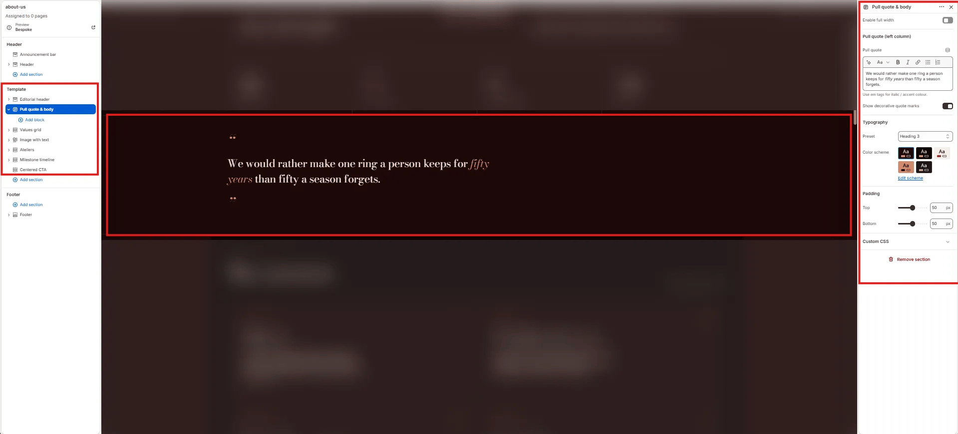
- Enable full width: Toggle to extend the section edge-to-edge.
- Pull quote: The large quote text displayed in the left column. Supports rich text and italic/accent colour styling (e.g., “We would rather make one ring a person keeps for fifty years than fifty a season forgets.”).
- Show decorative quote marks: Toggle to display large decorative opening and closing quotation marks above and below the quote text.
- Typography: Choose the typographic preset for the quote text (e.g., Heading 3).
- Color scheme: Choose a color scheme for the section.
- Padding top / Padding bottom: Control vertical spacing.
Values Grid Section Settings
The Values Grid section renders an editorial principle cards grid — each card features a principle number, icon, title, and body text. Use it to articulate your brand’s core values or standards.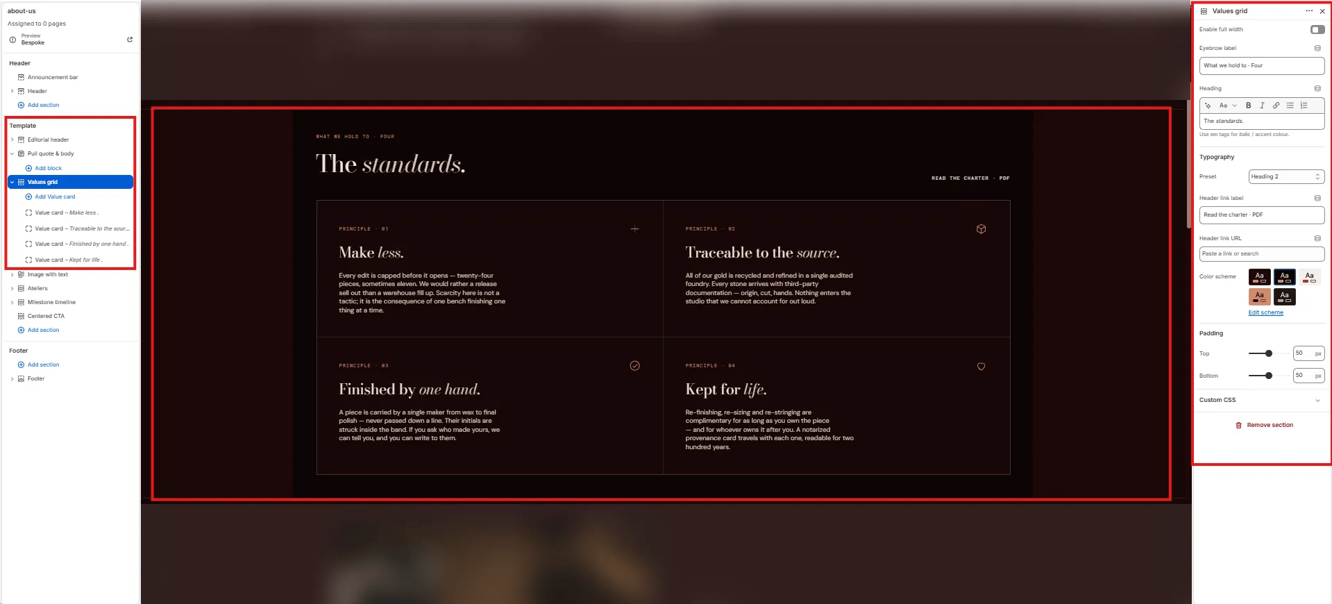
Content
- Enable full width: Toggle to extend the section edge-to-edge.
- Eyebrow label: Small label above the heading (e.g., “What we hold to · Four”).
- Heading: Section heading displayed above the grid (e.g., “The standards.”). Supports italic/accent colour.
- Typography: Choose the typographic preset for the heading (e.g., Heading 2).
- Header link label: Label for the optional link displayed top-right of the heading row (e.g., “Read the charter · PDF”).
- Header link URL: URL destination for the header link.
Style
- Color scheme: Choose a color scheme for the section.
Spacing
- Padding top / Padding bottom: Control vertical spacing.
Value Card Block Settings
Each Value Card block is one principle card in the grid. Cards display in a 2-column grid.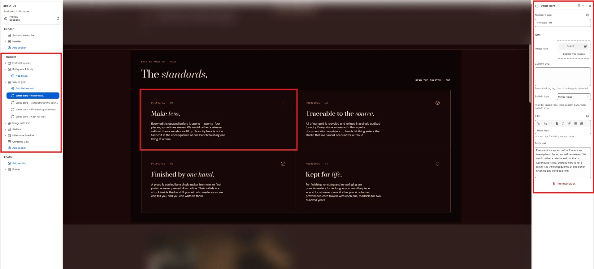
- Number / label: The card identifier displayed at the top (e.g., “Principle · 01”).
- Image icon: Upload a custom icon image for this card. Takes priority over the SVG and built-in icon.
- Custom SVG: Paste a full SVG tag to use as the card icon (used only if no image is uploaded).
- Built-in icon: Select a built-in icon from the theme icon set (e.g., “Minus / plus”, Heart, Diamond).
- Title: The card heading (e.g., “Make less.”). Supports italic/accent colour.
- Body text: The principle description displayed below the title.
Image With Text Section Settings
The Image With Text section renders alternating full-width image/text rows — each row has a large image on one side and editorial copy on the other, ideal for telling the craft and provenance story of the brand.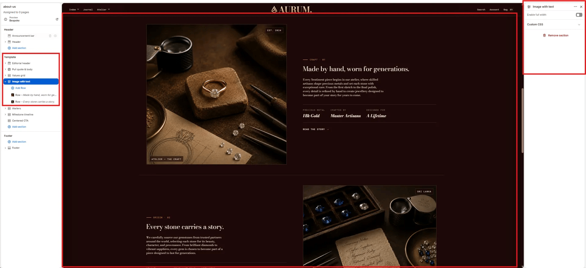
- Enable full width: Toggle to extend the section edge-to-edge.
Row Block Settings
Each Row block is one image/text pair within the Image with Text section. Multiple Row blocks stack vertically, alternating image position.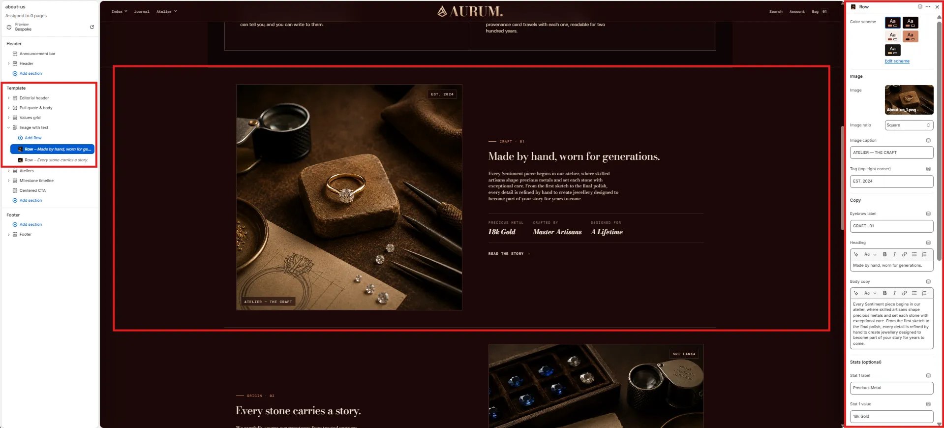
Style
- Color scheme: Choose a color scheme for this row.
Image
- Image: Upload the image for this row.
- Image ratio: Aspect ratio for the image — Square, Landscape, Portrait, or Adapt.
- Image caption: Small caption text displayed below the image (e.g., “ATELIER — THE CRAFT”).
- Tag (top-right corner): Short text badge overlaid in the top-right corner of the image (e.g., “EST. 2024”, “SRI LANKA”).
Copy
- Eyebrow label: Small label above the row heading (e.g., “CRAFT · 01”, “ORIGIN · 01”).
- Heading: Row heading displayed in the text column (e.g., “Made by hand, worn for generations.”).
- Body copy: Supporting paragraph text below the heading.
Stats (optional)
Up to three stat pairs displayed in a small row below the body copy:- Stat 1–3 label / value: Label and value for each stat (e.g., “Precious Metal / 18k Gold”, “Crafted by / Master Artisans”, “Designed for / A Lifetime”).
Ateliers Section Settings
The Ateliers section renders a side-by-side atelier location card grid — each Location block contains address, operational details, and action buttons for directions and viewing bookings.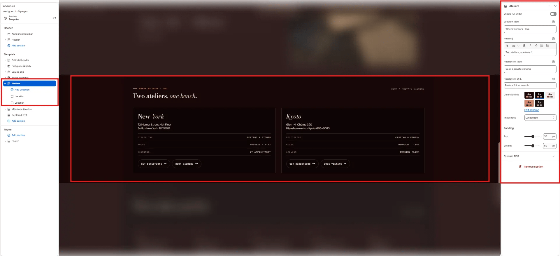
Content
- Enable full width: Toggle to extend the section edge-to-edge.
- Eyebrow label: Small label above the heading (e.g., “Where we work · Two”).
- Heading: Section heading (e.g., “Two ateliers, one bench.”). Supports italic/accent colour.
- Header link label: Label for the link on the right side of the heading row (e.g., “Book a private viewing”).
- Header link URL: URL destination for the header link.
Style
- Color scheme: Choose a color scheme for the section.
- Image ratio: Aspect ratio for atelier images — Landscape, Portrait, or Square.
Spacing
- Padding top / Padding bottom: Control vertical spacing.
Location Block Settings
Each Location block is one atelier card in the grid.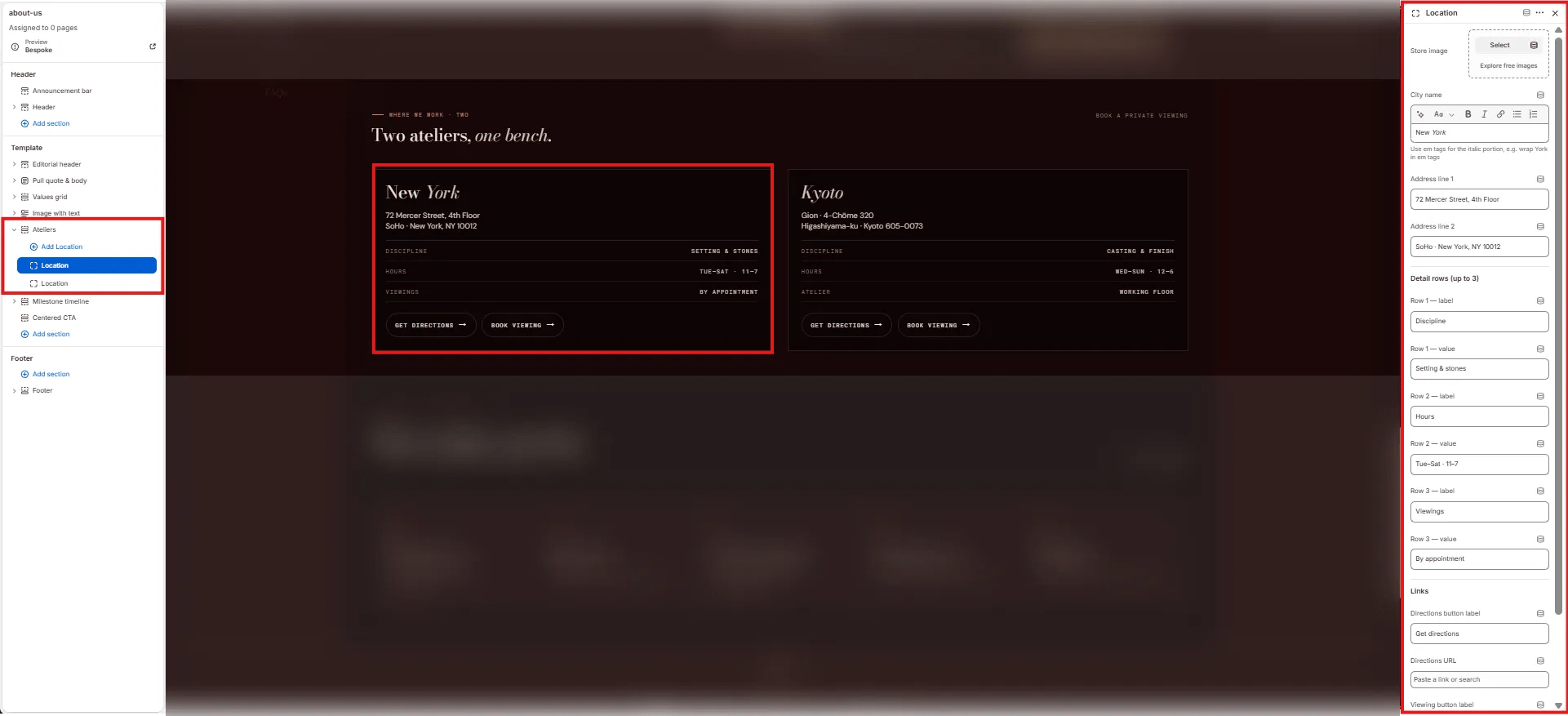
- Store image: Upload a photo of the atelier location.
- City name: The city name displayed as the card heading. Supports italic/accent colour (e.g., “New York”, “Kyoto”).
- Address line 1: First line of the atelier address (e.g., “72 Mercer Street, 4th Floor”).
- Address line 2: Second line of the address (e.g., “SoHo · New York, NY 10012”).
- Row 1–3 label / value: (e.g., “Discipline / Setting & stones”, “Hours / Tue–Sat · 11–7”, “Viewings / By appointment”).
- Directions button label: Label for the directions CTA (e.g., “Get directions”).
- Directions URL: Link to Google Maps or equivalent.
- Viewing button label: Label for the booking CTA (e.g., “Book viewing”).
- Viewing URL: Link to the viewing booking page.
Milestone Timeline Section Settings
The Milestone Timeline section renders a horizontal scrollable brand history timeline — each Milestone block is one card in the chronological sequence.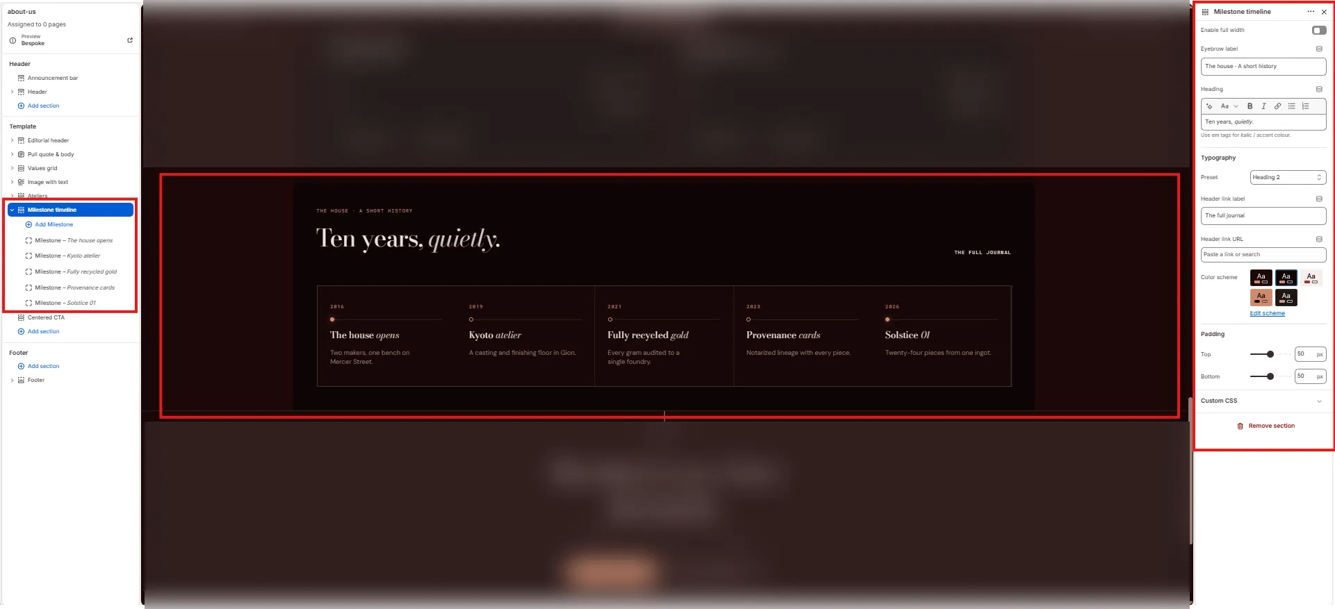
Content
- Enable full width: Toggle to extend the section edge-to-edge.
- Eyebrow label: Small label above the heading (e.g., “The house · A short history”).
- Heading: Section heading (e.g., “Ten years, quietly.”). Supports italic/accent colour.
- Typography: Choose the typographic preset for the heading (e.g., Heading 2).
- Header link label: Label for the link on the right side of the heading (e.g., “The full journal”).
- Header link URL: URL destination for the header link.
Style
- Color scheme: Choose a color scheme for the section.
Spacing
- Padding top / Padding bottom: Control vertical spacing.
Milestone Block Settings
Each Milestone block is one event card in the timeline.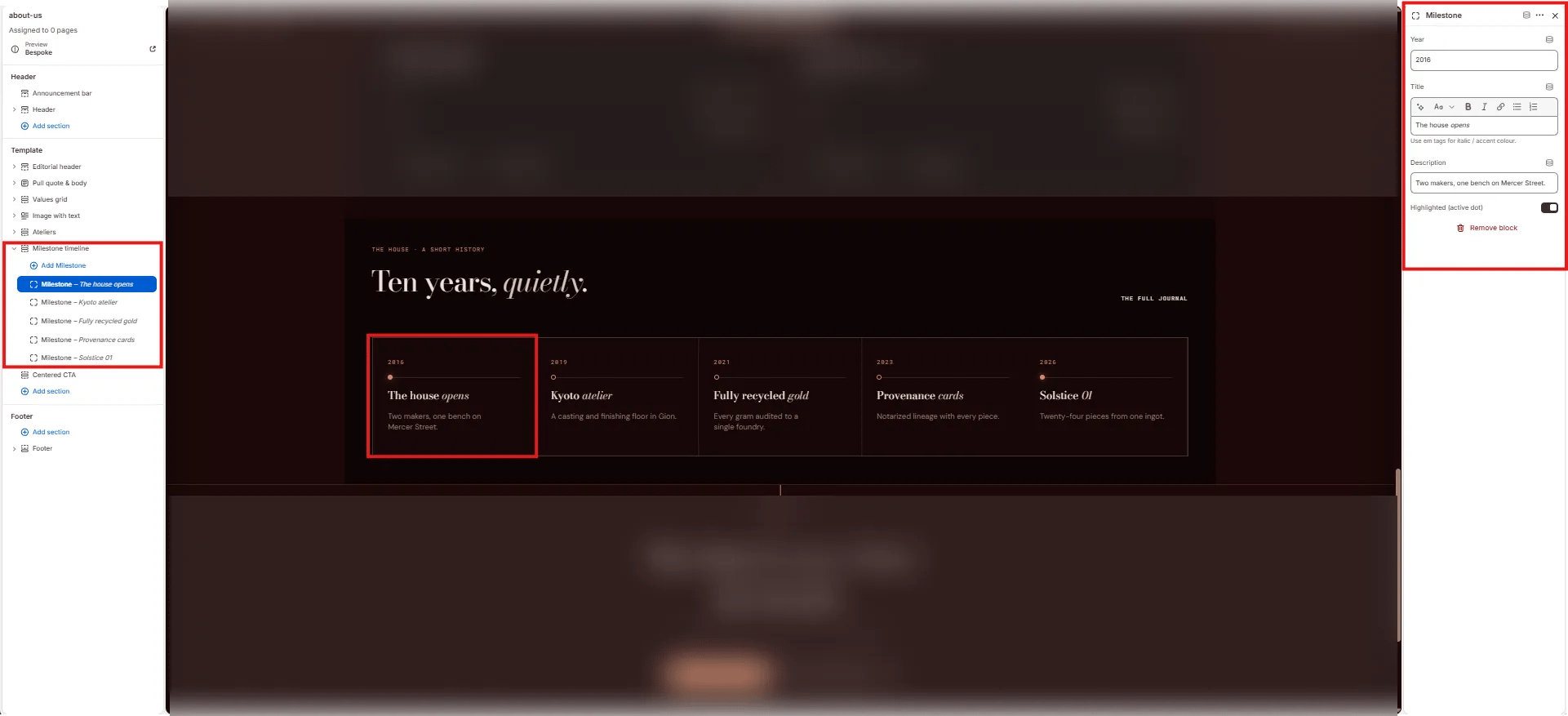
- Year: The year displayed at the top of the milestone card (e.g., “2016”, “2019”).
- Title: The milestone heading. Supports italic/accent colour (e.g., “The house opens”, “Kyoto atelier”).
- Description: Short description displayed below the title (e.g., “Two makers, one bench on Mercer Street.”).
- Highlighted (active dot): Toggle to mark this milestone with a filled accent dot — use for the most recent or most significant milestone.
Centered CTA Section Settings
The Centered CTA section renders a full-width closing section with a centered eyebrow, heading, sub-text, and two side-by-side CTA buttons — typically used to invite visitors to book a viewing or explore the journal.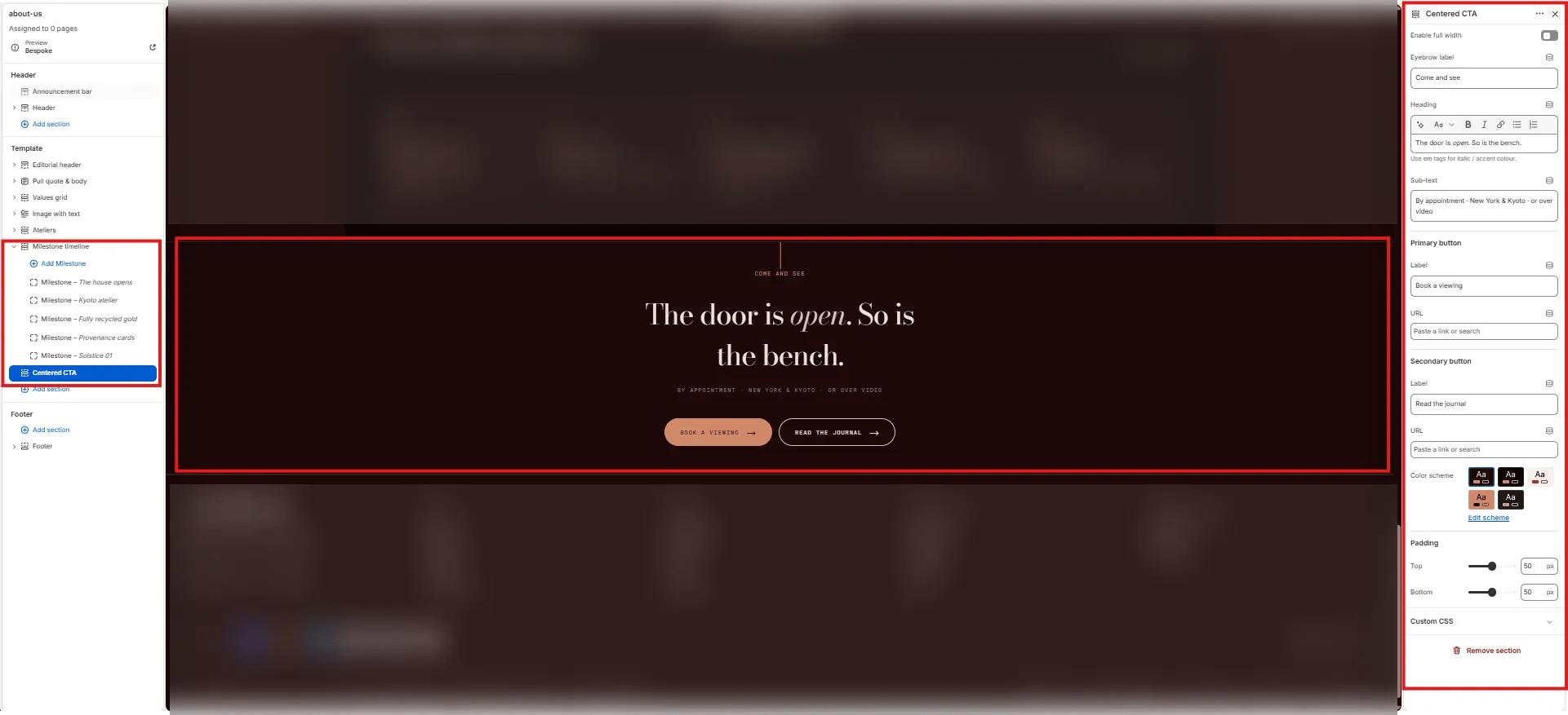
- Enable full width: Toggle to extend the section edge-to-edge.
- Eyebrow label: Small label above the heading (e.g., “Come and see”).
- Heading: Main CTA heading. Supports italic/accent colour (e.g., “The door is open. So is the bench.”).
- Sub-text: Supporting text below the heading (e.g., “By appointment · New York & Kyoto · or over video”).
- Primary button label: Label for the filled/accent primary button (e.g., “Book a viewing”).
- Primary button URL: Link for the primary button.
- Secondary button label: Label for the outlined secondary button (e.g., “Read the journal”).
- Secondary button URL: Link for the secondary button.
- Color scheme: Choose a color scheme for the section.
- Padding top / Padding bottom: Control vertical spacing.