How to Add the Section
- From your Shopify admin, go to Online Store → Themes and click Customize.
- Navigate to the page where you want to add this section.
- Click Add section and select Product carousel.
- Select a collection, fill in the content fields, and click Save.
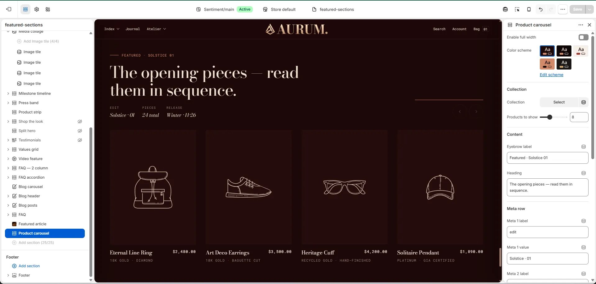
Section Settings
Content
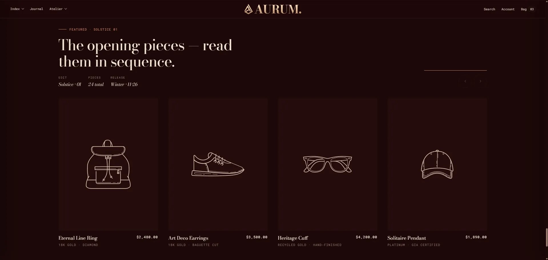
- Eyebrow: Small label above the heading.
- Heading: Main section heading.
- Meta 1 / 2 / 3 — Label & Value: Three metadata pairs displayed alongside the heading (e.g., “Edit / Solstice · 01”, “Pieces / 24 total”, “Release / Winter · 11·26”).
- View all label: The label on the view-all CTA button.
- View all URL: The link for the view-all button. Falls back to the collection URL if left blank.
Source & Display
- Full width: When enabled, the section stretches edge-to-edge.
- Collection: Select the Shopify collection to pull products from.
- Products to show: Number of products to display in the carousel (range: 4–16).
Style
- Color scheme: Choose a color scheme for the section.
Spacing
- Padding top / Padding bottom: Control vertical spacing around the section.