How to Add the Section
- From your Shopify admin, go to Online Store → Themes and click Customize.
- Navigate to the page where you want to add this section.
- Click Add section and select Collection rail.
- Add Tile blocks for each collection category (up to 12 tiles).
- Click Save.
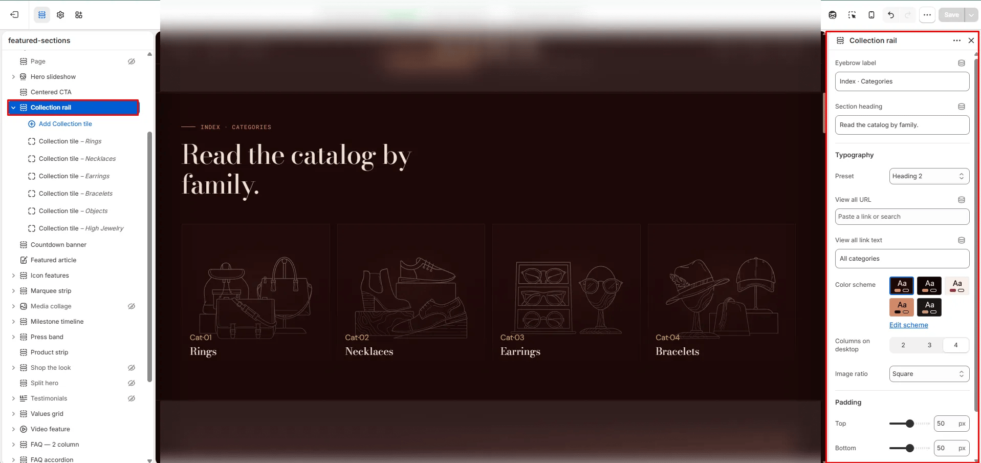
Section Settings
Content
- Eyebrow: Small label displayed above the heading.
- Heading: Main section heading.
- Heading typography: Select the typographic style for the heading.
- View all URL / View all label: Link and label for an optional “view all” CTA.
Display
- Columns desktop: Number of tile columns on desktop (2, 3, or 4).
- Image ratio: Aspect ratio for all tile images — Portrait, Square, Landscape, or Adapt.
Style
- Color scheme: Choose a color scheme for the section.
Spacing
- Padding top / Padding bottom: Control vertical spacing around the section.
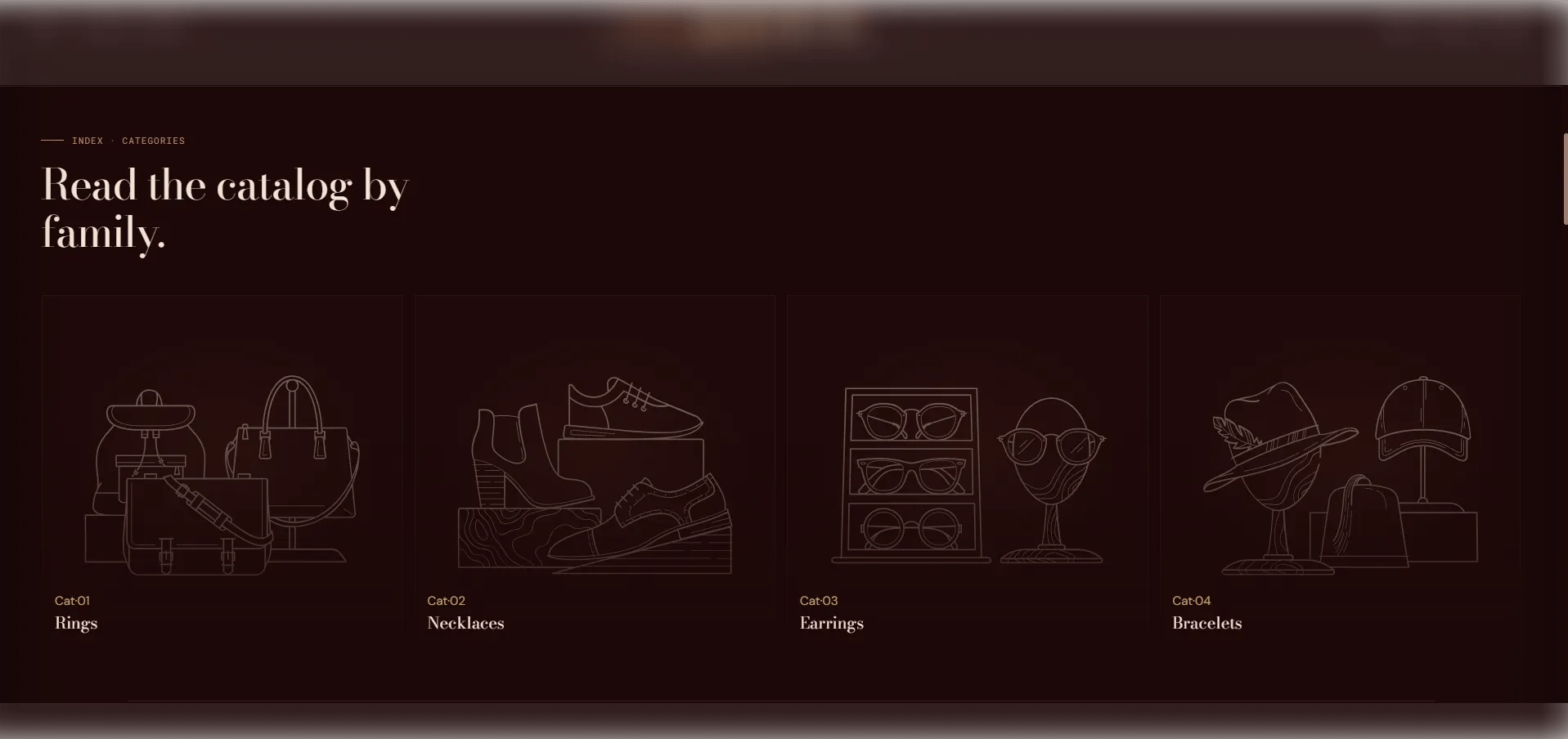
Tile Block Settings
Each Tile block is one collection category card. You can add up to 12 tiles.Source
- Collection: Select the Shopify collection this tile links to.
- URL: A fallback link used if no collection is selected.
Content
- Title: The display title for the tile. Defaults to the collection name if left blank.
- Number: A label or sequence number displayed on the tile (e.g., “Cat · 01”).
- Piece count: A manual piece count displayed on the tile when no collection is linked.
Image
- Image: Upload a custom image to override the collection’s default image for this tile.