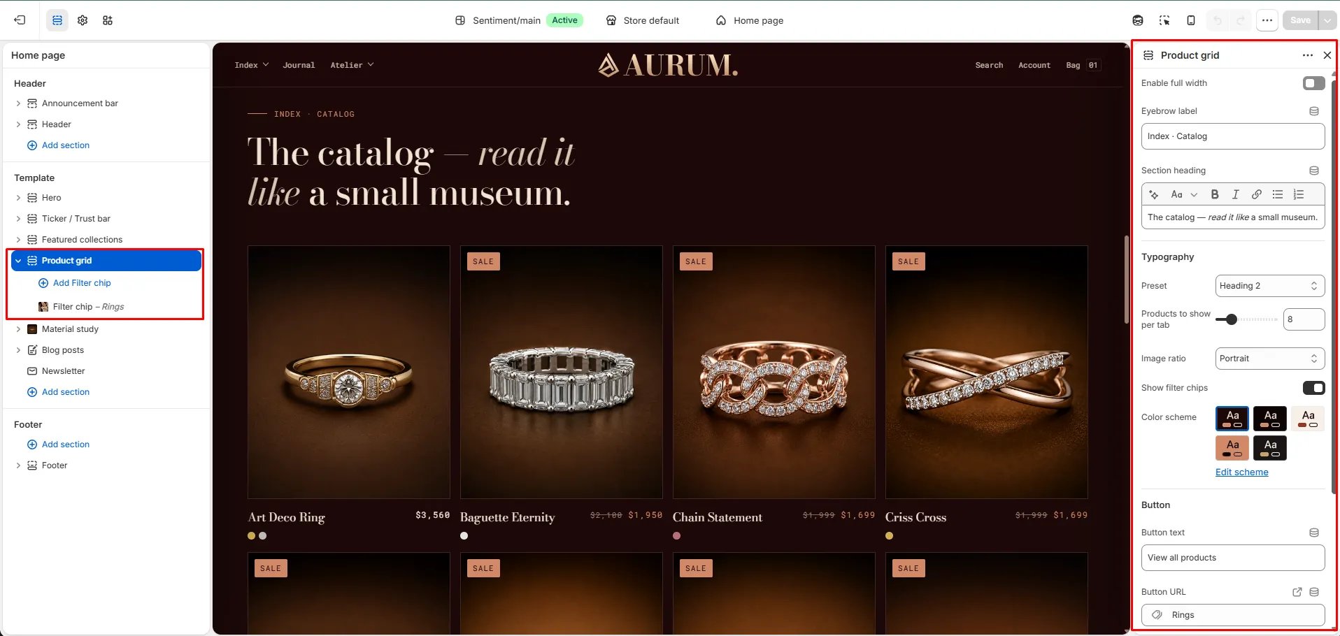
How to Add the Section
- From your Shopify admin, go to Online Store → Themes and click Customize.
- Navigate to the page where you want to add this section.
- Click Add section and select Product grid.
- Add Filter chip blocks to define which collections appear as tabs.
- Click Save.
Section Settings
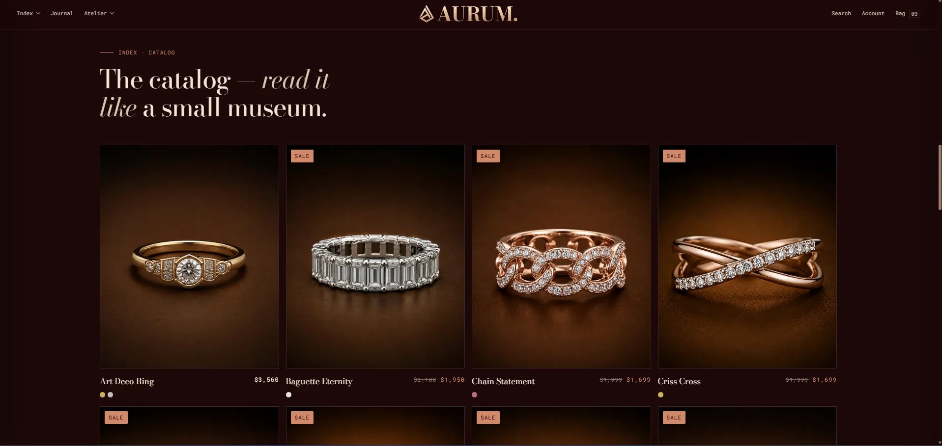
Content
- Eyebrow: Small label above the heading.
- Heading: Main section heading. Supports rich text and italic emphasis.
- Heading typography: Select the typographic style for the heading.
- CTA text / URL: An optional call-to-action link displayed below the product grid.
Display
- Full width: When enabled, the section stretches edge-to-edge.
- Products to show: Number of products to display per collection tab (range: 4–24, step 4).
- Image ratio: Aspect ratio for product card images — Portrait, Square, Landscape, or Adapt.
- Show filters: When enabled, collection filter chip tabs appear above the grid when 2 or more Filter chip blocks are added.
Style
- Color scheme: Choose a color scheme for the section.
Spacing
- Padding top / Padding bottom: Control vertical spacing around the section.
Filter Chip Block Settings
Each Filter chip block adds one collection tab to the grid. Add two or more blocks to activate the tabbed filter.- Collection: Select the Shopify collection whose products will be displayed when this tab is active.
- Label: A custom label for the tab chip. Defaults to the collection title if left blank.