
How to Configure the Product Page
- From your Shopify admin, go to Online Store → Themes and click Customize.
- From the top page dropdown, select Products → Default product (or navigate to a specific product).
- Click any section or block in the left sidebar under Template to open its settings.
- Adjust settings in the right panel, then click Save.
- Product media — image gallery / carousel
- Product title — name, vendor, SKU, collection
- Product rating — star rating display
- Product price — price, compare-at price, installments
- Variant picker — material/color/size selectors
- Buy buttons — add to bag + buy now
- Trust signals — icon + label trust bar
- Pairs with — curated product pairings
- Description — collapsible product description
- Complementary products — app-powered recommendations
- Accordion — expandable content rows (Materials & care, Shipping & returns, Provenance & certification)
- Concierge — private viewing CTA
- Craftsmanship band — editorial brand strip
- Related products — “You may also like” grid
Product Section Settings
The top-level Product section controls the size guide panel, sticky layout behaviour, and the add-to-cart bar.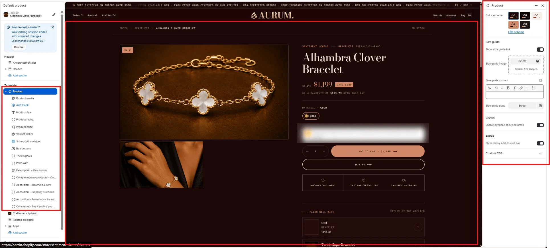
Size Guide
- Show size guide link: Toggle to display a size guide link near the variant picker. When enabled, clicking it opens the size guide panel.
- Size guide image: Upload an image (e.g., a measurement chart) to display inside the size guide panel.
- Size guide content: Rich text field for size guide copy — include measurements, fit notes, or material care tips.
- Size guide page: Optionally link to a full size guide page for a “View full guide” link inside the panel.
Layout
- Enable dynamic sticky columns: When enabled, the product info column sticks to the viewport as the customer scrolls through the media gallery on desktop.
Extras
- Show sticky add-to-cart bar: Displays a persistent bottom bar with the product name, price, and add-to-bag button as the customer scrolls past the main buy buttons.
Product Media Block Settings
The Product Media block controls the image gallery on the left side of the product layout — including layout style, aspect ratio, video behaviour, and variant image filtering.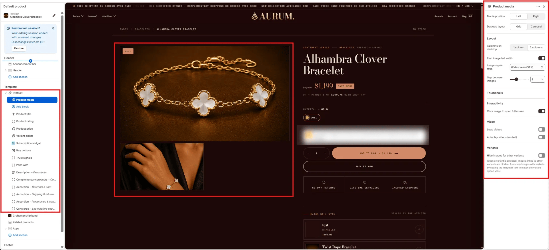
Position
- Media position: Choose Left (default) or Right to place the gallery on either side of the product info column.
- Desktop layout: Grid displays all images in a stacked grid; Carousel shows one image at a time with navigation arrows.
Layout
- Columns on desktop: Show the gallery in 1 column (single wide) or 2 columns (mosaic grid).
- First image full width: When enabled in 2-column layout, the first image spans the full width before the grid begins.
- Image aspect ratio: Sets the crop ratio for all gallery images — Widescreen (16:9), Landscape, Square, Portrait, or Adapt (original).
- Gap between images: Controls the pixel gap between images in the grid (range: 0–20 px).
Thumbnails
Thumbnail strip navigation appears automatically in Carousel layout mode.Interactivity
- Click image to open fullscreen: When enabled, clicking any image opens a fullscreen lightbox viewer.
Video
- Loop videos: When enabled, product videos loop continuously.
- Autoplay videos (muted): When enabled, videos auto-play without sound when the gallery loads.
Variants
- Hide images for other variants: When a variant is selected, images linked to other variants are hidden. To associate images with a specific variant, set the image alt text to match the variant option value exactly.
Product Title Block Settings
The Product Title block renders the product name, breadcrumb meta (vendor, collection, SKU), and the HTML heading tag used for SEO.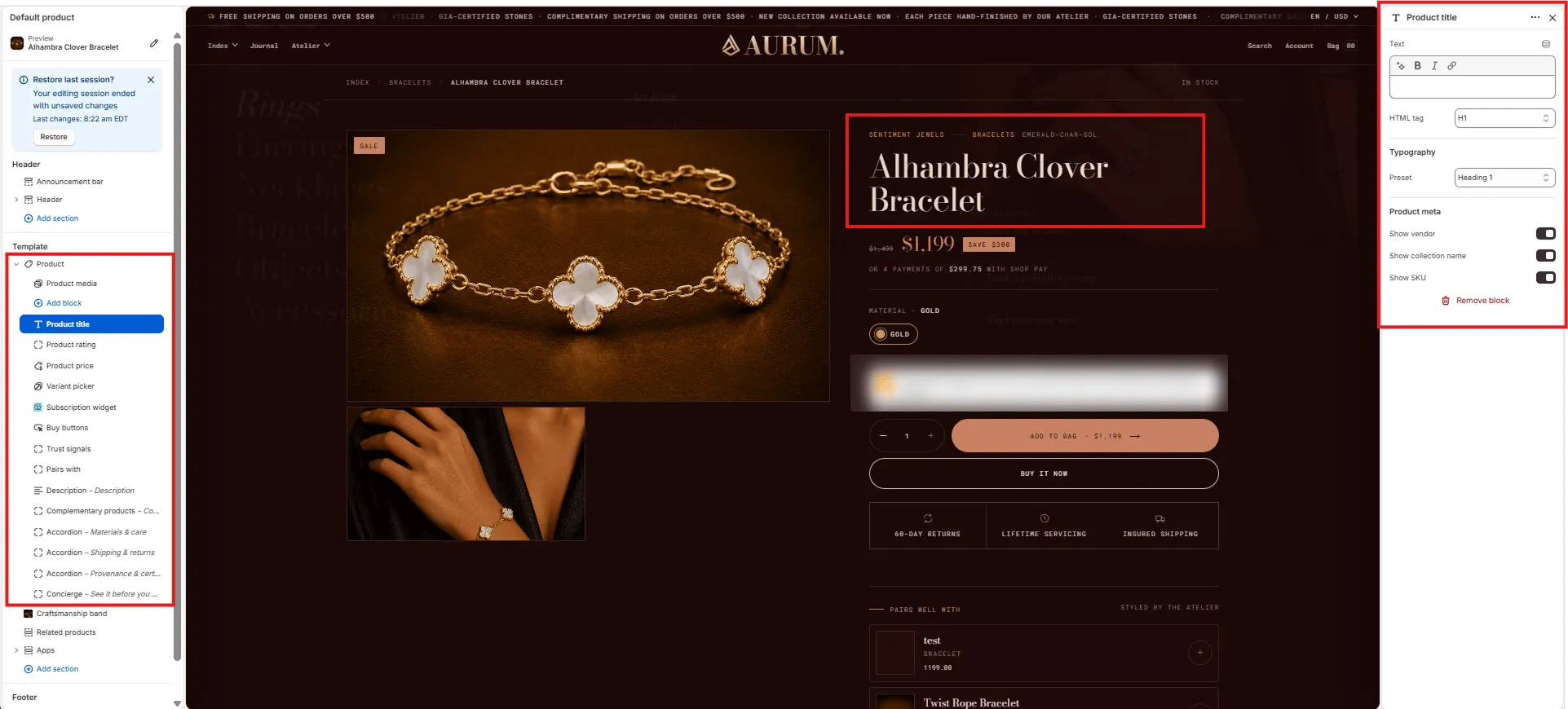
Content
- Text: Override the product title text displayed on the page (leave blank to use the Shopify product title).
- HTML tag: Select the heading tag for the product name — H1 (recommended for SEO) or H2.
Typography
- Preset: Choose the typographic style for the title from your theme’s heading presets (e.g., Heading 1, Heading 2).
Product Meta
- Show vendor: Toggle to display the product vendor name above the title.
- Show collection name: Toggle to display the primary collection name above the title.
- Show SKU: Toggle to display the product SKU below the title.
Product Price Block Settings
The Product Price block displays the current price, compare-at (original) price, any active sale badge, and an optional installment payment message.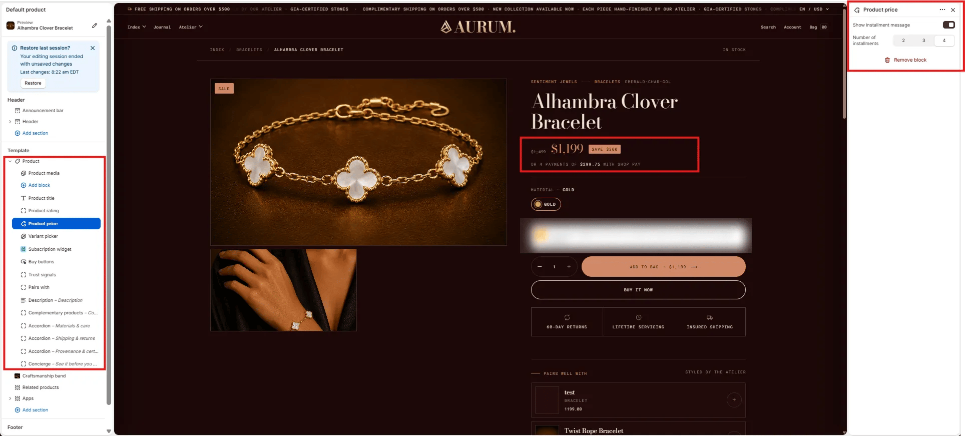
Installments
- Show installment message: Toggle to display a “or X payments of $Y with Shop Pay” message below the price. Requires Shop Pay Installments to be active on your store.
- Number of installments: Set the number of installment payments shown in the message — 2, 3, or 4.
Variant Picker Block Settings
The Variant Picker block renders the product option selectors (e.g., Material, Size, Color) that customers use to choose a specific variant before adding to bag.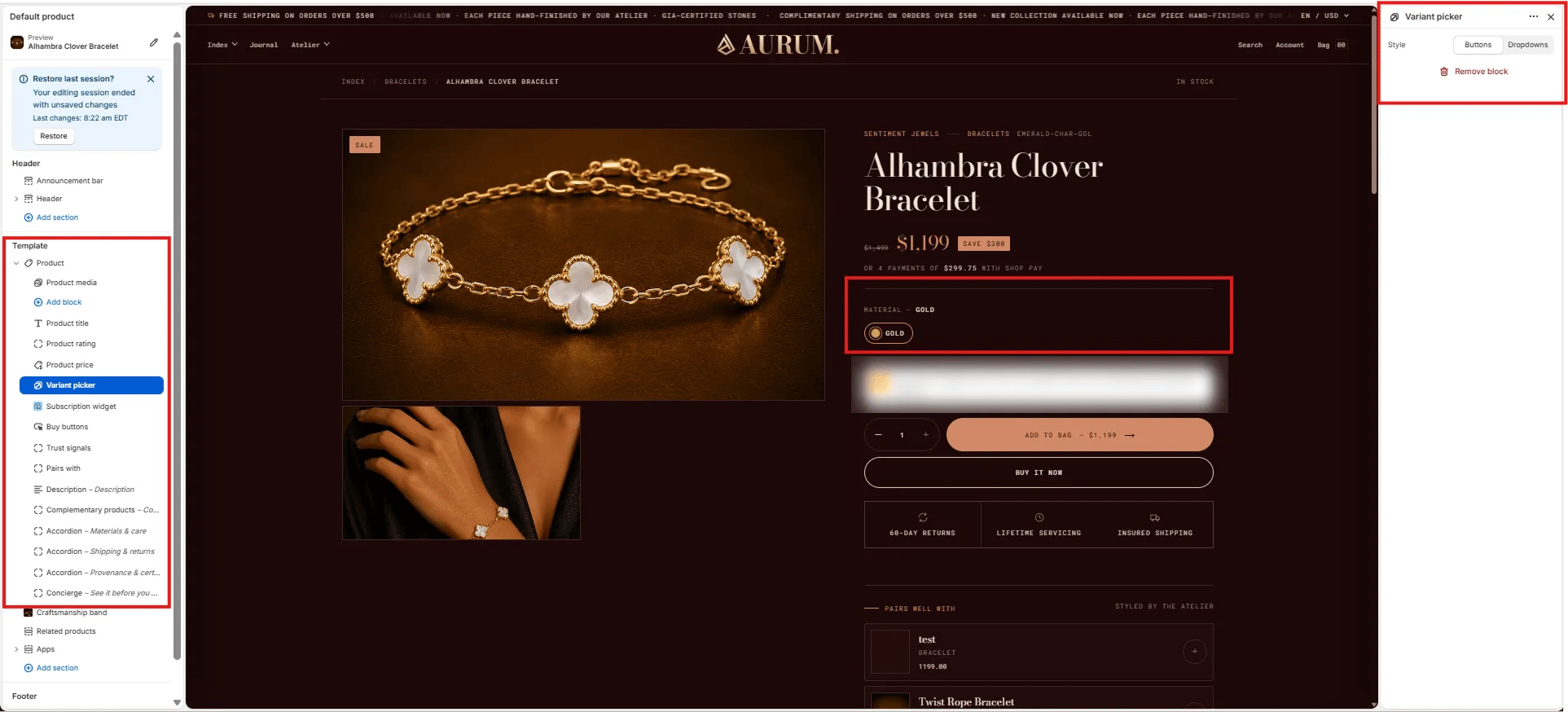
Style
- Style: Choose between Buttons (visual swatches or pill buttons) or Dropdowns (select menus). Buttons work best for color/material options; dropdowns suit options with many values.
Buy Buttons Block Settings
The Buy Buttons block renders the main purchase actions — the quantity selector, Add to Bag button, and Buy It Now button.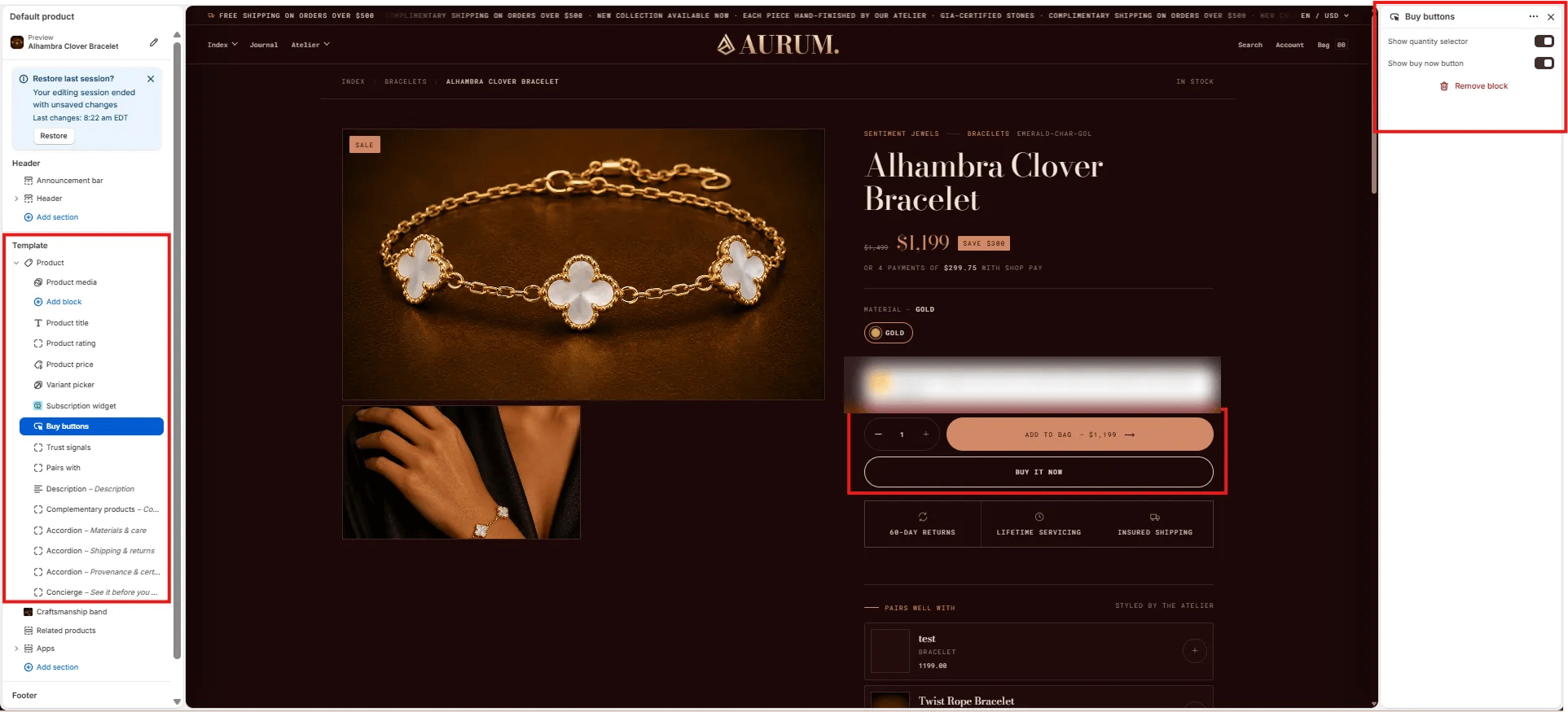
- Show quantity selector: Toggle to show or hide the quantity +/− stepper next to the add-to-bag button.
- Show buy now button: Toggle to show or hide the Buy It Now accelerated checkout button below the add-to-bag button.
Trust Signals Block Settings
The Trust Signals block renders a row of up to three icon + label trust indicators below the buy buttons — such as return policy, servicing, and shipping guarantees.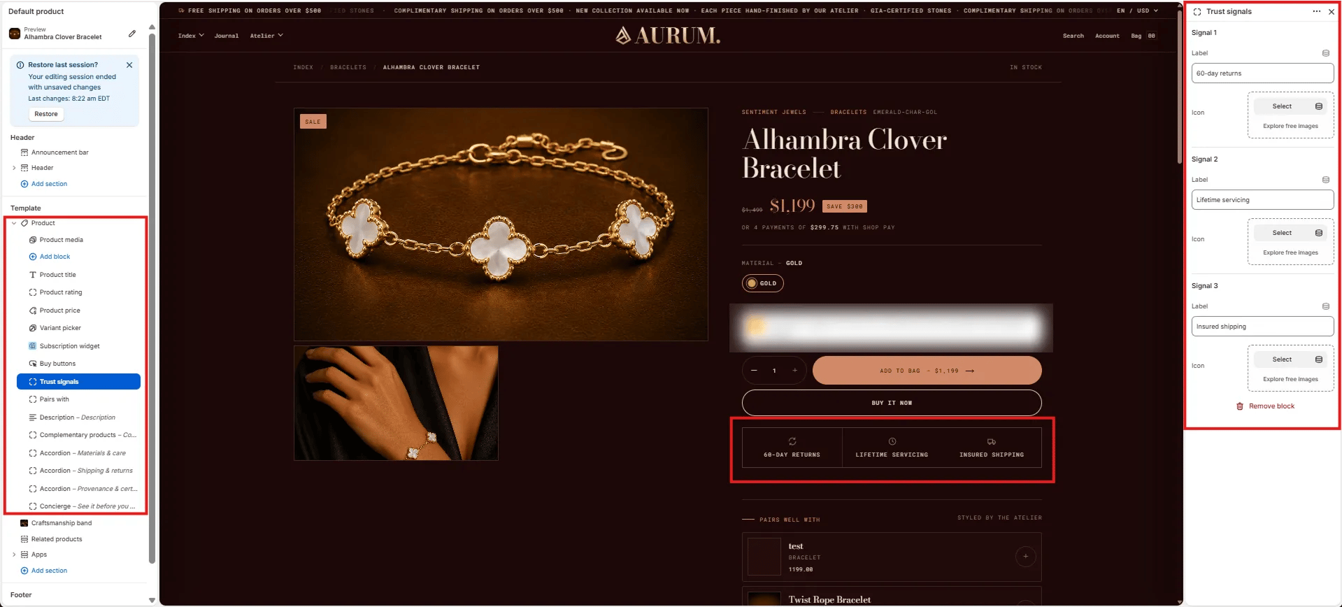
- Label: Short trust statement displayed below the icon (e.g., “60-day returns”, “Lifetime servicing”, “Insured shipping”).
- Icon: Upload a custom icon image for this signal. Use simple, outlined icons at a small size for best results.
Pairs With Block Settings
The Pairs With block renders a curated “Pairs well with” product panel below the trust signals, showing complementary items that can be added together in one action.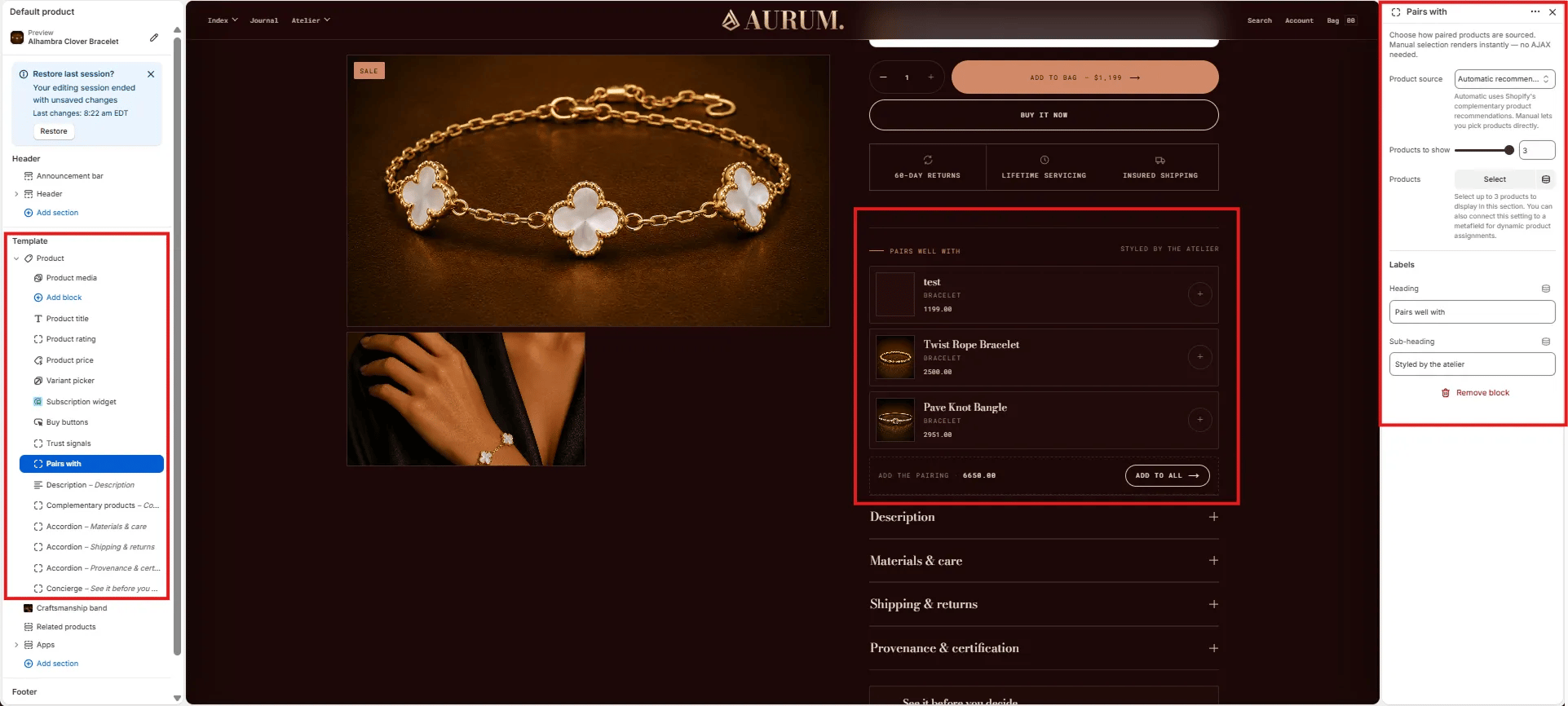
Source
- Product source: Choose Automatic (uses Shopify’s complementary product recommendations — no AJAX required) or Manual to hand-pick specific products. Manual selection renders instantly without additional API calls.
- Products to show: Number of paired products displayed (range: 1–3).
- Products: If using Manual source, select the specific products to feature as pairings.
Labels
- Heading: Label displayed above the pairing list (e.g., “Pairs well with”).
- Sub-heading: Secondary label on the right side of the heading row (e.g., “Styled by the atelier”).
Description Block Settings
The Description block renders the product’s Shopify description in a collapsible accordion row within the product info column.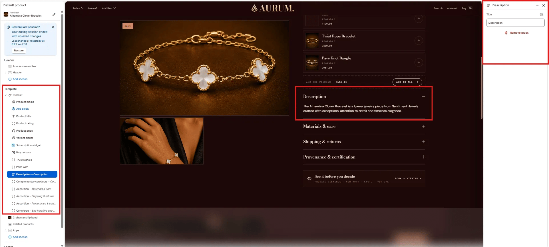
- Title: The accordion row label displayed as the toggle heading (default: “Description”). Customize this label to match your brand voice.
Complementary Products Block Settings
The Complementary Products block renders a collapsible panel of algorithm-driven product recommendations sourced from the Shopify Search & Discovery app. Complementary products must be configured in the app before this block shows products on the storefront.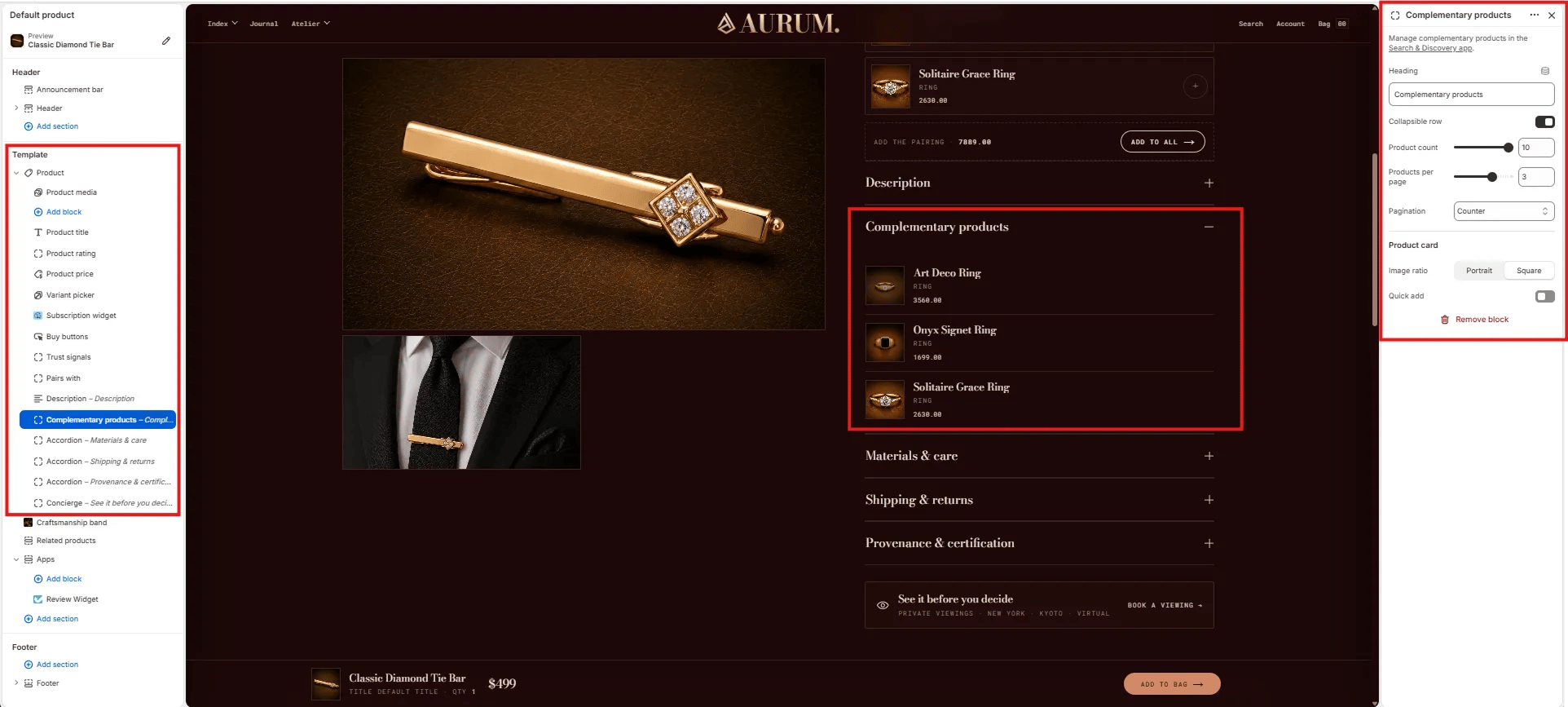
Content
- Heading: The accordion row label for the complementary products panel (default: “Complementary products”).
- Collapsible row: Toggle to render the block as a collapsible accordion row (on) or always-expanded (off).
Display
- Product count: Total number of complementary products to fetch (range: 1–10).
- Products per page: Number of products shown per page within the panel (range: 1–5).
- Pagination: Choose the pagination style — Counter (e.g., “1 / 3”) or dots.
Product Card
- Image ratio: Aspect ratio for product thumbnail images — Portrait or Square.
- Quick add: Toggle to show a quick add-to-cart button on each product card.
Accordion Block Settings
The Accordion block creates a collapsible content row within the product info column. Multiple Accordion blocks can be added to build a full product details panel — commonly used for Materials & care, Shipping & returns, and Provenance & certification.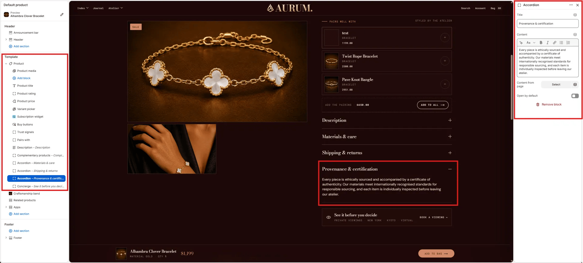
- Title: The accordion row heading (e.g., “Materials & care”, “Shipping & returns”, “Provenance & certification”).
- Content: Rich text content displayed when the accordion row is expanded. Supports bold, italic, links, and lists.
- Content from page: Optionally pull the accordion content from a Shopify page — useful for managing long-form policy content centrally.
- Open by default: Toggle to have this accordion row expanded when the page loads (default: collapsed).
Concierge Block Settings
The Concierge block renders a full-width “see it before you decide” CTA bar at the bottom of the product info column, inviting customers to book a private viewing appointment.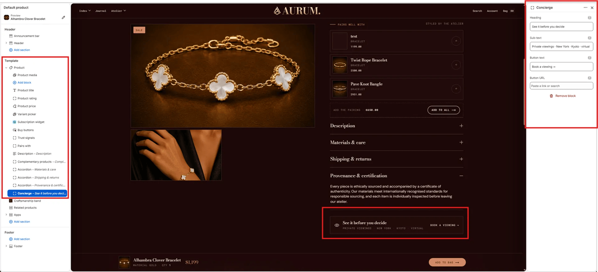
- Heading: The primary text for the concierge bar (e.g., “See it before you decide”).
- Sub-text: Secondary text below the heading, typically listing viewing locations (e.g., “Private viewings · New York · Kyoto · virtual”).
- Button text: Label on the CTA button (e.g., “Book a viewing →”).
- Button URL: Link destination for the button — paste a URL or search for a page.
Craftsmanship Band Section Settings
The Craftsmanship Band section renders a full-width editorial strip below the product info column, combining an artisan image, an eyebrow label, a heading, body text, and a three-column facts row — communicating brand craft values directly on the product page.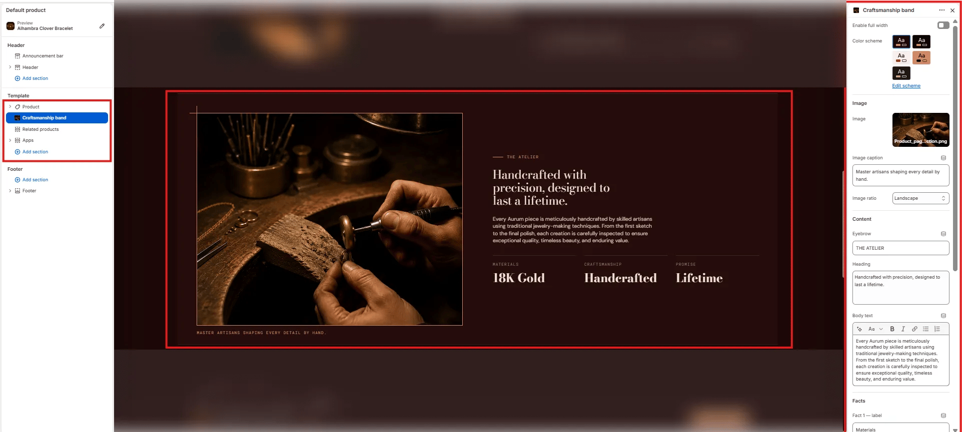
Layout
- Enable full width: Toggle to extend the section edge-to-edge across the viewport.
Style
- Color scheme: Choose a color scheme for the section background and text.
Image
- Image: Upload an artisan or process image for the left column.
- Image caption: Small caption text displayed below the image (e.g., “Master artisans shaping every detail by hand.”).
- Image ratio: Aspect ratio for the image — Landscape, Portrait, Square, or Adapt.
Content
- Eyebrow: Small label above the heading (e.g., “THE ATELIER”).
- Heading: Main editorial heading (e.g., “Handcrafted with precision, designed to last a lifetime.”).
- Body text: Supporting paragraph text below the heading.
Facts
- Fact label / value pairs: Up to three short stat columns displayed below the body text (e.g., “Materials / 18K Gold”, “Craftsmanship / Handcrafted”, “Promise / Lifetime”).
Related Products Section Settings
The Related Products section renders a full-width product grid below the craftsmanship band, showing items from the same collection under a “You may also like” heading.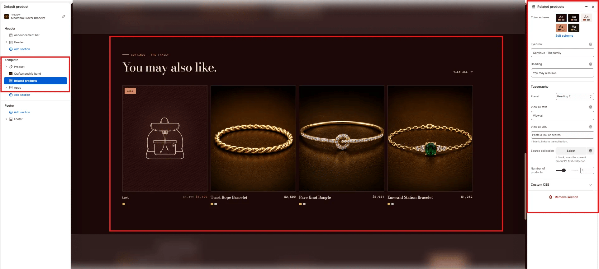
Content
- Eyebrow: Small label above the heading (e.g., “Continue · The family”).
- Heading: Main section heading (e.g., “You may also like.”).
- Typography: Typographic preset for the heading (e.g., Heading 2).
- View all text: Label for the “View all” link (default: “View all”).
- View all URL: Destination for the “View all” link. Leave blank to auto-link to the source collection.
Source
- Source collection: Select a specific collection to pull related products from. If left blank, the section uses the current product’s first collection automatically.
- Number of products: Number of product cards to show in the grid (range: 2–8, default: 4).