How to Configure the Password Page
- From your Shopify admin, go to Online Store → Themes and click Customize.
- From the top page dropdown, select Password.
- Click Password in the left sidebar under Template to open its settings.
- Click Save when done.
To enable or disable password protection, go to Shopify Admin → Online Store → Preferences → Password protection.
Password Section Settings
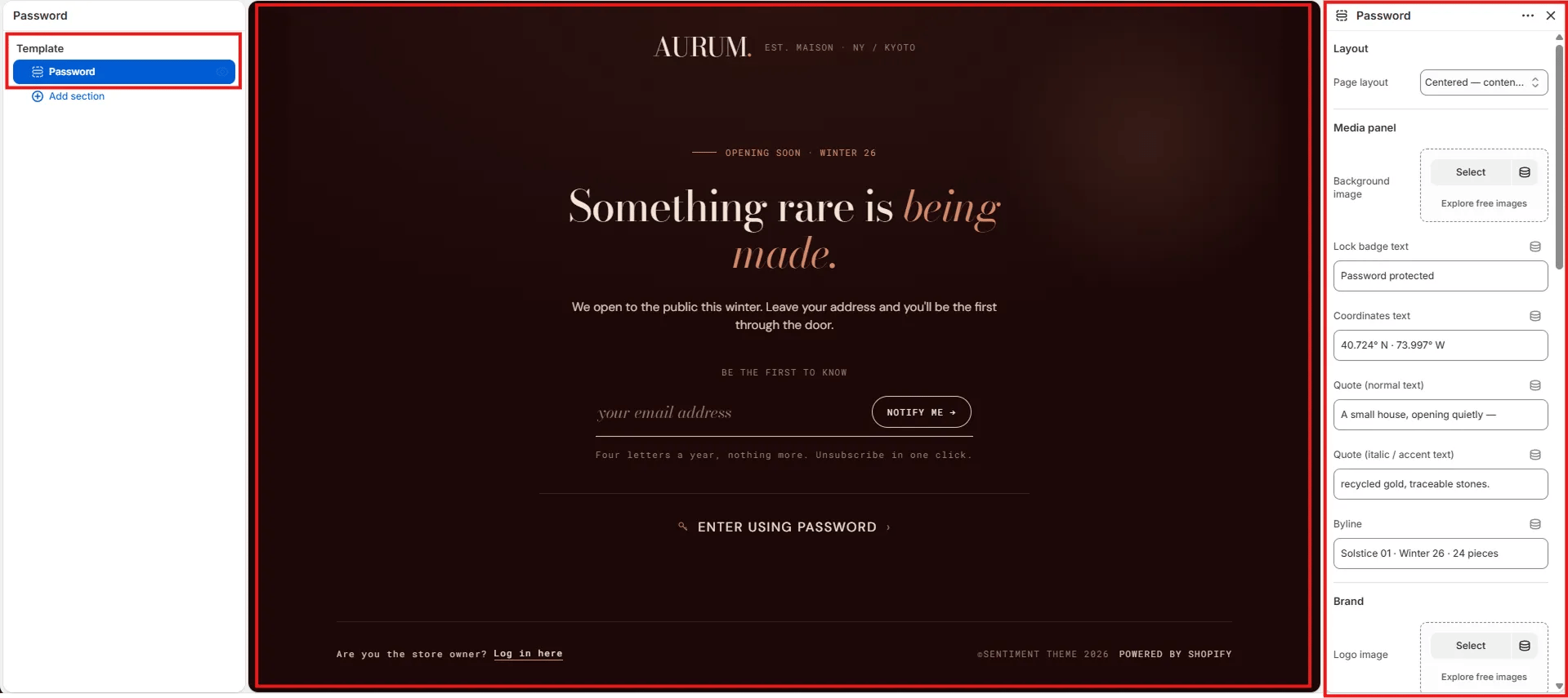
Layout
- Page layout: Choose the overall layout for the password page. Options include Centered — content only (full-screen centered form with background) and Split — media panel (form on one side, editorial media panel on the other).
Media Panel
Settings in this group control the atmospheric background and editorial overlay elements displayed on the page or in the media panel depending on the chosen layout.- Background image: Upload a full-bleed background image for the page or media panel. Click Explore free images to browse Shopify’s stock image library.
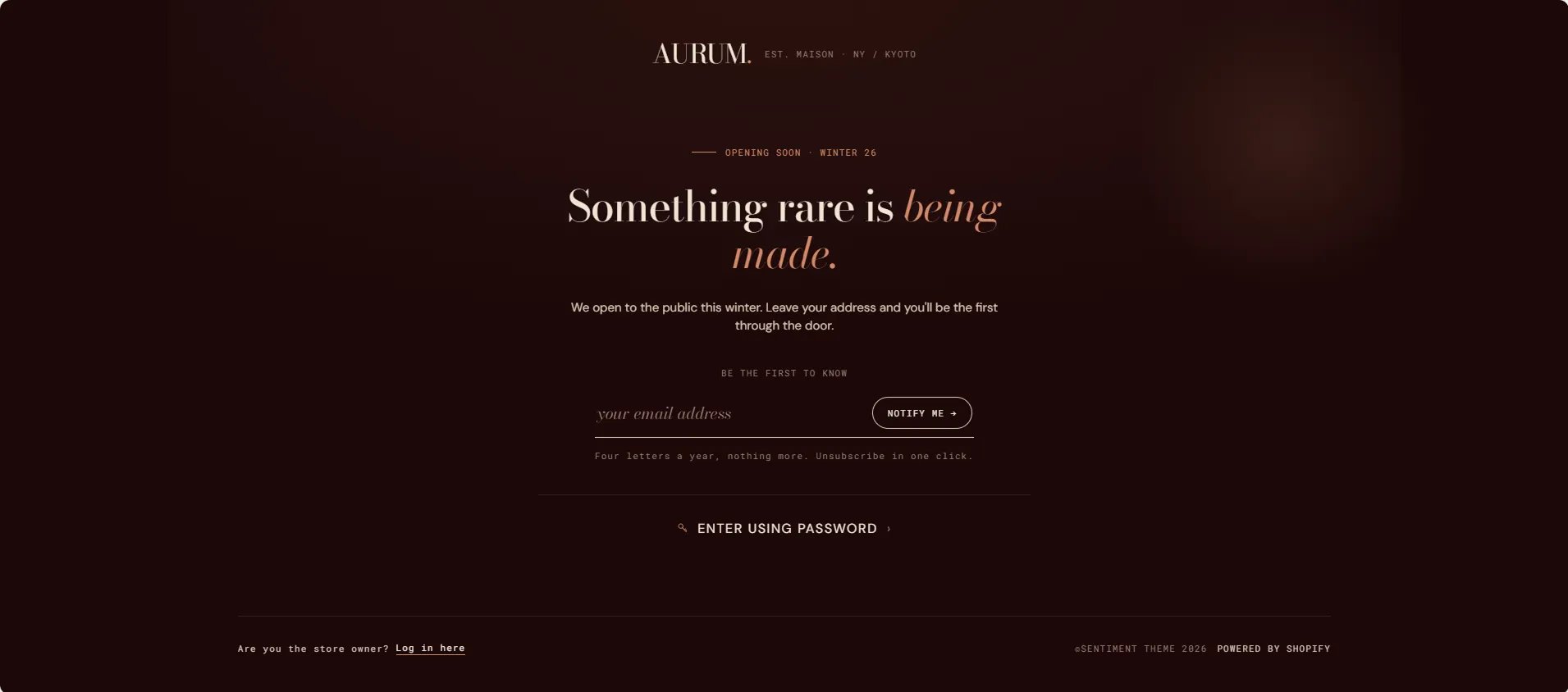
- Lock badge text: Small text shown next to the lock icon badge on the page (e.g., “Password protected”).
- Coordinates text: Decorative geographic coordinates displayed as an atmospheric detail on the media panel (e.g., “40.724° N · 73.997° W”).
- Quote (normal text): The regular-weight portion of the editorial quote overlay on the media panel (e.g., “A small house, opening quietly —”).
- Quote (italic / accent text): The italic or accent-colour portion of the quote (e.g., “recycled gold, traceable stones.”).
- Byline: Small text displayed below the quote — typically used for collection or season information (e.g., “Solstice 01 · Winter 26 · 24 pieces”).
Brand
- Logo image: Upload a custom logo image to display at the top of the password page. If left blank, the store name is displayed as text.
- Logo tagline: Short brand descriptor displayed next to the logo (e.g., “EST. MAISON · NY / KYOTO”).
Content
- Eyebrow label: Small label displayed above the main heading (e.g., “Opening soon · Winter 26”).
- Heading (normal text): The regular-weight portion of the main heading (e.g., “Something rare is”).
- Heading (italic / accent text): The italic or accent-colour portion of the heading (e.g., “being made.”).
- Body text: Supporting paragraph displayed below the heading (e.g., “We open to the public this winter. Leave your address and you’ll be the first through the door.”).
Email Form
- Form label: Small uppercase label displayed above the email input (e.g., “Be the first to know”).
- Email placeholder: Placeholder text inside the email input field (e.g., “your email address”).
- Submit button label: Label on the subscribe button (e.g., “Notify me →”).
- Disclaimer text: Small text displayed below the form — typically used for frequency or privacy notes (e.g., “Four letters a year, nothing more. Unsubscribe in one click.”).
Password Link
- Password link label: Text for the “Enter using password” link shown below the email form (e.g., “Enter using password”). Leave blank to hide.