How to Configure the FAQ Page
- From your Shopify admin, go to Online Store → Themes and click Customize.
- From the top page dropdown, select Pages → FAQ.
- Click FAQ with groups or FAQ help CTA in the left sidebar under Template to open settings.
- Add Category group blocks to create topic sections, then add Question & answer blocks beneath each group.
- Click Save when done.
- FAQ with groups — searchable FAQ with topic sidebar, availability stats, and a sidebar CTA card
- FAQ help CTA — closing section with heading and CTA buttons
FAQ With Groups Section Settings
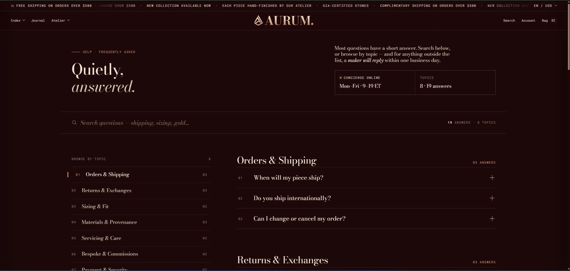
The FAQ with groups section is the main body of the FAQ page — rendering the page masthead, a live search bar, a left sidebar with topic index and concierge card, and the full categorized question/answer accordion on the right.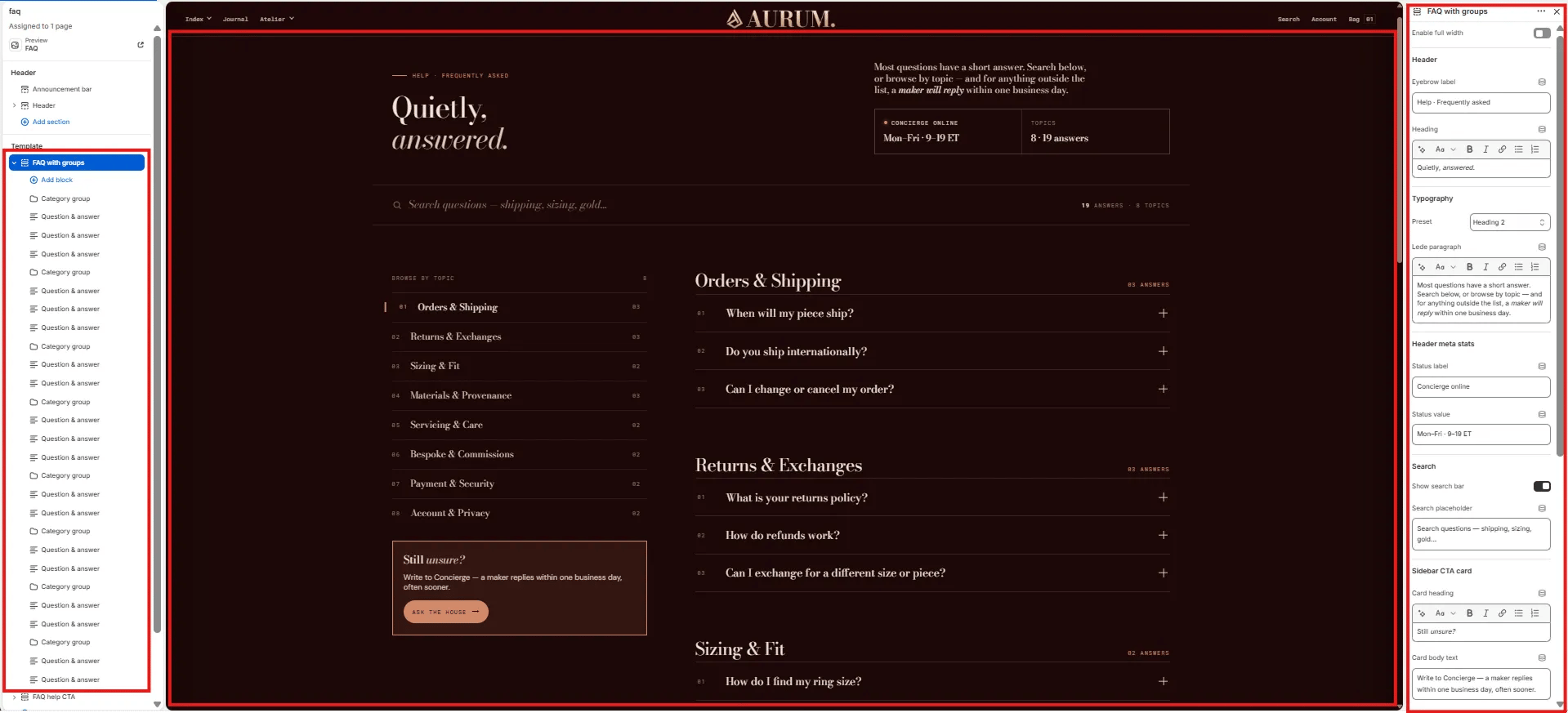
Layout
- Enable full width: Toggle to extend the section edge-to-edge across the viewport.
Header
- Eyebrow label: Small label above the heading (e.g., “Help · Frequently asked”).
- Heading: Main page heading. Supports rich text and italic emphasis (e.g., “Quietly, answered.”).
- Typography: Choose the typographic preset for the heading (e.g., Heading 2).
- Lede paragraph: Supporting text displayed to the right of the heading (e.g., “Most questions have a short answer. Search below, or browse by topic — and for anything outside the list, a maker will reply within one business day.”).
Header Meta Stats
Two stat cells displayed in a panel below the lede — showing concierge availability and total topic/answer counts.- Status label: Label for the first stat (e.g., “Concierge online”).
- Status value: Value for the first stat (e.g., “Mon–Fri · 9–19 ET”).
The second stat (Topics / answer count) is auto-generated from the blocks in the section and cannot be edited manually.
Search
- Show search bar: Toggle to show or hide the live search bar above the FAQ content. When enabled, customers can type to filter questions in real time.
- Search placeholder: Placeholder text inside the search input (e.g., “Search questions — shipping, sizing, gold…”).
Sidebar CTA Card
A small card displayed at the bottom of the left sidebar, encouraging customers to write in if they can’t find their answer.- Card heading: Heading on the sidebar card. Supports italic/accent colour (e.g., “Still unsure?”).
- Card body text: Supporting text below the heading (e.g., “Write to Concierge — a maker replies within one business day, often sooner.”).
Category Group Block Settings
Each Category Group block creates a new topic section in the FAQ — appearing as a named item in the left sidebar topic index and as a bold section heading above its question rows.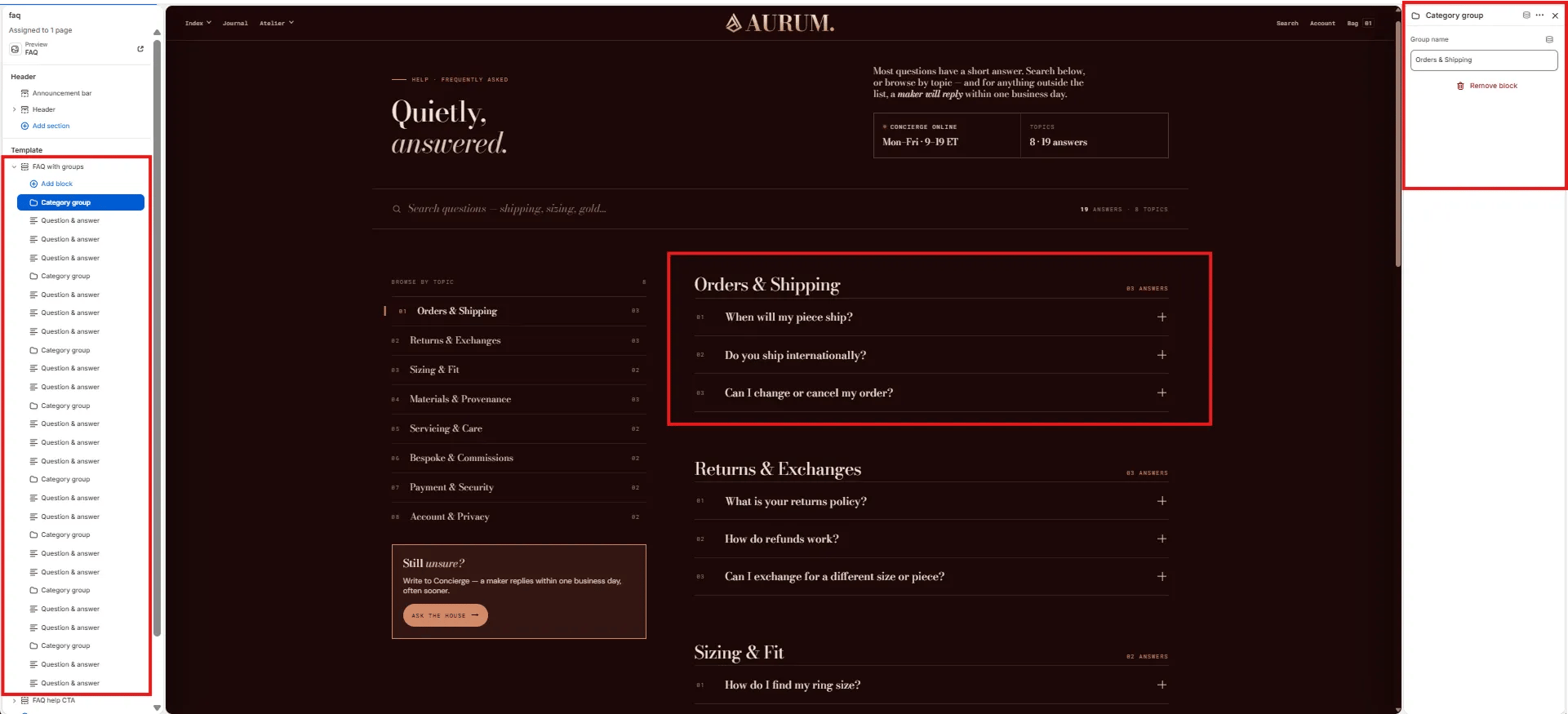
- Group name: The topic name displayed in the sidebar and as the section heading (e.g., “Orders & Shipping”, “Returns & Exchanges”, “Sizing & Fit”).
Question & Answer Block Settings
Each Question & Answer block is one entry in the FAQ accordion. It supports a question, a rich text answer, and up to two optional related links displayed below the answer.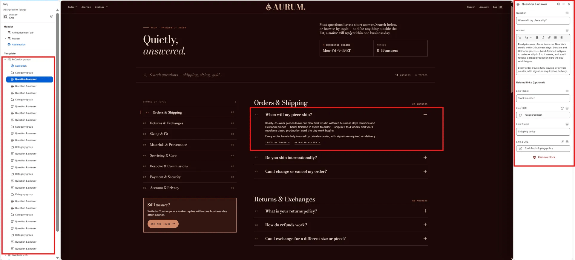
- Question: The accordion heading — the customer’s question (e.g., “When will my piece ship?”).
- Answer: Rich text answer displayed when the accordion row is expanded. Supports bold, italic, links, and lists.
Related Links (optional)
Up to two inline links displayed below the answer — useful for linking to policy pages, order tracking, or contact.- Link 1 label / URL: Label and URL for the first related link (e.g., “Track an order” →
/pages/contact). - Link 2 label / URL: Label and URL for the second related link (e.g., “Shipping policy” →
/policies/shipping-policy).
FAQ Help CTA Section Settings
The FAQ help CTA section renders a two-column closing strip below the FAQ — with editorial copy on the left explaining the concierge service, and stacked CTA buttons on the right for direct escalation.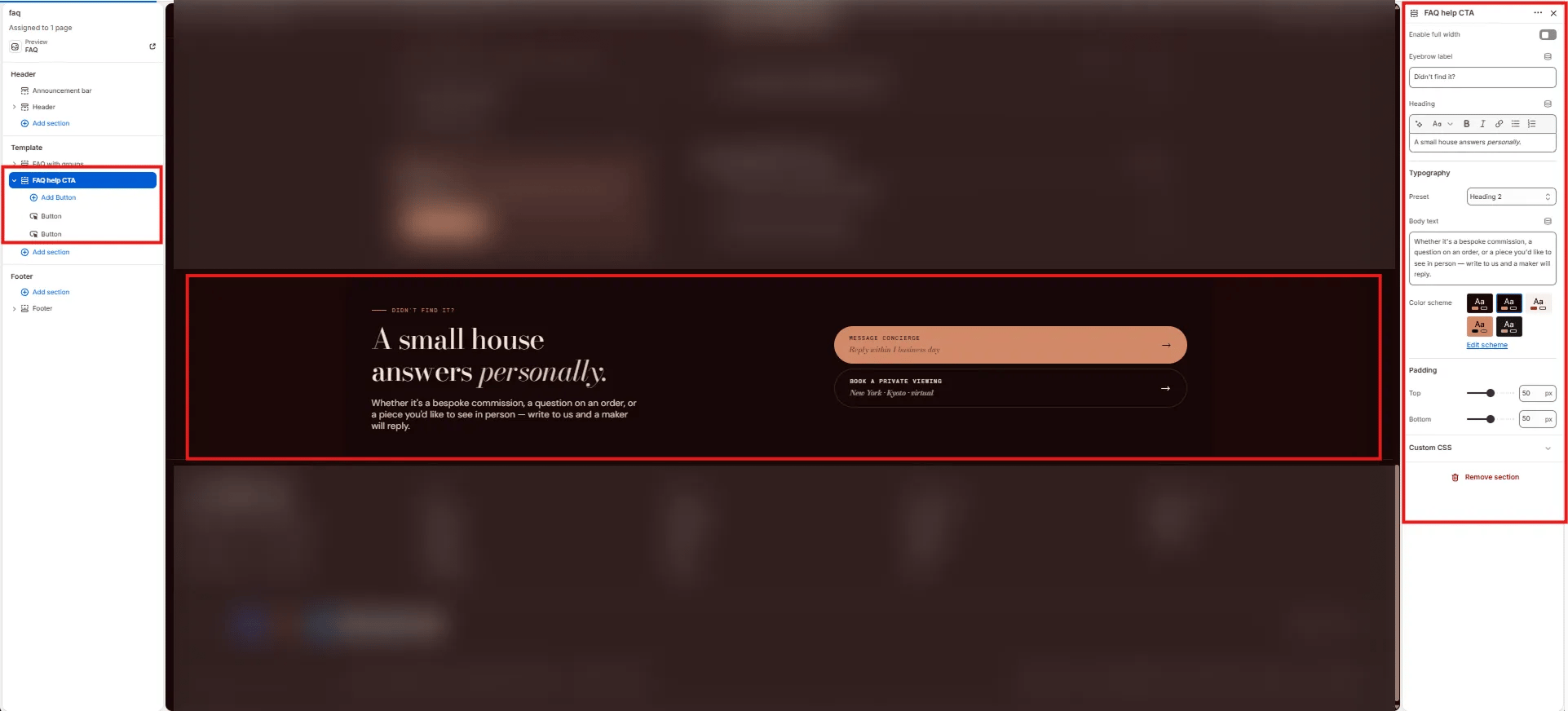
Content
- Enable full width: Toggle to extend the section edge-to-edge.
- Eyebrow label: Small label above the heading (e.g., “Didn’t find it?”).
- Heading: Main section heading. Supports italic/accent colour (e.g., “A small house answers personally.”).
- Typography: Choose the typographic preset for the heading (e.g., Heading 2).
- Body text: Supporting paragraph below the heading (e.g., “Whether it’s a bespoke commission, a question on an order, or a piece you’d like to see in person — write to us and a maker will reply.”).
Style
- Color scheme: Choose a color scheme for the section.
Spacing
- Padding top / Padding bottom: Control vertical spacing.
Button Block Settings
Each Button block is one CTA button in the FAQ help CTA section. Add up to two Button blocks — the first uses a filled (primary) style and the second uses an outline style by default.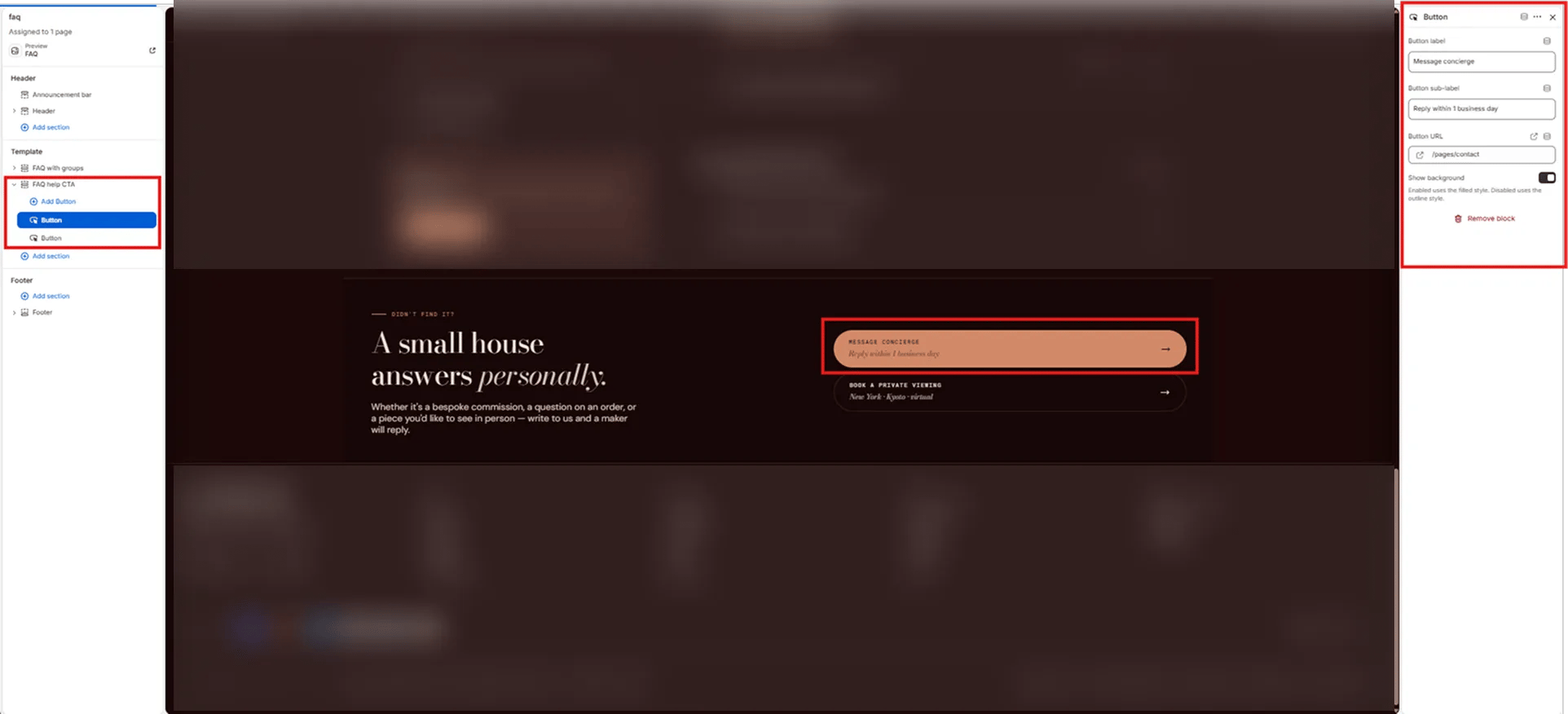
- Button label: Main button text displayed in large type (e.g., “Message concierge”, “Book a private viewing”).
- Button sub-label: Secondary smaller text displayed below the button label (e.g., “Reply within 1 business day”, “New York · Kyoto · virtual”).
- Button URL: Link destination for the button (e.g.,
/pages/contact). - Show background: Toggle to switch between filled style (on) and outline style (off). Use filled for the primary action and outline for the secondary.