How to Add the Section
- From your Shopify admin, go to Online Store → Themes and click Customize.
- Navigate to the page where you want to add this section.
- Click Add section and select Icon features.
- Add Feature blocks for each item you want to display.
- Click Save.
Section Settings
Content
- Eyebrow: Small label displayed above the heading.
- Heading: Main section heading.
- Heading typography: Select the typographic style for the heading.
- View all URL / View all label: Link and label for an optional “view all” CTA beside the heading.
Style
- Color scheme: Choose a color scheme for the section.
Spacing
- Padding top / Padding bottom: Control vertical spacing around the section.
Feature Block Settings
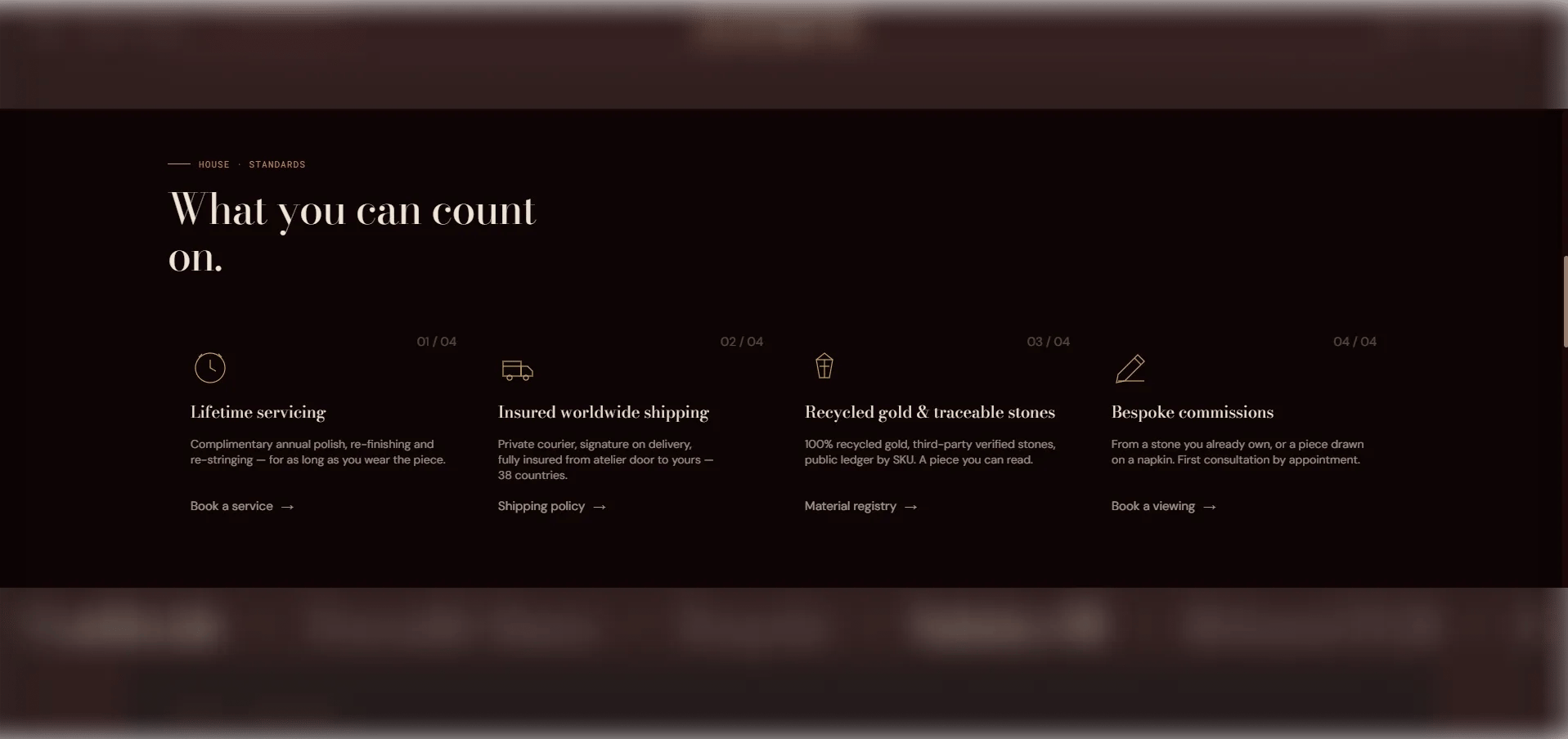
Each Feature block is one card in the icon grid. You can add up to 8 feature blocks.Icon
- Icon image: Upload an image to use as the icon (recommended size: 48×48px or 96×96px). Takes priority over all other icon options.
- Icon SVG: Paste custom SVG path data for a 48×48 viewBox icon. Used if no icon image is uploaded.
Content
- Title: The feature card heading (e.g., “Complimentary shipping”).
- Body: Supporting description text for this feature.
- Link text / URL: An optional link label and destination. When a URL is provided, the entire card becomes a clickable link.