How to Configure the Header
- From your Shopify admin, go to Online Store → Themes.
- Click Customize on the Sentiment theme.
- In the Theme Editor, select the Header section from the left sidebar.
- Adjust the settings according to your preferences.
- Click Save to apply your changes.
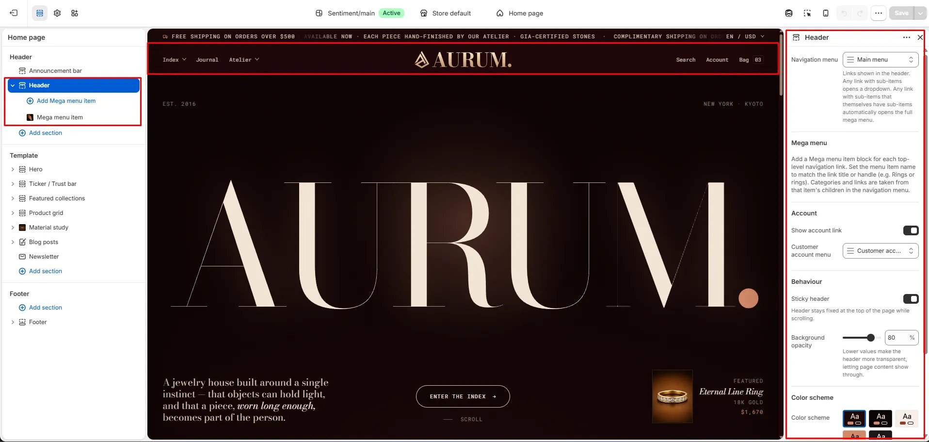
Header Settings
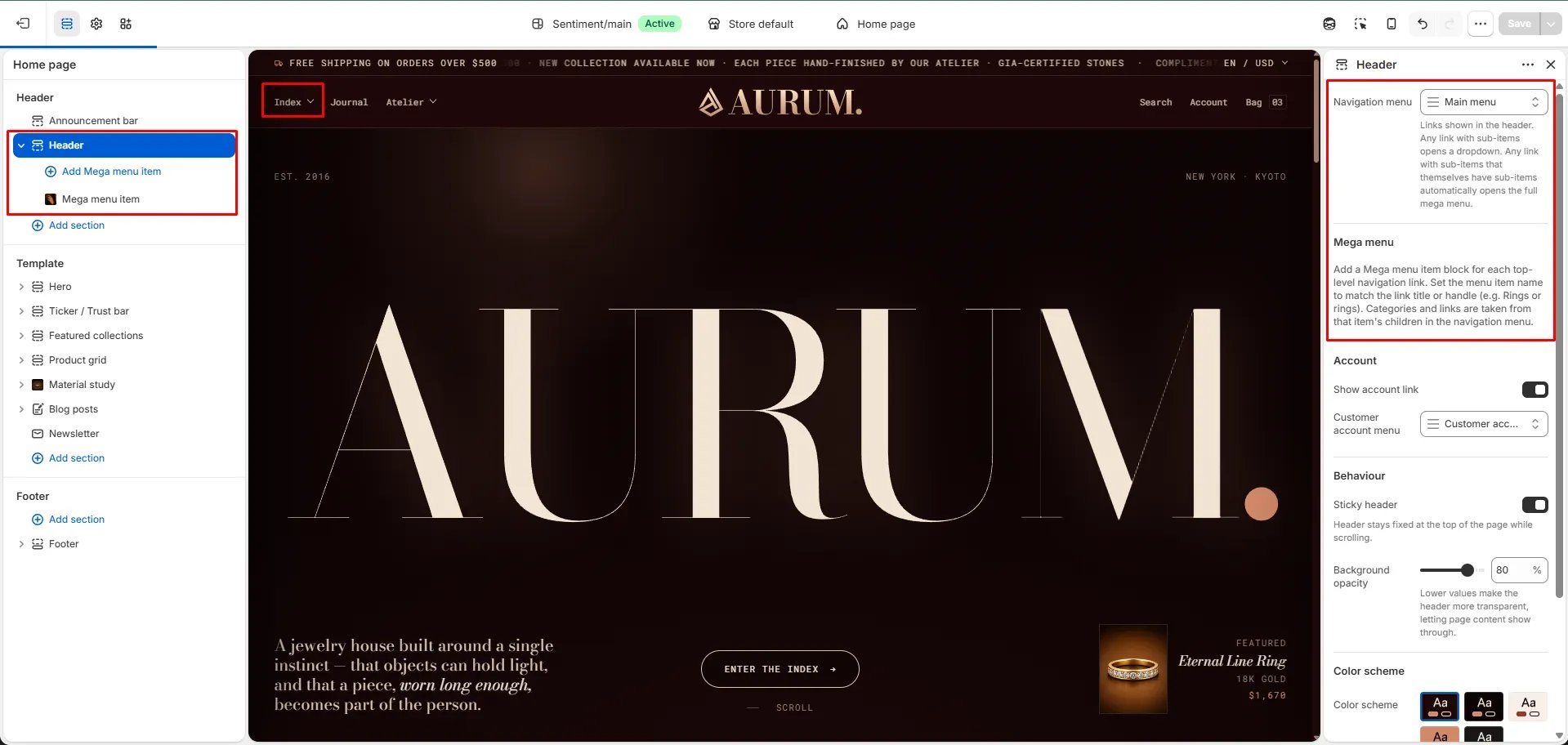
- Navigation menu: Select the menu to display in the header. Any link with sub-items automatically opens a dropdown. Any link with sub-items that themselves have sub-items automatically opens the full mega menu.
- Show account link: Toggle this on to display an account icon in the header, allowing customers to log in or access their account directly.
- Customer account menu: Select the menu to use for customer account navigation links.
- Sticky header: When enabled, the header remains fixed at the top of the page as customers scroll, keeping navigation always accessible.
- Background opacity: Control how transparent the header background appears. Lower values make the header more see-through, letting page content show through beneath it. A value of 80% provides a slightly translucent look while keeping text legible.
- Color scheme: Choose from your store’s defined color schemes to set the header’s background and text colors.
Setting Up Navigation Menus
How to Create Your Navigation Menu
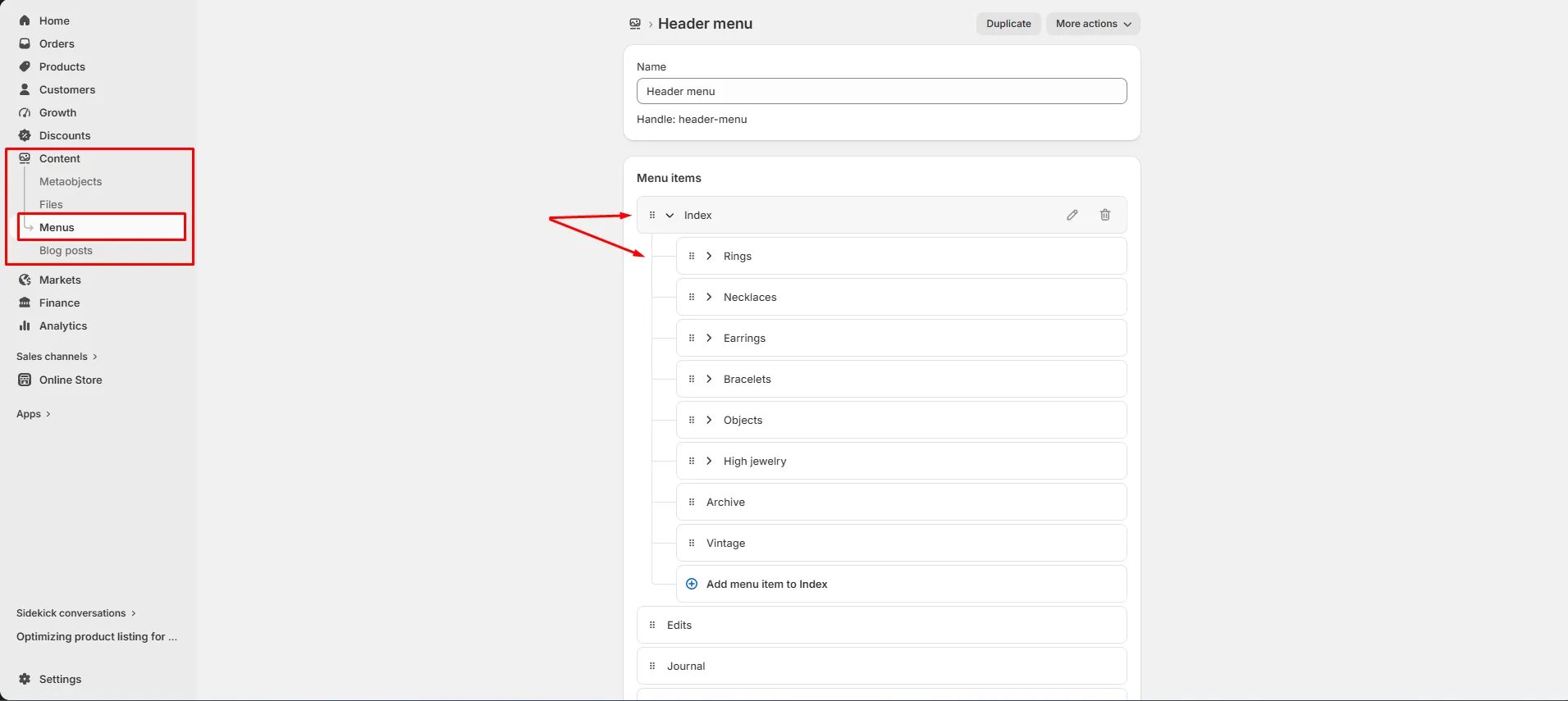
- In your Shopify Admin, go to Content → Menus.
- Click on your Header menu (or create a new one).
- Add your top-level menu items (e.g., Rings, Necklaces, Earrings).
- To create a dropdown, nest sub-items beneath a parent item by dragging them slightly to the right using the handle icon (⠿).
- To trigger the full mega menu, add sub-items to those nested items as well — any link with two levels of nesting automatically opens the mega menu in the theme.
- Click Save menu.
How the Navigation Renders
- A top-level link with no sub-items renders as a plain link.
- A top-level link with one level of sub-items renders as a standard dropdown.
- A top-level link with sub-items that themselves have sub-items automatically renders as the full mega menu.
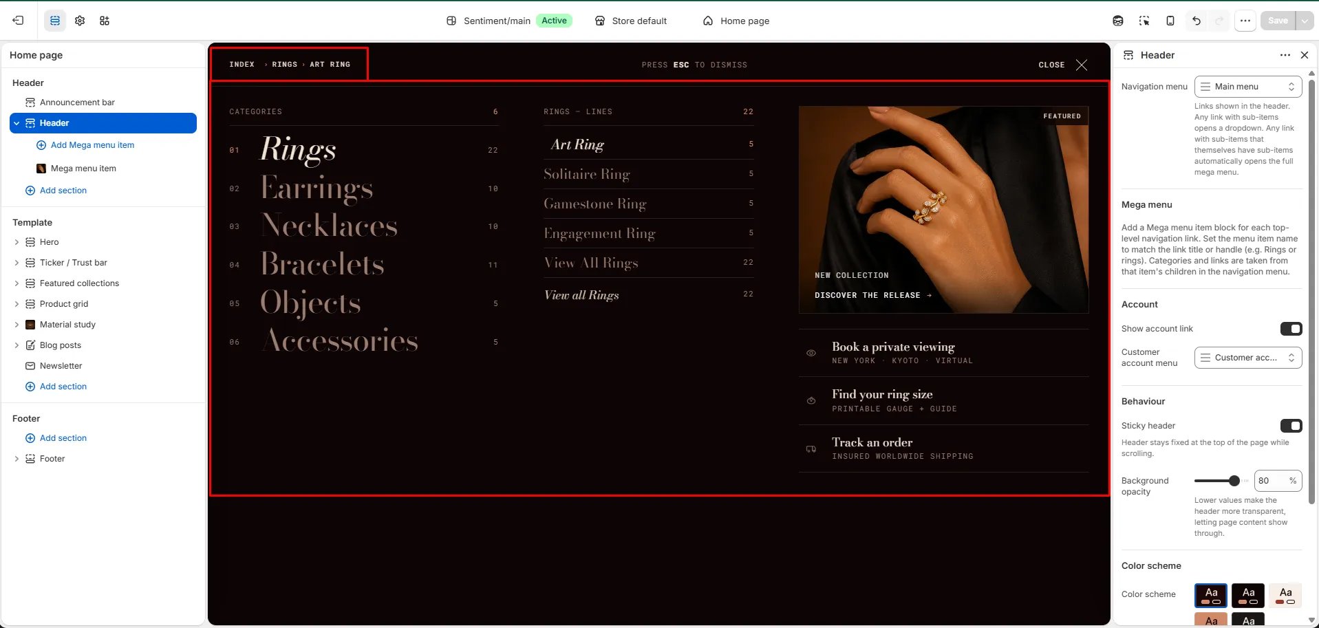
Mega Menu
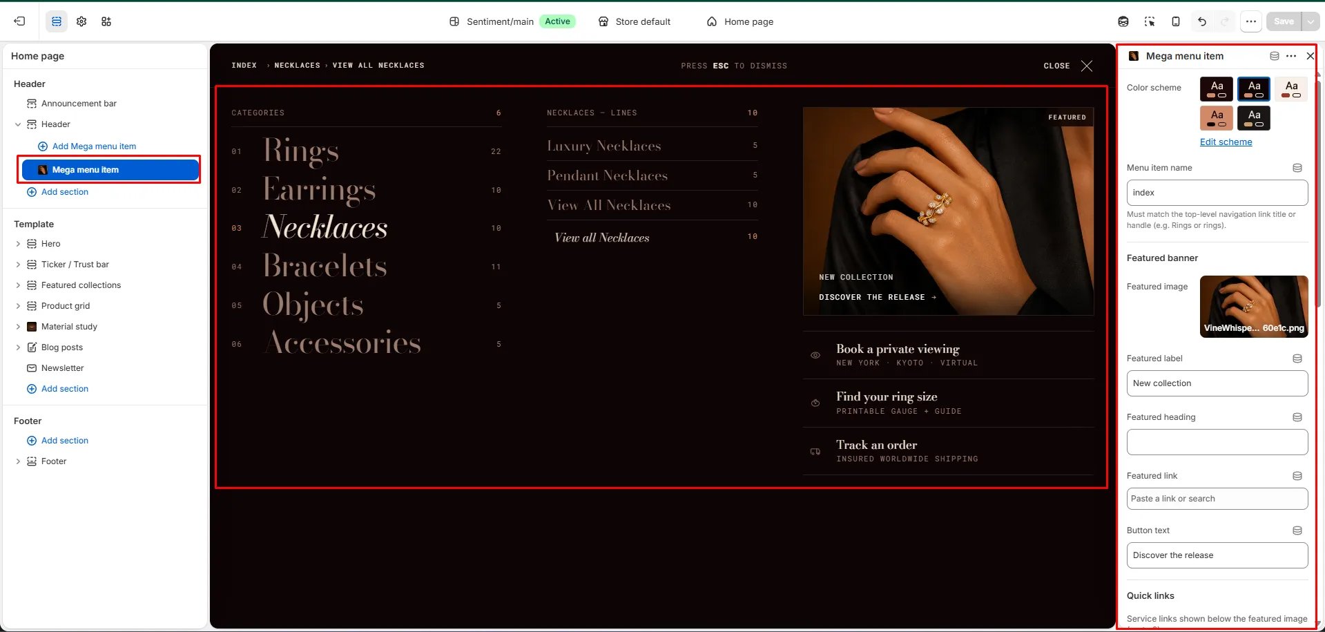
The mega menu is a wide, editorial navigation panel that displays your categories in numbered columns alongside featured links and a branded image panel. It gives customers a visual overview of your full catalog at a glance. To enable the mega menu for a top-level navigation link, add a Mega menu item block in the theme editor for that link:- In the Theme Editor, click Header in the left sidebar.
- Click Add Mega menu item.
- Set the Menu item name to exactly match the top-level navigation link title or handle (e.g.,
ringsfor a link titled “Rings”). This is how the theme knows which menu item should trigger this mega menu. - Configure the Featured banner and Quick links for that item.
- Click Save.
Mega Menu Item Settings
- Color scheme: Choose a color scheme specifically for this mega menu panel — useful for giving each category its own visual identity.
- Menu item name: Enter the exact title or handle of the top-level navigation link this mega menu should be attached to (e.g.,
index,rings,necklaces). This must match the link title or handle in your navigation menu.
Featured Banner
The featured banner appears on the right side of the mega menu panel, adding a visual highlight to the category.- Featured image: Upload an image to display in the banner panel of the mega menu.
- Featured label: Add a small label above the heading (e.g., “New collection”).
- Featured heading: Add a heading to overlay on the featured image.
- Featured link: Set the URL the banner links to when customers click it.
- Button text: Customize the label on the banner’s call-to-action button (e.g., “Discover the release”).
Quick Links
Quick links are service-style links displayed below the featured image in the mega menu — ideal for shortcuts like “Book a private viewing”, “Find your ring size”, or “Track an order”.