How to Configure the Blog Page
- From your Shopify admin, go to Online Store → Themes and click Customize.
- From the top page dropdown, select Blogs → Journal (or your blog name).
- Click any section in the left sidebar under Template to select and configure it.
- Click Save when done.
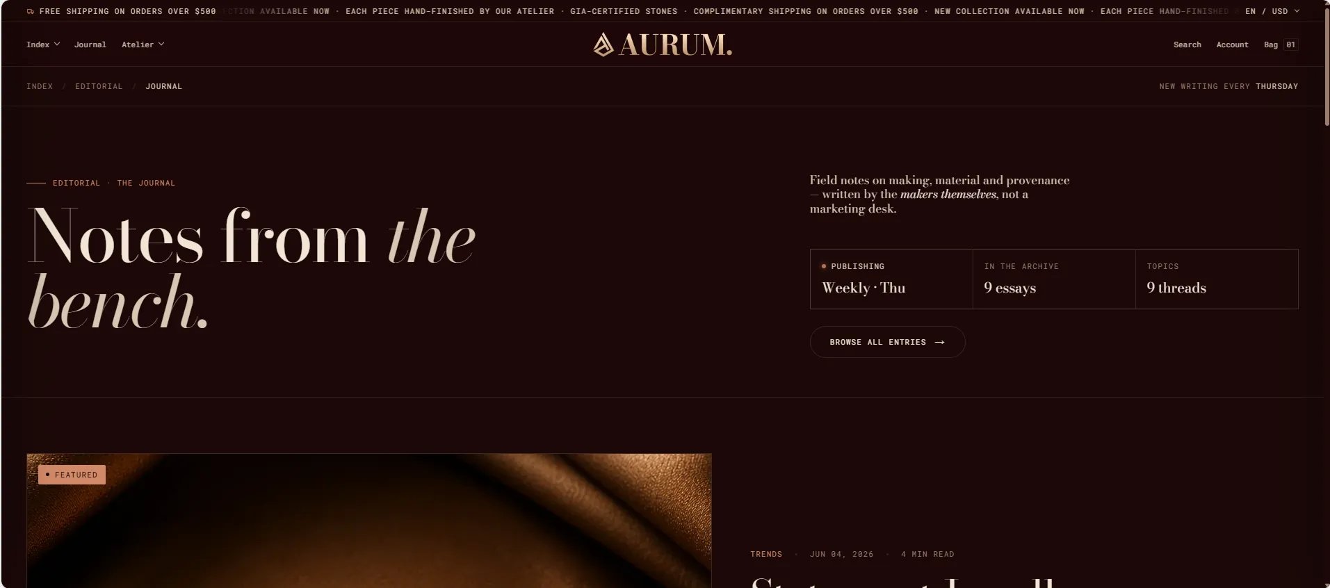
- Blog header — editorial masthead with heading and breadcrumb
- Featured article — spotlight card for the most recent or pinned post
- Blog posts grid — paginated grid of all articles
- Newsletter — email signup at the bottom of the listing page
Blog Header Section Settings
The Blog Header section is the masthead at the top of the listing page. It includes a breadcrumb, eyebrow, heading, and right-column blocks for text, stats, and a CTA button.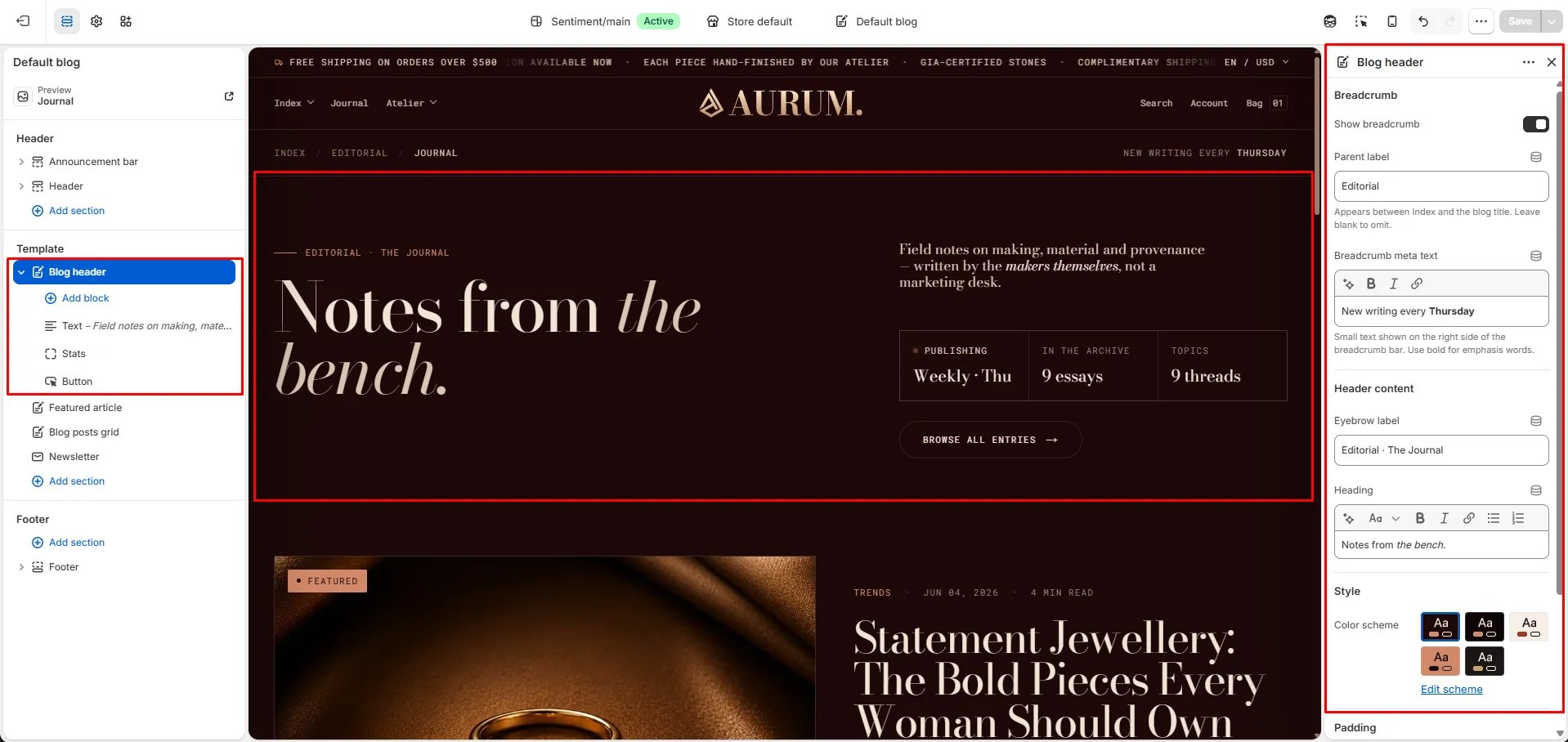
Breadcrumb
- Show breadcrumb: Toggle to show or hide the breadcrumb navigation bar above the heading.
- Parent label: The label inserted between “Index” and the blog title in the breadcrumb path (e.g., “Editorial”). Leave blank to omit the parent step.
- Breadcrumb meta text: Small text shown on the right side of the breadcrumb bar. Use bold for emphasis words (e.g., “New writing every Thursday”).
Header Content
- Eyebrow label: A small label displayed above the main heading (e.g., “Editorial · The Journal”).
- Heading: The main blog masthead heading. Supports rich text and italic emphasis (e.g., “Notes from the bench.”).
Style
- Color scheme: Choose a color scheme to control the section’s background and text colors.
Spacing
- Padding top / Padding bottom: Control the vertical spacing around the Blog header section.
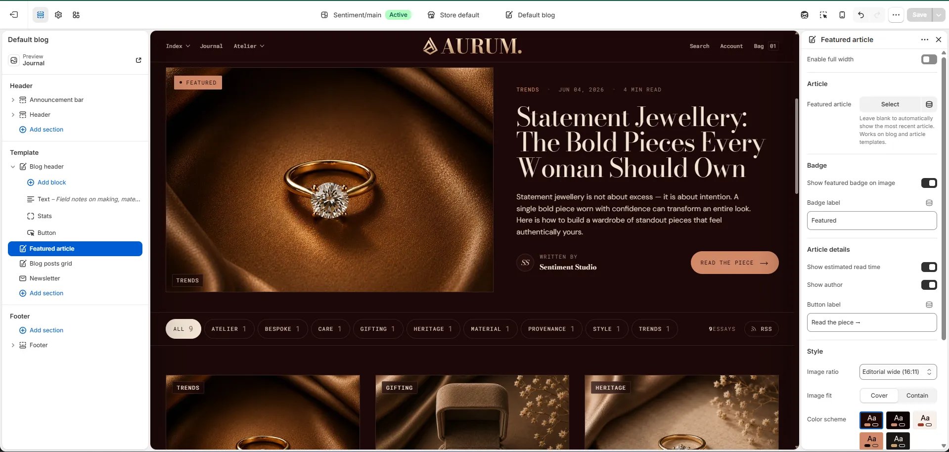
Featured Article Section Settings
The Featured Article section displays a large spotlight card for one article — typically your most recent or most important post. It sits directly below the Blog header and above the posts grid. For full configuration details, see the Featured article section documentation. Key settings:- Featured article: Pin a specific article, or leave blank to auto-show the most recent post.
- Show featured badge / label: Toggle and customize the “Featured” badge on the card.
- Show read time / Show author: Toggle metadata shown on the card.
- Image ratio / Image fit: Control how the article image is displayed.
- Color scheme / Padding: Style and spacing controls.
Blog Posts Grid Section Settings
The Blog Posts Grid section renders the full paginated grid of articles from your blog below the featured article spotlight.Content
- Eyebrow: Small label above the heading.
- Heading: Section heading displayed above the grid.
- Heading typography: Select the typographic style for the heading.
- View all label: Text for the “view all” link at the bottom of the grid.
Source
- Blog: Select the blog to pull articles from.
- Articles to show: Number of articles to display per page before pagination (range: 2–12).
Display
- Full width: When enabled, the grid stretches edge-to-edge.
- Columns desktop: Number of columns on desktop (2, 3, or 4).
- Image ratio: Aspect ratio for article card images — Portrait, Tall portrait, Square, Landscape, or Adapt.
- Image fit: Controls how images fill their card — Cover or Contain.
- Show author: Toggle to display the author’s name on each article card.
- Show date: Toggle to display the publish date on each card.
- Show read time: Toggle to display the estimated read time on each card.
- Show tags: Toggle to display the article’s tags as chips on each card.
Style
- Color scheme: Choose a color scheme for the grid section.
Spacing
- Padding top / Padding bottom: Control the vertical spacing around the grid.
Newsletter Section Settings
The Newsletter section appears at the bottom of the blog listing page as a full-width email signup area.- Heading: Heading above the signup form.
- Subtext: Supporting description text below the heading.
- Email placeholder: Placeholder text inside the email input field.
- Submit text: Label on the submit button.
- Success text: Message shown after a successful subscription.
- Color scheme: Choose a color scheme for the newsletter section.
- Padding top / Padding bottom: Control vertical spacing.