How to Add the Section
- From your Shopify admin, go to Online Store → Themes and click Customize.
- Navigate to a collection page.
- Click Add section and select Collection banner.
- Configure the settings below and click Save.
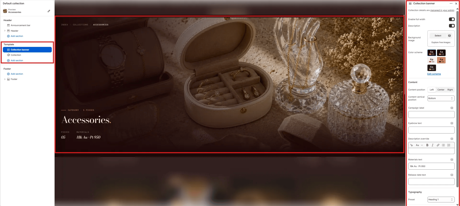
Section Settings
Layout
- Enable full width: Toggle to extend the banner edge-to-edge across the viewport (default: on).
Content Toggles
- Description: Toggle to show or hide the collection description text pulled from Shopify admin below the heading.
Background
- Background image: Upload a custom background image for the banner. If no image is uploaded, the banner uses the collection image set in Shopify admin.
Style
- Color scheme: Choose a color scheme to control the banner’s text and overlay colors.
Content
- Content position: Horizontal alignment of the overlay content — Left, Center, or Right.
- Content vertical position: Vertical alignment of the overlay content — Bottom (default), Center, or Top.
- Campaign label: Small label displayed above the collection name (e.g., “CATEGORY · 5 PIECES”). Use this for seasonal campaign tags or piece counts.
- Eyebrow text: A secondary small label above the main heading, separate from the campaign label.
- Description override: Rich text field to override the collection description from Shopify admin with custom copy for this template.
- Materials text: Short materials line displayed in the stats row below the heading (e.g., “18k Au · Pt 950”).
- Release date text: Optional date or drop information displayed in the stats row (e.g., “Spring 2025”).
Typography
- Preset: Choose the typographic style for the collection name heading (e.g., Heading 1).