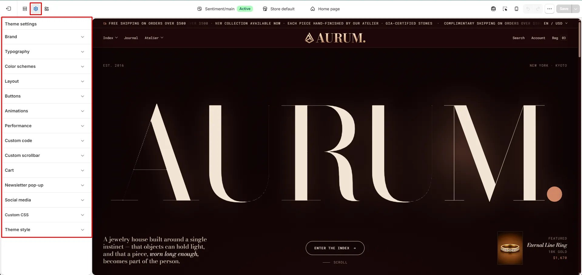
Global settings for your theme
Brand
Brand
Your brand settings define how Sentiment introduces your store to customers — from the logo in your header to the name and tagline that appear across your site.
- Logo image: Upload your store’s logo. For best results, use a transparent PNG or SVG so it sits cleanly against any background color.
- Logo width: Adjust the slider or enter a pixel value to control how large your logo appears in the header.
- Favicon image: Upload a square image (recommended 32x32px, PNG or ICO). This icon is displayed in browser tabs and bookmarks, helping customers recognize your store at a glance.
- Brand name: Enter your store’s name. This is used internally by the theme and in places like structured data for search engines.
- Brand tagline: Add a short line that captures your brand’s voice — this can be pulled into sections like your homepage hero or footer to reinforce your store’s identity.
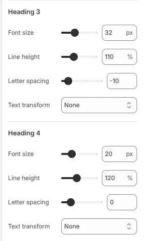
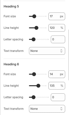
Typography
Typography
Typography plays a key role in your store’s branding. You can customize the fonts and sizes for headings, body text, and navigation to create a cohesive, editorial look.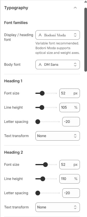
- Font families: Choose your display/heading font and body font. Sentiment uses Bodoni Moda for headings and DM Sans for body text by default.
- Headings (H1–H6): Adjust the font size, line height, letter spacing, and text transform for each heading level individually, giving you full control over your store’s visual hierarchy.
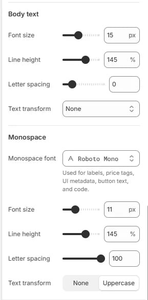
- Body text: Set the font size, line height, letter spacing, and text transform for descriptions, product details, and general content.
- Monospace: Customize the font, size, and spacing used for labels, price tags, button text, and other small UI details.
Color schemes
Color schemes
Color schemes are a powerful way to manage your store’s branding globally. Instead of setting colors for each element individually, you define “schemes” that contain a harmonious set of colors for backgrounds, text, and accents.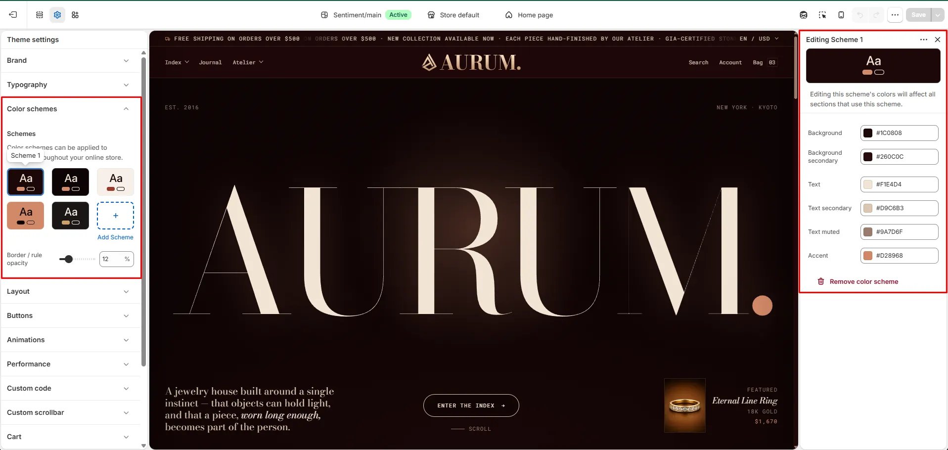
- What color schemes do: They let you instantly change the look of a section by selecting a different scheme — for example, a dark scheme for your hero banner and a lighter scheme for your product grid.
- Schemes: Choose from your existing color schemes or click Add Scheme to create a new one. Each scheme can be applied to any section throughout your store.
- Border / rule opacity: Adjust how visible borders and dividing lines appear across sections using this scheme.
Editing a scheme:
Click on any scheme to open its settings and customize the following colors:- Background & Background secondary: Set the main and supporting background colors for the scheme.
- Text, Text secondary & Text muted: Define the primary text color along with secondary and muted variations for less prominent content.
- Accent: Set the highlight color used for buttons, links, and key interactive elements.
- Remove color scheme: Delete a scheme you no longer need.
Layout
Layout
Layout settings control how wide your store’s content stretches across the screen and how much breathing room it has on the sides — keeping your design consistent and readable on every device.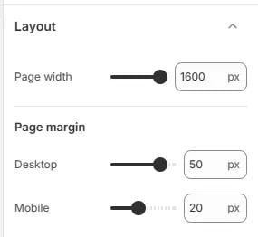
- Page width: Set the maximum width of your store’s content area in pixels. A value of 1600px is recommended for a spacious, full-width feel while still keeping content contained on large monitors.
- Page margin – Desktop: Define the horizontal padding between the content area and the edge of the browser window on desktop screens. A value of 50px provides comfortable spacing on wider displays.
- Page margin – Mobile: Set the horizontal padding on mobile devices. A value of 20px ensures content doesn’t feel cramped on smaller screens while still making full use of available space.
Buttons
Buttons
Button settings let you control the shape, spacing, and hover behavior of all buttons across your store — ensuring they match your brand’s style consistently everywhere they appear.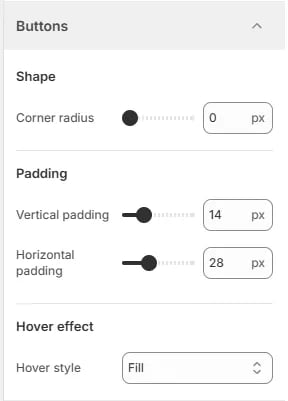
- Corner radius: Set how rounded the button corners are in pixels. A value of 0px gives buttons a sharp, square look; increase the value for softer, pill-shaped buttons.
- Vertical padding: Control the space above and below the button label. A value of 14px creates a comfortable click target without making buttons feel oversized.
- Horizontal padding: Control the space to the left and right of the button label. A value of 28px gives buttons a balanced, readable width relative to their text.
- Hover style: Choose how buttons respond when a customer hovers over them. The Fill option floods the button with the accent color on hover, providing a clear and satisfying visual feedback.
Animations
Animations
Animation settings let you control how elements move and appear across your store — adding polish and energy to the browsing experience while keeping performance in mind.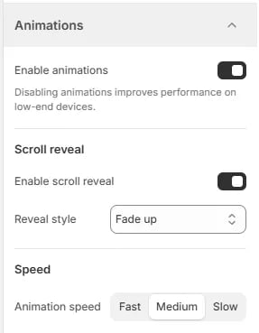
- Enable animations: Toggle all theme animations on or off globally. Disabling animations improves performance on low-end devices and can be a good accessibility consideration for customers who prefer reduced motion.
Scroll reveal
- Enable scroll reveal: When turned on, elements animate into view as customers scroll down the page, creating a dynamic and engaging feel.
- Reveal style: Choose how elements appear during scroll reveal. Fade up smoothly fades elements in while sliding them upward — a clean, modern effect that suits jewelry and lifestyle brands well.
Speed
- Animation speed: Select how fast or slow animations play across your store. Choose from Fast, Medium, or Slow depending on the pacing that best suits your brand’s personality.
Performance
Performance
Performance settings help your store load faster and feel more responsive — especially important for customers browsing on slower connections or mobile devices.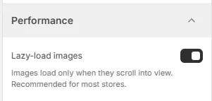
- Lazy-load images: When enabled, images load only when they scroll into the customer’s view rather than all at once on page load. This significantly reduces initial load time and is recommended for most stores.
Custom code
Custom code
Custom code settings allow you to inject your own CSS and JavaScript directly into your storefront — useful for advanced styling tweaks or adding third-party scripts without editing theme files.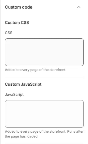
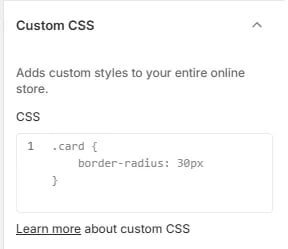
Custom CSS
- CSS: Paste any custom CSS rules here. This code is added to every page of the storefront, letting you override or extend the theme’s default styles globally. For example, you can use this to adjust border radii, spacing, or typography on any element across your store.
Custom JavaScript
- JavaScript: Paste any custom JavaScript here. This code is added to every page of the storefront and runs after the page has fully loaded, making it safe for DOM manipulation or third-party integrations.
Custom scrollbar
Custom scrollbar
Custom scrollbar settings let you style the browser scrollbar to match your store’s color palette — adding a polished, on-brand detail that most stores overlook.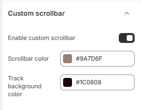
- Enable custom scrollbar: Toggle this on to replace the default browser scrollbar with a custom-styled one using the colors defined below.
- Scrollbar color: Set the color of the scrollbar thumb — the draggable handle customers interact with. This should contrast well against the track for easy visibility.
- Track background color: Set the color of the scrollbar track — the groove the thumb slides along. A darker track color pairs well with a lighter scrollbar thumb for a clean, high-contrast look.
Cart
Cart
Cart settings control how the shopping cart looks and behaves — including its display style, shipping incentives, gift options, and order notes to improve the checkout experience.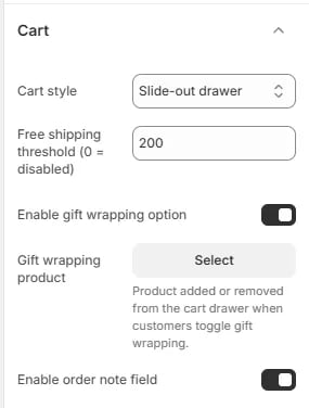
- Cart style: Choose how the cart is presented to customers. Slide-out drawer opens the cart as a panel from the side of the screen without leaving the current page, keeping customers in their shopping flow.
- Free shipping threshold: Enter a minimum order value to display a free shipping progress bar in the cart. Set to 0 to disable this feature. For example, a value of 200 encourages customers to add more items to qualify for free shipping.
- Enable gift wrapping option: Toggle this on to show a gift wrapping option in the cart drawer, allowing customers to add gift wrapping to their order before checkout.
- Gift wrapping product: Select the product that gets added to or removed from the cart when a customer toggles the gift wrapping option. This should be a dedicated gift wrapping product set up in your Shopify catalog.
- Enable order note field: When enabled, a text field appears in the cart allowing customers to leave a note with their order — useful for special instructions, personalization requests, or delivery details.
Newsletter pop-up
Newsletter pop-up
The newsletter pop-up lets you capture email subscribers directly from your storefront. You can fully control when it appears, what it says, and how it looks — including a branded image panel to make it feel native to your store.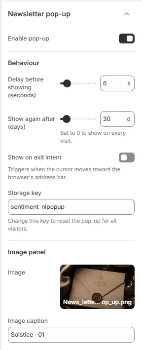
- Enable pop-up: Toggle this on to activate the newsletter pop-up across your storefront.
Behaviour
- Delay before showing: Set how many seconds after page load the pop-up waits before appearing. A value of 6 seconds gives customers time to engage with your content before the pop-up shows.
- Show again after (days): Control how many days pass before the pop-up is shown again to a returning visitor. Set to 0 to show it on every visit.
- Show on exit intent: When enabled, the pop-up triggers as the customer’s cursor moves toward the browser’s address bar — catching them just before they leave the page.
- Storage key: A unique key used to track whether a visitor has already seen the pop-up. Change this key to reset the pop-up for all visitors and show it again from scratch.
Image panel
- Image: Upload a branded image to display alongside the sign-up form — ideal for adding a lifestyle photo or brand visual that reinforces your store’s identity.
- Image caption: Add a short caption beneath the image for context or a subtle brand message.
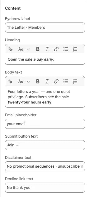
Content
- Eyebrow label: A small label displayed above the heading to set context — for example, identifying the audience or offer type.
- Heading: The main headline of the pop-up. Supports rich text formatting including bold and italic.
- Body text: Supporting copy beneath the heading. Use this to communicate the value of subscribing. Supports rich text formatting.
- Email placeholder: The placeholder text shown inside the email input field before the customer starts typing.
- Submit button text: The label on the form’s submit button — keep it short and action-oriented.
- Disclaimer text: Add a small note below the form for privacy or unsubscribe information.
- Decline link text: The text for the link customers can click to dismiss the pop-up without subscribing.
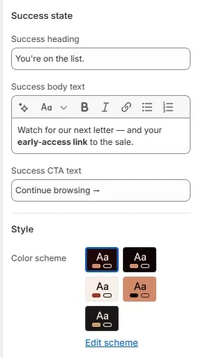
Success state
- Success heading: The headline shown after a customer successfully submits their email.
- Success body text: Supporting message shown on the success screen. Use this to set expectations about what subscribers will receive.
- Success CTA text: The label on the button that dismisses the success screen and returns the customer to browsing.
Style
- Color scheme: Choose from your store’s defined color schemes to control the background, text, and accent colors of the pop-up. Click Edit scheme to modify an existing scheme.
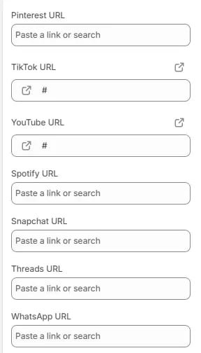
Social media
Social media
Social media settings let you link your store to all your brand’s social profiles. These URLs are used wherever social icons appear in your theme — such as the header, footer, or any section that displays social links.Add the full URL for each platform you want to display. Leave a field empty to hide that platform’s icon from your storefront.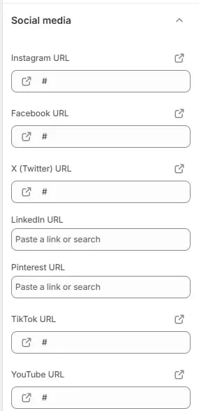
- Instagram URL: Link to your brand’s Instagram profile.
- Facebook URL: Link to your Facebook page or profile.
- X (Twitter) URL: Link to your X (formerly Twitter) account.
- LinkedIn URL: Link to your LinkedIn company page or personal profile.
- Pinterest URL: Link to your Pinterest profile or boards.
- TikTok URL: Link to your TikTok account.
- YouTube URL: Link to your YouTube channel.
- Spotify URL: Link to your Spotify artist page or branded playlist.
- Snapchat URL: Link to your Snapchat profile.
- Threads URL: Link to your Threads account.
- WhatsApp URL: Link to your WhatsApp business chat or contact link.
Scroll to top
Scroll to top
The scroll to top button gives customers a quick way to return to the top of the page — especially useful on long product pages, collection pages, or editorial content where a lot of scrolling is involved.
- Enable scroll to top: Toggle this on to display a scroll to top button on your storefront. The button typically appears in the bottom corner of the screen after the customer has scrolled past a certain point.