How to Add the Section
- From your Shopify admin, go to Online Store → Themes and click Customize.
- Navigate to the page where you want to add this section.
- Click Add section and select Featured collections.
- Add Capsule blocks for each collection you want to feature (up to 6).
- Click Save.
Section Settings
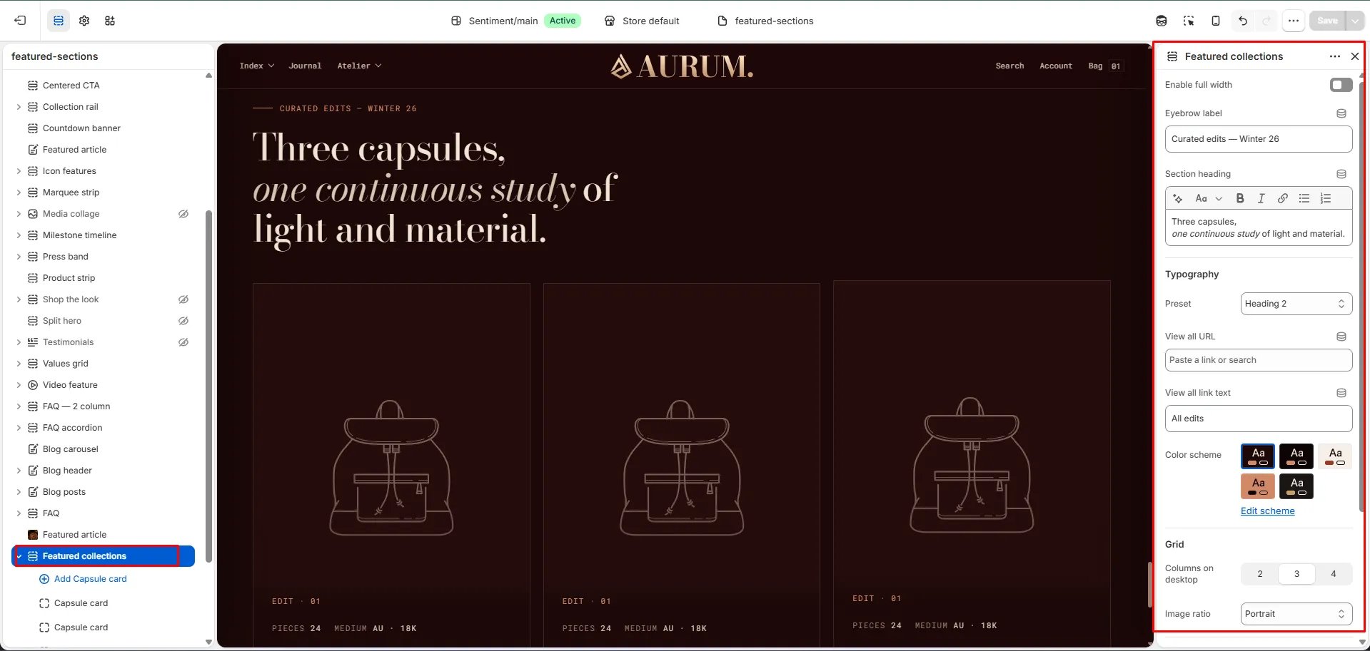
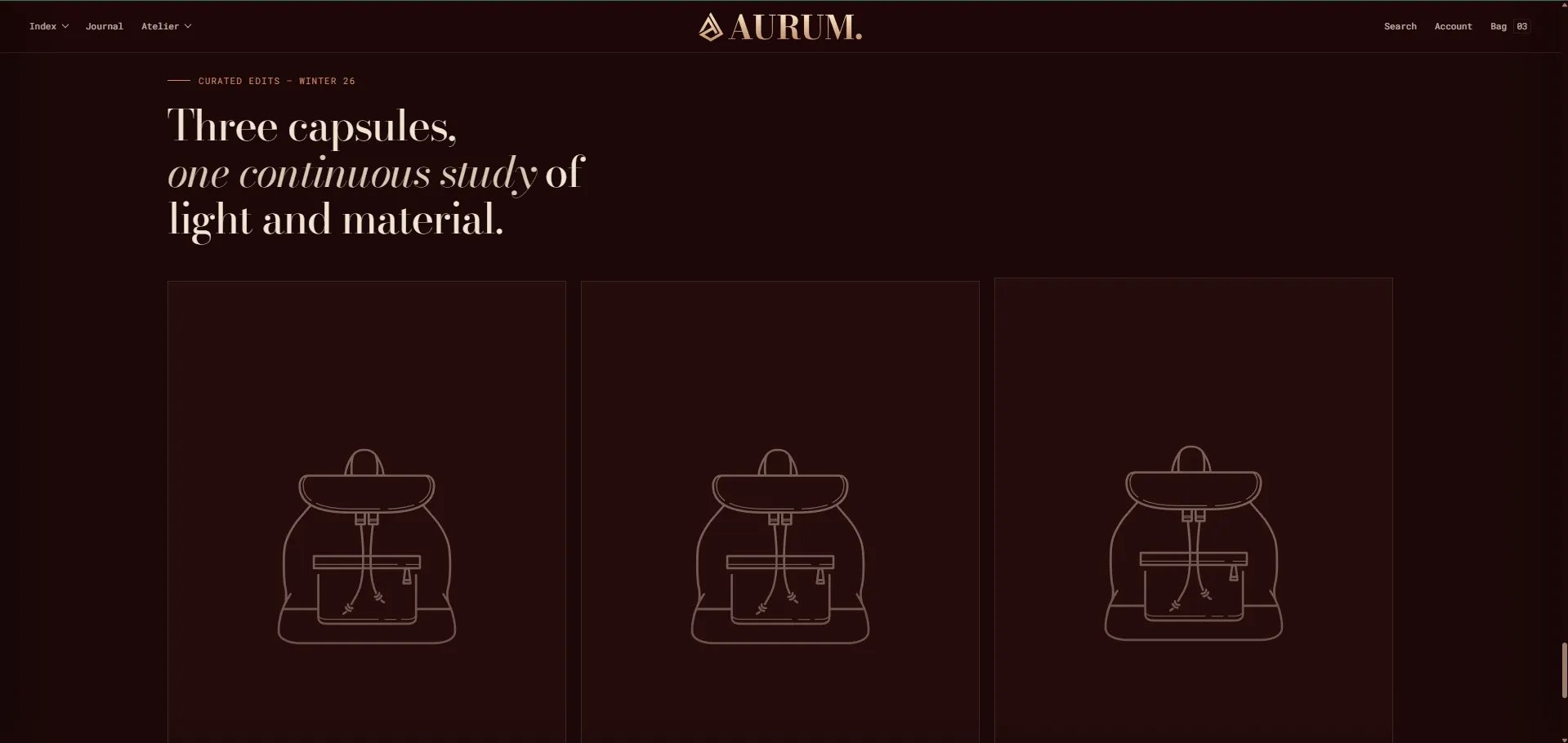
Content
- Eyebrow: Small label displayed above the heading.
- Heading: Main section heading. Supports rich text and italic emphasis.
- Heading typography: Select the typographic style for the heading.
- View all URL / View all label: Link and label for an optional “view all” CTA.
Display
- Full width: When enabled, the section stretches edge-to-edge.
- Columns desktop: Number of capsule columns on desktop (2, 3, or 4).
- Image ratio: Aspect ratio for capsule images — Portrait, Tall portrait, Square, Landscape, or Adapt.
Style
- Color scheme: Choose a color scheme for the section.
Spacing
- Padding top / Padding bottom: Control vertical spacing around the section.
Capsule Block Settings
Each Capsule block is one featured collection card. You can add up to 6 capsule blocks.Source
- Collection: Select the Shopify collection this capsule links to and pulls its image from.
Content
- Number: An edit number or label for the collection (e.g., “Edit · 01”).
- Title: Display title for the capsule. Defaults to the collection name if left blank.
- Description: A short description displayed below the title.
- Meta 1 / Meta 2 — Label & Value: Two metadata pairs for additional collection details (e.g., “Materials / 18k Au · Pt” or “Pieces / 24”).
Image
- Image: Upload a custom image to override the collection’s default image for this capsule.