How to Add the Section
- From your Shopify admin, go to Online Store → Themes and click Customize.
- Navigate to your homepage.
- Select the Hero section from the left sidebar, or click Add section to add it.
- Add content blocks (Heading, Text, Button, Featured product) and configure each one.
- Click Save.
Section Settings
Style
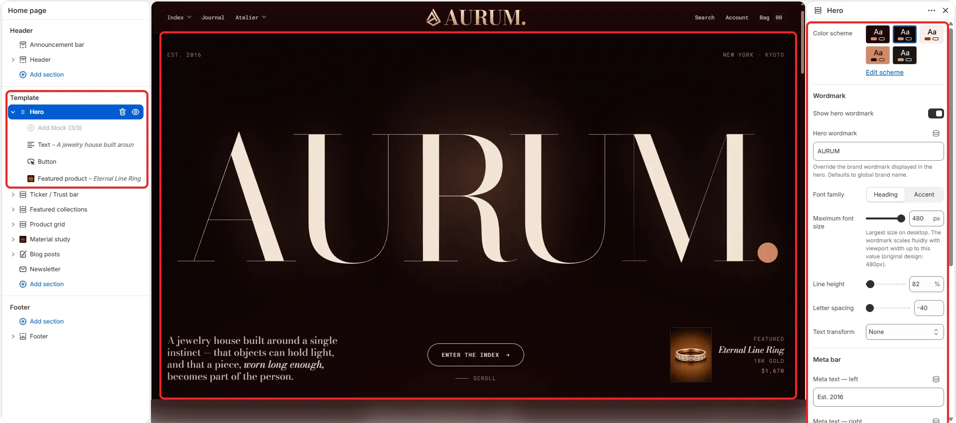
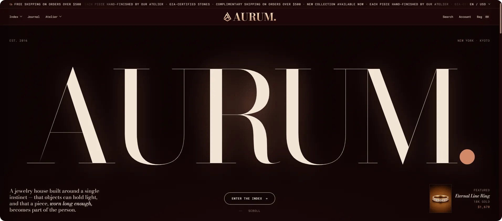
- Color scheme: Choose a color scheme for the hero’s UI elements and overlay text.
- Mobile alignment: Set how block content aligns on mobile — Left, Center, or Right.
Wordmark
- Show wordmark: Toggle to display a large typographic wordmark overlaying the hero background.
- Wordmark: The text displayed as the wordmark (typically your brand name in a large display style).
- Wordmark font family: Choose between the heading font or the accent font.
- Wordmark font size: Set the wordmark size in pixels (range: 120–480px).
- Wordmark line height: Adjust the line height percentage.
- Wordmark letter spacing: Fine-tune letter spacing.
- Wordmark text transform: Set case transformation — None, Uppercase, Lowercase, or Capitalize.
Metadata
- Meta left: A text label displayed in the bottom-left corner of the hero.
- Meta right: A text label displayed in the bottom-right corner of the hero.
- Collection: Optionally link the hero to a collection for contextual navigation.
Spacing
- Padding top / Padding bottom: Control the vertical spacing around the hero section.
Content Block Settings
Content blocks are added inside the Hero section to build the overlay copy. Each block type has its own settings.Heading Block
- Text: The heading text. Supports inline rich text and italic emphasis.
- Heading tag: HTML heading level for the text (H2–H6).
- Alignment: Horizontal alignment of the heading on desktop.
- Typography: Select the typographic style for the heading.
Text Block
- Text: The body or lede paragraph. Supports full rich text formatting.
- Alignment / Mobile alignment: Horizontal alignment on desktop and mobile independently.
- Typography: Select the typographic style (default: lede).
Button Block
- Label: The button text.
- URL: The link destination.
- Open in new tab: When enabled, the link opens in a new browser tab.
- Show arrow: Toggle to display an arrow icon on the button.
- Show scroll cue: Toggle to display a subtle scroll-down animation cue.
Featured Product Block (limit 1)
A floating product card overlay displayed in the corner of the hero image.- Product: Select the product to display in the card.
- Featured label: A small label shown on the card (e.g., “Featured”).
- Material: A material or detail line shown on the card.
- Title typography: Select the typographic style for the product title on the card.